During a drought in Orange County in the 1990s, there were wide dead
lawns spray-painted green and signs nailed to trees saying, “Armed
Response.” Some people were pretty successful with their faux-nature
plots, but others upped the yellow and threw in a bit of neon for a
probably unintentional Flash-Gordon-on-the-moon look. Nearly 20 years
later, the latter is the shade increasingly showing up in landscapes.
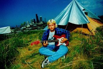
(Alice Wheeler, Homeless Camp, Seattle)
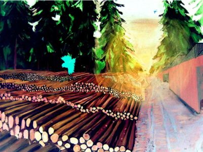
 Barney Kulok, Crescent Street, Queens, New York
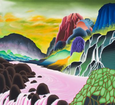
 Ezra Johnson, still from The Time of Tall Statues
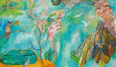
 Elizabeth Sandvig, Landscape in Spring with Owl


The way the foreground recedes in that Alice Wheeler photo is crazy – you fall into that picture and look up at the sky.
I felt like (in my amateur opininon) the printing of the photos at her recent Greg Kucera show was not great – that deep saturation has a way of overtaking subtlety sometimes. I wonder if it has something to do with the size though too, because at this small size (and backlit on a computer monitor as well), the saturation is there but so are the subtleties. Small sizes say ‘snapshot’ but they also make you look closer.
Again, amateur opinion, but there it is.