Even though 95 percent of museum visitors enter through the parking lot in the rear. The proposed plaza will not only spruce up the entrance almost nobody uses but wrap around the building to sprinkle museum dust on the cars.
The museum’s 2003 Antoine Predock building may be a peach, but the plaza is a pit.
TAM is unusually frank in its assessment of its plaza problem.
* There is undistinguished street visibility along Pacific Avenue
* There is no protection on the plaza from the elements
* The building turns its back on the city
* Museum appears closed and monolithic from the outside
* Plaza feels empty
* Plaza appears like a drive-by space
* Plaza feels stark, cold
* Plaza contains no art work.
The budget is $3 million, entries due June 5. Discussion forum, or shell of a discussion forum, here. Outline of issues here.
Why not let an artist do it? The artist can add landscape designers as needed. Be bold, Tacoma Art Museum. Pick an artist.
My preliminary recommendations, based on their past work and interests:
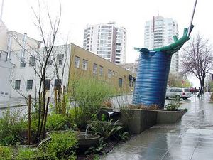
Buster Simpson: No one understands public space better, or engaging the audience.
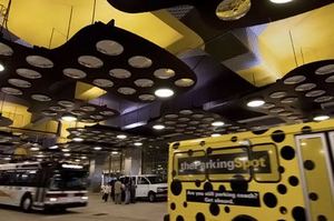
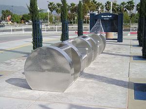
 Ries Niemi and Sheila Klein: Working together, they’ll make sure nobody forgets this plaza ever again. Plus, Klein is all over the concept of glam parking lot, and Niemi can do the furniture.
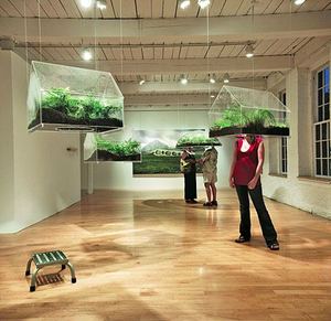
 Vaughn Bell: portable nature for a parking lot culture.
 Bruce Conkle and Marne Lucas: Lively up yourself with fantasy, Northwest edition of Eco-Baroque.
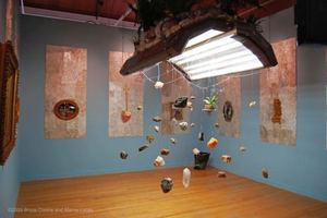
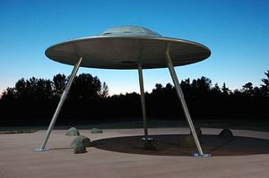
Peter Reiquam: The concept of a flying saucer was invented in Tacoma. Roots, baby, roots.
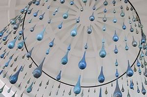
 Ann Gardner: Rain can be a plus. And she knows how to wrap a plaza in rhythm.
 I would love to see what Claudia Fitch came up with.
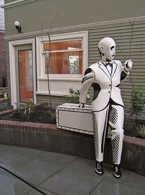 Ditto Linda Beaumont.


Leave a Reply