Here’s the review of mine I promised to link to–in the wonderful Financial Times, where the dear, charming Hilary Ostlere used to write.
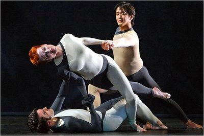
One of the heavenly tangles in Nearly Ninety (dancers Silas Reiner, Holley Farmer, and Koji Mizuta; Photo: Andrea Mohin/The New York Times)
A few followup notes:
So we critics agreed about one thing, at least, that Nearly Ninety‘s set by architect Benedetta Tagliabue was massively obtrusive. (Tonya Plank kindly lists all the reviews that have been printed or posted as of yesterday.)
I also agree with Alastair Macaulay in the Times that the number of hapless collaborations–with musicians and particularly artists–has grown in the last several years. The big problem for me is when the companion arts push in a narrative or social direction, precisely where Cunningham doesn’t go. (I’m thinking of the Robert Gober slides at the last Joyce Event and Mikel Rouse’s folkish songs, with words, for eyeSpace.)
Perhaps Cunningham’s age is partly responsible for the bad fits. The artists and musicians he grew up with–artistically, I mean–are mainly dead (Rauschenberg, Cage, Tudor, Feldman). They shared his aesthetic and understood the requirement of his theater–that dancing is the most fleet of the arts and needs to be protected from intrusions in a way that sound and set don’t. So if you’re going to have a set that covers the whole stage–make it as ineffable as the dance (e.g., Andy Warhol’s silver mylar pillows for Rainforest.) If it’s going to constrain the dancers, make that constraint something that the choreographer can work with (the rubber bindings for Crises). Same with a set that partially eclipses the dancers. (Rauschenberg’s Impressionist costumes that blend with the Impressionist backdrop for Summerspace was a magical effect.)
To work Tagliabue’s massive structure into the dance, Cunningham would have had to start way before nearly 90 and end way after (Nearly 95, anyone?) Remember how, to create Ocean, he considered the movement from all 360 degrees of the circular stage? Tagliabue’s structure would have offered equal challenges. Without the time for them, this shiplike skeleton reduced Cunningham’s multidimensional, anti-proscenium orientation to two dimensions: back and forth, along the lip of the stage.
The music worked for me precisely because it honored Cageian principles and Cageian clarity. (About a decade ago, Sonic Youth did a whole Cage “cover” album, so they’re no strangers to the man.) It brought to mind birds rising en masse from a wire, calling into the air; the scrape of industrial metal against metal on an icy early morning; and sometimes just a languid tune on an electric guitar played as if in a livingroom. The musicians attended lovingly to the dance.
I think, as critics, we need to be careful that we’re not simply knocking the collaborations’ looseness–that Cunningham lets the artists and musicians do what they will. Or if we are, we need to know it.

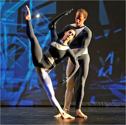
A not very tender document of the most tender of duets, with Jennifer Goggans and Daniel Squire. In the background a 3-D elaboration of shadows of the monster set behind the scrim (Photo: Andrea Mohin/The New York Times).
PPS: A little more on the pathos of opposite impulses I mentioned in my review: it’s why I’ll miss Daniel Squire as much as Holley Farmer. He makes a gripping drama out of staying upright. When he does those iconic sideways Cunningham curves, it’s as if the earth were calling.
Both he and Farmer distinguish themselves in the company with the contrasting dynamics that play across their body. At the end of Squire’s typically angular Cunningham arms are hands with relaxed fingers. Cunningham has said, “Drama is contrast”–and here it is. Squire’s body bends as tautly as a bow, but his head turns loosely and sharply. With Farmer, it’s her head that reposes regally atop her spine while her torso prickles with twitchiness.


Great piece. I felt a light bulb click on in my brain.
[Apollinaire responds]: Thank you, Regina. And *I’ve* been very much enjoying your blog.
Excellent analysis of the decor for NN combined with apt references to Cunningham’s past collaborations. Thank you for this insightful post.
[Apollinaire:] You’re very welcome!