main: March 2010 Archives
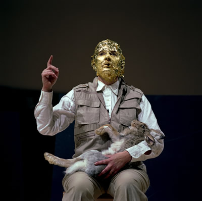
Marina Abramović as Joseph Beuys (Guggenheim Museum, 2005)
MoMA Redeemed?
Marina Abramović (MoMA, to May 31) did not set up the parameters of Performance Art. Though there are only a few years between the seminal (sic) works of Vito Acconci and those of Abramović and her early-Performance partner Ulay, their efforts are surely second-generation. Second-generation, but not second-rate. Oh, yes, art is fast, and a generation can occur in the blink of an eye.
Who are the pioneers? Bruce Nauman and Dennis Oppenheim surely count for something, although their performance art was studio-based (Nauman) or landscape-based (Oppenheim) and neither usually "performed" before any audience other than the camera. Acconci sometimes did, as in his notorious Seed Bed masturbation piece, in which he pleased himself under a false floor in the Sonnabend Gallery. Before these artists, Yoko Ono and Joseph Beuys reigned -- and before that there was Yves Klein, with his infamous Leap Into the Void.
Before I go on, for a previous take on Abramović, her recreations of "famous" Performances at the Guggenheim, and my own addendum to the history of the still-fugitive performance genre, please see my Artopia entry of Nov. 11, 2005. Note too that in Artopia we capitalize Performance and Performance Art when these terms refer to the post-'65 genre and do not when we mean performance in general, which may apply to a theater performance or the way an automobile operates.

Chrisopher Marlowe
Does Precedence Exclude Transcendence?
Is first always best? Well, in other realms, that is not necessarily the case. Christopher Marlowe was the first to write plays in blank verse, but none would dispute that Macbeth (1605?) is better than Tamberlaine (1587).
Yet in art, although we like Man Ray's readymades, full glory goes only to Marcel Duchamp as the inventor of same. R. Mutt's urinal is better than Man Ray's metronome. And, closer to home, is not de Kooning still considered greater than Franz Kline?
Abramović is not a Performance Art founder, but she has the noteworthy distinction of making only Performances. In this regard, she is to Performance Art what Allan Kaprow is to Happenings; she has not swerved. I would be surprised indeed if she suddenly began to produce paintings and sculptures for the art market.
We like the freedom that artists now have to investigate all genres, which of course is to their own peril. Early on we had some doubts about those who first gained attention with Performance Art and then moved quite quickly to make saleable products of no particular interest. That most of the Happenings gang went on to make Pop Art did not mean that the tactic was foolproof.
Performances, as most grad-school artists know, were once how you opened the door or lured the customers into the store. We do not have to wonder where Matthew Barney got the idea. But we do not blame the pioneers, really. They did only what they had to do to escape working as waiters or cabdrivers or college professors. But who says you have to make a living with your art?
In Artopia we are entertaining the idea that if you make your living with your art -- which includes teaching art -- you are not really an artist, but a hack. That does not mean you have to be born rich to be an artist or need to have a rich husband or wife, although this might help. I see nothing wrong with being a short-order cook and an artist.
Of course, grad-school artists now count Performances as part of their kit bags, on the way to stardom. Paintings, sculptures, environments, drawings, prints, videos, and Performances. Well, why not? Throw in architecture too, for good measure. And fashion. We are all Leonardo, or at least Picasso.
Sort of.

Pioneer, O Pioneer
Not only is Abramović noteworthy because she devotes herself to Performance Art, but she is the first of such to be honored with a full-blown survey at the Museum of Modern Art. MoMA, heretofore known mostly for offering its lucrative stamp of approval to artists of a more material bent and more obviously descending from Picasso and Matisse, has taken a gigantic step into ... the last half of the last century.
Well, better late than never.
Does this mean that MoMA is now the leading light of contemporary art? If one must maintain a distinction between modern and contemporary art, then yes, definitely. But if you assume that Duchamp is as modernist as Picasso and Matisse, then that distinction is moot. If you assume that Constructivist, Futurist, and Dada performance art were part and parcel of modernism -- as I do -- then what was so new and dangerous about Performance Art?
I would have liked to see a Carolee Schneemann retrospective first. Now that the MoMA public has accepted full-frontal, real-life nudity, is it ready for Schneemann's Meat Joy (1964) or Interior Scroll (1974)?
And as much as I hate group shows or 10%-ers (see the previous Artopia, called "Not Just the Whitney Biennial"), an historical survey of Performance Art might be called for. (Of course, even if a museum-generated history of Performance Art is in the making, no one says that it has to happen in historical order.)

Abramović/Ulay: Relation in Time, 1977
Breaking Another Thumb
In the visual arts, alas, there's another rule of thumb: the breakthrough art in any artist's career always wins. Collectors scramble for the fresh. Decline is inevitable, unless the artist is Matisse.
I was all set to proclaim Abramović as conforming to this evil notion, her best works occurring early in her career. Certainly her Performances after her breakup with Ulay (her German lover and collaborator) are in general not as strong as the collaborations. Their couple-ness was new to visual art as content and form. They were never Tristram and Isolde or Castor and Pollux. But at least they were never Gilbert and George.
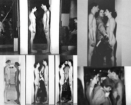
Ulay holding a poised arrow at Abramović's heart is ... heart-stopping. Seeing photographs of people squeezing between their facing, naked bodies in the various incarnations of their doorway piece Imponderabilia makes the current MoMA re-performance, using buff models with perfect Ken and Barbie skins, seem clinical rather than alchemical.
Abramovic/Ulay, Imponderabilia, 1977

The last Ulay/Abramović collaboration (1988) involved each starting out at opposite ends of The Great Wall of China and then meeting. But instead of marrying, as apparently was the plan, when they met they decided to split. That there was a kind of reconciliation (if you will excuse the term) or reunion during the Artist Is Present Performance - dutifully recorded by all official cameras, video and otherwise - adds a strange but sentimental twinge.
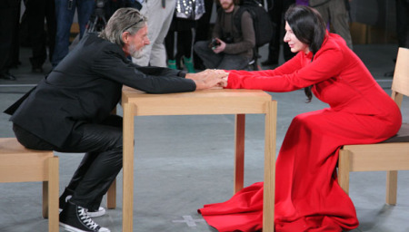
Abramović and Ulay reunited at The Artist Is Present, MoMA.
I should also note we are not into masochism, no matter how the subject, even explored by a woman, may reveal socially objectified sexual roles. And Abramović's "Balkan" pieces are laughable -- perhaps intentionally. We like the Rabelaisian aspect, but we ourselves are not obsessed with Yugoslavia, nor does Abramović convert us to her concerns. Peasants baring their breasts to the rain or humping fields is really not all that funny, or telling. Because Abramović's family was highly placed in the former Yugoslavia -- an Orthodox patriarch, a revolutionary hero, and so forth -- it is difficult to see these multiple-screen presentations at MoMA as emblematic of the marginal or the despised, the conquered and reconquered orphan-cultures of the Euro-empire. Let's put it this way: Abramović is not to the land of Tito what film director Béla Tarr (Satantango, 1994) is to Hungary.
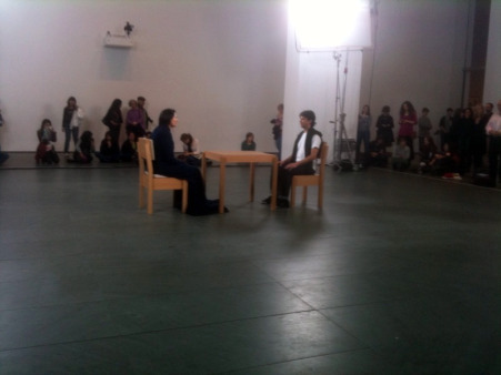
But then, ah yes, we come across the new Endurance Work: The Artist Is Present. She sits all day long in the MoMA atrium, and visitors, one at a time, may seat themselves across the table from her and stare back as long as they want. It's a masterpiece: so startling and effective, whether you sit with her or not, that it is charisma personified. The piece is also available live online during museum hours: 10:30 AM to 5:30 PM, Fridays until 8 PM, but not on Tuesdays when the museum is closed.
This most recent work explains a great deal. It demonstrates why videos and photographs of older pieces are more effective than the re-performances, using paid nudes. And I go back to imagine how different the original performances must have been when executed by the artist herself.
Unlike Kaprow's Happenings (the reinterpretations of which have their own set of problems), Abramovic's Performances are charisma-based. Not any old charisma will do: you need her charisma. Furthermore, had the artist decided to "re-perform" her old works herself, wouldn't that naked 63-year-old-body set up a different set of meanings than the same body naked at 29?
 Saving the Legacy
In the now burgeoning effort to preserve Performance Art -- apparently initiated by Abramović herself, bless her - there's perhaps been too much discussion about re-performance and re-creation and how to make money and not enough about what makes Performances different from most Happenings, most Fluxus Events, and -- at the opposite end of the live-art spectrum -- theater. These forms are alike in that they are time-bound (like cinema, by the way, and literature too), and persons are the enactors.
Well, maybe there is not enough time to worry about what exactly it is we are trying to save.
Performance Art is suddenly being bought and sold. Sehgal's Kiss (2002) at the Guggenheim was bought and paid for by MoMA. Performances, therefore, have cracked the plastic ceiling and are acceptable in museums, alongside paintings, sculptures, prints, drawings, and cinema. Is this the end of Performance Art?
Not quite.
What will be bought and sold is the right to present or re-perform, just as you can buy and sell the copyright to a song or a play. That cannot happen with charisma-based Performance Art, because you cannot buy or sell the artist. Or can you? And if you do buy his or her Performance-on-demand, what happens when death intrudes? Goodbye, charisma. Goodbye, artwork. Goodbye, investment.
Unlike paintings and sculptures, which are relics that sometimes retain the charisma or the aura of the artist, Performance Art residue is mostly charisma- and aura-free. Props are just props. The only exceptions I can think of right now are bits of Beuys-iana and a few Ana Mendieta "souvenirs."
Not one item or collection of items in the Abramović survey is aurific, not even the table of potential torture-instruments offered to audiences of her Rhythm O (1974).
But she herself in the MoMA atrium has enough aura for a dozen retrospectives. That face, those eyes, that stage presence, that way of holding herself. ...

Mark Staff Brandl
The Braid: Solving the Historical Mystery
Performance Art is part of the visual-theater strand of the art braid, beginning with rituals and Mysteries. Later, someone had to design the Mass; and artists from the Renaissance down were often required to invent fetes and celebrations as required by patrons of far grander, more lasting commemorations. Futurist and Dada hijinks ended most of that, and visual-theater went wild.
Visual theater, like others art strands, weaves in and out of practice, visibility, and consciousness, assuming a proper and appropriate guise in each new temporal context. Our currently preferred embodiment, once known as Body Art, goes by the name of Performance Art, and for purposes of discussion and analysis should clearly be distinguished from Happenings, Events, Cabaret, and Theater, itself - as in Broadway, Off-Broadway, and Summer Stock.
The Braid is the official Artopia visualization of art history -- not the staircase, the treadmill, or even the double helix. For a lucid, witty, and extremely helpful presentation of the Braid, see Mark Staff Brandl's Post-Hysterical: Timeline, Comics and a Plurogenic View of Art History, a lecture presented at this year's College Art Association meeting in Liechtenstein.Click here.
Brandl cleverly bundles The Braid with the history of the comics. Timelines will never look the same again -- or be abandoned to the academic quagmire. Brandl and I agree: if you want to improve the understanding of art, you absolutely must improve the visualization of change. Diagrams based on Darwinian evolution or Hegelian dialectic simply will not do. And, as you may already have suspected, all of Artopia is one big braid. The Braid is a principle of literary composition. Art criticism should embody its subject.
Proposed: Characteristics of Performance Art
1. There are no scripts, as there sometimes were for Happenings and as there usually are for theater.
2. There are no roles, as in theater and some Happenings.
3, Although there may be written descriptions, Performances are not rule-based, as are Fluxus Events.
4. Unlike Happenings, Fluxus, or theater, Performances cannot be performed by just anyone. They must be performed by the artist or artists.
5. Unlike theater, there is no acting. The performer is not pretending to be someone else.
6. As in Fluxus Events, there may or may not be an audience, whereas in Happenings and theater there is always an audience.
7. Unlike in theater and most Fluxus events, but like in Happenings, there may be a residue, which may or may not have artistic value.
8. Everything can be filmed, taped, photographed and otherwise documented without this material becoming a substitution for the primary artwork.
But the artist should always have the last word:
* * *
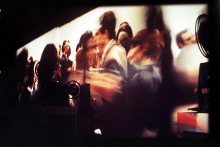
Marta Minujin: Minucode, 1968
Latin Braids
Shouldn't Latin American Happenings and performances be included in the visual-theater strand of the Art Braid? A re-creation of Marta Minujin's 1968 Minucode now at Manhattan's Americas Society (to April 30) reminds us of the richness of real art as opposed the reductive versions offered in Grad School lectures and seminars; and, alas, in many textbooks and crib notes.
Minujin, an Argentine artist noted for her Happenings and Mass Media art works, took ads out in The Times and The Voice requesting potential Minucode participants to fill out a questionnaire, indicating their principal activities or occupations: Politics, Business, Fashion or Art. And, among other things, were asked to indicate: "What type of materials turn you on? For example: invisible color wall, moving screen, sounds, lights, smells, touching surfaces. Do you like to play with your shadow? To listen to your own voice? To be reproduced in electronic media?"
Four cocktail parties were put together, one for each category, and each party was recorded on film. During each cocktail party participants improvised sound and light shows. The publicity for Minucode was the real artwork. And Minujin worked the p.r. like a pro. Minucode was everywhere as was Minujin in her bleached-blond bangs.
I participated in this piece when it was originally offered, but could not spot myself in the reincarnated wrap-around cinema projections now on view. Surprisingly when I asked myself if I could date the presentation by internal evidence alone or separate the business, art, fashion, and politics cocktail parties, I could not do the latter, whereas the former might only be achieved by noting women's hairdos. Late '60s hairdos now seem strange indeed. Otherwise we are now retro in vitro. How odd that the clothes and the men all look the same over so many decades.
See here my notes on a survey called "Latins in Manhattan," Artopia February 11, 2008, which also demonstrates The Braid in action.

Richard Hendy: Kashima Tetsudo Line, Requium for a Railroad, Spike Japan.
Blong-Blong, or Rust Never Sleeps
A new word is born, right here on Artopia! We are exhausted explaining how Artopia is more than a blog. Not only is it aimed for the ages and carefully looked over by a brilliant editor, it is so much longer than most blogs that it deserves to be called a blong.
SAY IT: "BLONG."
Speaking of which, here is a link to a blong that I like concerning the downfall of Japan, sort of. Richard Hendy - a British translator living in Tokyo -- calls his blong Spike Japan. Best and longest entry is "Requiem for a Railroad."
Not only was Japan in the forefront of the bubble-burst, with virtually no immigration allowed, a very low birthrate, and the oldest population in the world (more people 100 or over than anywhere else), it is in the forefront of depopulation...and rust. Genre-bender Kiyoshi Kurosawa, in films such as Cure and Retribution, lovingly includes abandoned factories, hospitals, and the desolate Tokyo waterfront.
Hendy's Requium is more detailed, and in some ways even more poetic. The short Kashima Tetsudo line he investigates is a linear ruin of abandoned stations and rusty railroad bridges. Depopulation? Motorization taking its toll? I myself have perversely taken great pleasure in photographing a totally abandoned shopping mall on Long Island -- weeds through concrete, over-turned benches, trash cans still overflowing, a tipped shopping cart the only vehicle in a vast parking lot. But Hendy's accounting of the ghostly Kashima Tetsudo line is solidified by facts and dead-pan observations.

More Good News for Marina: The Apt App
Yes, Artopia endorses the iPhone. And aside from the "clap app" (Simple Applause) that allows you to applaud yourself with six degrees of intensity (person, people, crowd, laughter, wow, and whistle), our favorite free app is Is This Art? Take a photo of the object in question with your iPhone and the program -- provided in part by the Mattress Factory (a longstanding alternative art space in Pittsburgh) -- will answer your all-important query.
The Is This Art? iPhone application is a new tool designed for people who have questions about the artistic integrity of their surroundings. Using your iPhone's camera and a complex, revolutionary algorithm, we now have the ability to instantly provide users with an authoritative declaration of artistic importance.
Made with love in the STEEL City, this app is collaborative endeavor produced by the Pittsburgh-based artists and developers at Deeplocal and the Mattress Factory. Extra-special assistance was lent by C-Monster and WNYC in New York.
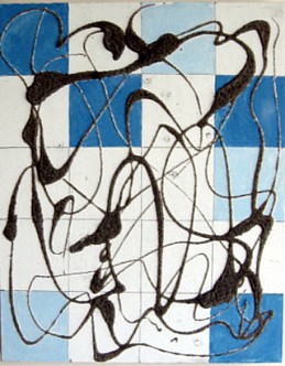 An old painting of mine (1998) using polluted beach sand, elicited this response: "This piece is modernist after modernism without being post-modernist, therefore THIS IS ART."
I aimed at the photo of Abramovic's reunion with Ulay, and received: "Someone who spent most of their life in college wrote an essay about this, therefore THIS IS ART."
I pointed at a photo of the historic Abramovic/Ulay Imponderabilia doorway Performance and Is This Art? replied: "This makes me feel intellectually inferior, therefore THIS IS ART."
Is everything art?
No.....
I aimed my iPhone at a recent artwork of my own, clicked, and got this response:
"This work does not resuscitate the referential possibilities of historical stasis, therefore THIS IS NOT ART"
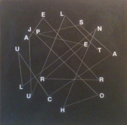
I now have hope.
In any case, I am now looking for a partnership that will facilitate a new app called Is This Good Art? It will make millions
FOR AN AUTOMATIC ARTOPIA ALERT CONTACT: perreault@aol.com

Theaster Gates: Cosmology of Yard, 2010
Beyond the Moat
No fancy title. Only 55 artists, all American. A few midcareer artists. More than half of them female.
You win some, you lose some. Reading the reviews, you would think "2010," the Whitney Biennial, was a revolution of some kind. Please. Except for the long-demanded (but apparently unplanned) increase in the number of women, it is back to square one, save a single exception. With more and more interest in installations and projected-video formats, a Whitney Biennial with fewer artists than the last allows more space allowed to each -- and lessens the visual and audio cacophony we routinely gird up to face as we plunge into this or that sideshow of contemporary art.
In preparation for the mandatory take on the premier U.S. biennial, I reread my last two overviews of the Whitney non-bellwether. If only I knew then what I know now.
Yet Another New Term You Need To Know
Surely you have realized how easy it is to change something you posted in haste on your very own website. Now newspapers are being asked to change and expunge past "news," such as embarrassing drunk-driving charges, jail time and the like. And some of them do. Or so says Melinda Burns in Unpublishing History. This is a slippery slope.
It's not just a matter of whose hand was caught in the till, but soon may concern big things that did or did not happen. What invasion of Iraq? What weapons of mass destruction? What Republican use of the reconciliation tactic?
Herewith is the Artopia problem: Should I correct irregular punctuation, misspellings, and deadly run-on sentences incurred before I had my brilliant editor? Yes; no problem. Change errors of fact? Well, probably, if suitably noted. Change opinions? Given 15 years of spare time, I could rewrite John Perreault and at the end, because even my opinions change, begin rewriting all over again, ad infinitum.
Nevertheless, some corrections might be in order.
Tiravanija and de Suvero: Peace Tower, 2006
The Last Biennial? Better Than an Art Fair and Faster, Bigger, Darker
In my Artopia post of April 7, 2006, I was, I now know, too optimistic. I did note, however, there were some ambiguities about the title.
Two innovations this time are of note. The Biennial has a title: "Day for Night," after Francois Truffaut's film (not his best) L'Nuit Americaine. "Day for night," translated into French as "American night," means filming in daylight with filters to create the look of nighttime. Does this mean that what some now perceive as The American Night is an illusion? Is the war in Iraq only a Hollywood fantasy? The other innovation: non-Americans included.
I should have stomped out pretentious and ambiguous Biennial titles then and there, because it only led to pretentiously titled Triennials and Biennials to come. I should also have pointed out that showing more artists does not necessarily mean more good art, or that including foreign artists, although it might reflect the current art world market, can result in just another bigger and no better mish-mash of bad art.
Fritz Haeg: Animal Estates, 2008
The Whitney Biennial: Good News
In regard to the Biennial of 2008 and my Artopia post of March 11, I was totally wrong about one thing; I followed the subhead "Is This the End of Art for Dummies?" with the following message from Pollyanna Perreault:
Don't believe everything you read; the Whitney Biennial isn't all bad. In fact, as a crystal ball, it is cause for hope. But before we start reading tea leaves, we can indulge in quantifications. We may be getting only Beuys-Lite, Acconci-Lite, and Haacke-Lite, but art is back on track. The '80s hijacking of art by bombastic egotism and Picabia parodies suddenly seems an ancient, commercial diversion.
If only!
10%
Perreault's Percentage
You know that we long ago discovered what has come to be known as Perreault's Percentage. No matter how talented the curator(s) or how vast the pool of artists, not more than 10 percent - Perreault's Percentage -- of any large survey is worth looking at. Why is this? Judgments are limited. Plus, art worth saving is simply too hard to make.
Perhaps Perreault's Percentage should be lowered even further. For purposes of comparison, and as a way of evaluating the current Biennial, let's put it to the test.
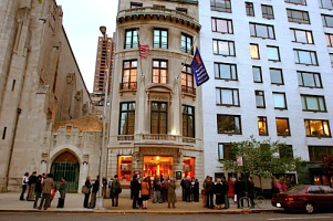
Thomas Cole Rolls Over in His Grave
"185th Annual Invitational," National Academy Museum, 1083 Fifth Ave., to June 7.
You already read the headlines about the ill-advised 2008 sale of a Frederic Church landscape from the National Academy's permanent collection in order to make ends meet; neither Artopia nor the American Association of Museums was pleased. Now, go to the National Academy website and read the history of the place. The Academy, founded in 1825, was progressive for its time, a heady, artist-run venue for American artists. In the 20th century, however, it was vehemently antimodernist.
Time to turn over a new leaf? Since 2002 there has been an invitational of non-member artists every two years, sharing the non-spotlight with the more traditional members show on an alternating basis.
On the Academy website you can also find a list of all living Academicians, including the latest crop, all of whom are still required upon acceptance to donate a work of art. And have it sold to pay the utility bills?
I told you so. That's what happens when you let artist run things. Furthermore, when selecting artworks or electing members, they elect their friends. They support the status quo.
But it is their status quo.
So I walked the walk.
As others have noted, some rooms are empty. But so are those that have art in them.
As I walked, I wondered: Does this 185th Annual Invitational follow Perreault's Percentage?
We are told that the 65 emerging and established artists have been CHOSEN BY ARTISTS ON VIEW FOR ALL (their caps). The artists who did the choosing are not on view for anyone. Who were they? But never mind. A little ambiguity because of an ungrammatical motto is not a sin. The Fifth Avenue building is charming; the gift shop is full. But will there be at least six-and-a-half artist worth looking at?
If I count the established or, more correctly, nearly established artists (and in some cases once-established artists), it's a yes.
It is good to see Judith Bernstein's cocks/bombs/bullets on a color ground for a change. Petah Coyne's wall piece and Valerie Jaudon's Pattern Painting, although too small, are likewise worth seeing. I was heartened as well by Nina Yankowitz's Buried Treasures; Secrets in Science, an installation (at the Academy! With projected texts!), recounting uncounted women contributors to the progress of science, from Cleopatra to Mrs. Einstein. And then, unaccountably, Brazilian favorite Cildo Meireles is represented by a photograph of the artist himself standing on his head on one of Manzoni's "Base of the World" cubes. I would have awarded Meireles the sculpture prize, and not just out of perversity.
 But Richard Van Buren won that award for a piece far different from his sculptures you may have seen in the late '60s. His Green Movement looks like a wacky, enlarged ring-holder tree made of plastic and decorated with seashells. The prize for Traditional Landscape Painting went to the well-known "Photorealist" Richard McLean; it's a beaut.
If, however, I limit myself to artists I have never seen before, we are in deep trouble - though not as much trouble as we'd be downtown at the Brucennial (see below). One clear exception is Stena Kohler, whose Spell is a spectacular Victorian fainting couch covered with sheets of felt held together with tweezers and hung vertically on the wall in the hallway.

Miami Break, but No Escape From Art
The Bruce High Quality Foundation is a collective that has broken through to art stardom. Their piece in the Whitney Biennial (see below) is a knockout; and their hi-jinks (serious) and projects (maybe satirical) have even found their way into Artopia. e.g. their art-world zombie movie; their panel discussion. I was, however, chagrinned to come across a card in our Belle Isle, Miami hotel room.
The Standart Video Series -- at all Standard Hotels, including the one now looming over Manhattan's High Line park - includes an offering by the BHQF: "L'Eau de Vie, un film de Jean-Luc Godard." Here is an online description of the Creative Time/Standard project and there you can see a Marilyn Minter video.
Miami? What was Artopia doing in Miami? And not during ArtBasel?
Sick of snowstorms and sick of art, we were taking outdoor mud-baths, sun-basking on the surround of an infinity pool with a view of Biscayne Bay, on an island -- the only "real" and original island not made from dredged sand -- that supports the Venetian Causeway between Miami and Miami Beach. We were hiding out at the Standard Spa.
 This secret hotel maintains the original '50s "Lido" sign, dating from when this ex-motel became a spa for Jewish grandmothers, one of which I am not. Although it may not really be by Morris ("Too Much Is Never Enough") Lapidus of Fontainebleau staircase-to-nowhere fame, the sign was retained.
And now it is a spa for...? Well, for those who are sick of Ocean Drive hubbub and disco thump and like to eat organic-y breakfasts, lunches, and dinners and nap in modest all-white beds draped by sheer white cloth. If you squint, that textile could be tropical netting that, if you live in the eternal Hollywood of the mind, could make you - male, female, or whatever - feel like Marlene Dietrich behind von Sternberg's age-defying bolts of fabric.
So, thinking we would have an art-free vacation, I open up the info-pac and there it is: Bruce High Quality Foundation. Wouldn't you know that those sneaks would honor Godard? Will unfashionistas or gym girls and gym boys care?

Note: We also had a preview of the about-to-open Villa (by Barton G.), the restored Versace mansion on Ocean Drive in Miami Beach proper. Based on Christopher Columbus' son's family home in Santo Domingo, it remains a 1930s Alhambra fantasy amid the Flash Gordon deco fantasies and Buck Rogers bungalows I wrote about in 1981 for Art in America. The superstar designer was shot down on the steps, and morbid folks from as far away as Idaho still pose for snapshots in front of the wrought-iron gates.
Now fully restored (and then some), the Villa outdoes Patterning and Decoration. Never before have I seen so much onyx and so many mosaics, such elaborate fabric and gigantic pillows, so much -- patterning and decoration. J-K Huysmans would have loved it.
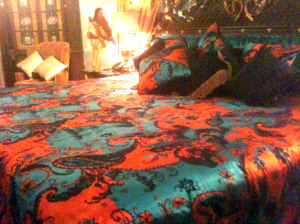
The Villa offers 10 suites, one of which was Madonna's favorite when she came to visit. But, art collectors, start saving your pennies: the tariff ranges from $2,200 to $5,200 per night. I'll take the latter! Although there is no Bruce High Quality video offering (yet), each suite comes with your very own butler, male or female, on call 24-hours a day.
Former Versace bedroom (detail)
And we were taken to see the Margulies Collection in Wynwood: a kind of private museum in a warehouse, which is the fashion in Miami. The early acquisitions on display are spectacular (LeWitt, Segal, Heizer).
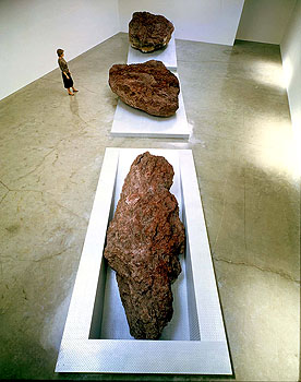
Michael Heizer: Elevated Surface Depressed, 1981.
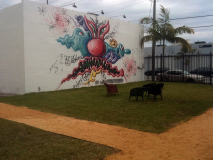
Nearby was Wynwood Walls, an ambitious Jeffrey Deitch project that debuted in December. If you care about such things, this might let you in on what L.A. (where dealer Deitch will be the new director of MOCA), might be facing.
Back in New York

Bruce High Quality Foundation University, Play Workshop, at Recess
For the Love of Bruce
"The BRUCENNIAL 2010: Miseducation," The Bruce High Quality Foundation, 350 West Broadway, with "educational" projects at RECESS, 41 Grand St., to April 12.)
Alas, back in the Big Apple, the BRUCENNIAL is being promoted by the Bruce as its "signature public program, as well as the most important survey of contemporary art in the world ever."
I particularly like the use of the word ever. One hopes Bruce is being satirical:
Following the triumphant successes of BRUCENNIAL08: Doing It Again (Bushwick) and BRUCENNIAL09: Smithumenta (Carol Gardens), BRUCENNIAL2010: Miseducation brings together 420 artists from 911 countries working in 666 discrete disciplines to reclaim education as part of an artist's ongoing practice beyond the principals of any one institution or experience.
By now you already know there is a Bruce High Quality Foundation University in which all the "students" seem to make combines using green schoolroom-blackboards chalked with incomprehensible sentences and diagrams, mocking (I hope) Joseph Beuys and his interminable lectures.
The BRUCENNIAL itself is a jumble, works brought in by the artists and hung or placed helter-skelter; first come, first served. Artist names and titles are penciled on the walls next to the individual masterpieces of rampant self-expression. Looks like, feels like the art you would see in any community art center, anywhere, only less neatly displayed, proving that presentation is a large part of creation. I am not saying that curators are artists, far from it. But, let's face it, a Salvation Army shop hit by a hurricane is not an ideal way to see any art.
Or is it?
The founder of Artopia once found a signed Dennis Oppenheim print at a Salvation Army store for $10 and an unsigned baby Warhol in a junk shop for $8.50. Maybe here too at the BRUCENNIAL, you should use your Salvation Army eyes.
A painting by poet Rene Ricard? Is this the same Rene Ricard of Factory fame? It's a little boy with a shotgun, partially obliterated by the words: "Eros. Don't forget the Cupid's quiver, the dart of love is mixed w/plain old arrows." I love it, I want it. How much is it? I give it the Artopia First Prize for Painting.
And then, amid a jumble of stuff, I spot a simple black square on a white canvas; then a music stand with a sheet of music on it: the song on display is Will I Grow Up to Paint a Square? ("Words and Cover by Carmelle Safie, music by Beachniks").
First Verse "I made a paint-ing of a square. D'you no-tice it? Is it way too spare? Does it make you a lit-tle more aware? Would it look good n a wall that's bare?"
Second Verse: " I made a paint-ing of a square. And I know you may not e-ven care, But it's some-thing that I-d like to share. So if you like it you can hang it any-where.
Refrain: If it's drawn in ink will it catch your eye? Will it make you think? When it's pain-ted black is it coming t'wards you? Is it moving back? Does it need a pair? Could it have more flair? Like a shape that's rare. Is it your nightmare? Or just another step in the stair?
Copyright 2010.
Artopia First Prize for Sculpture goes to: Carmelle Saffie.
Along with Salvation Army Treasure Hunting and awarding prizes, you can also play "spot the bad works by famous artists": Julian Schnabel (awful, except for the frame) and David Salle (the worst). Or good works by George Condo (a painting done in 1987) and Ron Gorchov (nd).
If there are indeed 420 artists, which I doubt, Perreault's Percentage dictates 42 artworks worth looking at. Sorry, wrong number.
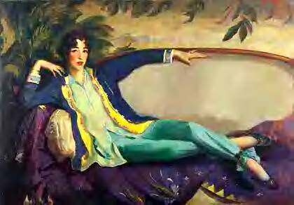
Robert Henri: Gertrude Venderbilt Whitney, 1916
Gertrude Vanderbilt Whitney Rolls Over in Her Grave, Again
"2010," Whitney Museum of American Art, 940 Madison Ave. (to May 20).
Now on to "2010," in which there are far too many excruciating video projections, too many artist-curated entertainment platforms, too many wretched abstract paintings. Each genre has its own form of awful.
But are there at least six works worth looking at?
Inspired by the National Academy Annual, I'd rather give prizes, and since the Whitney prides itself on the number of sterling artists it has gleaned from Biennials past - see here the concurrent "Collecting Biennials" ( to Nov. 26) -- I will urge some acquisition prizes.
In my notebook, I had starred only three entries for possible purchase. So in preparation for writing, I thought I had better recheck my findings by going to the Whitney website, where all works are illustrated, plus wall texts and links to various writings about each artist.
This is such a good website -- you can even curate your own show from the permanent collection -- that you may not want to actually visit the Whitney. Must you really see most of the art in person? After all, what do you lose? Scale, texture, exercise, annoying visitors from out of town, people in wet shoes coughing and sneezing?
You actually do have to experience my three proposals for acquisition in real life. About others, I am not so sure.
This may be the most important aesthetic question of the next decade, akin to reading newspapers and magazines online as opposed to reading them in real life, as it were. Or we could call it the New York Times Conundrum: if you give it away free, who will be left to buy it? Plus, if you don't give it away anymore, who will bother? I think the Times, set to charge for certain online content next year, will again be unpleasantly surprised.
And Artopia's 2010 Whitney Biennial "Purchase Prizes" Are...

The Ghostbusters Miller-Meteor Cadillac, not the BHQF multimedia version
1. Better at Art Than at Group Shows
The Bruce High Quality Foundation: We Like America and America Likes Us
The title refers to Joseph Beuys' famous 1972 U.S. performance: I Like America and America Likes Me. Here, however, as a sign of the times, a Cadillac ambulance/hearse (a prop from the movie Ghostbusters) offers its windshield for a rear projection of a media montage accompanied by a mournful, poetic voiceover personifying America: "We Like America and She...etc."
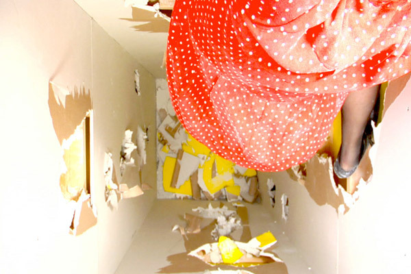
Seen from above, inside a column Gilmore kicks her way to the top (video still).
2. Kicking Up a Neo-Feminist Storm
Kate Gilmore: Standing Here
Trapped inside a double-walled, almost ceiling-high column of her own making, Gilmore, in a polka-dot dress, is seen from above kicking at the internal walls with her high heels trying to get to the top of the column, revealing glimpses of yellow. Will she make it to the top to escape, or at least to turn off the video camera? Artopia forbids spoilers. At the Whitney, what you will see is the video of Gilmore's action/performance and the column itself, with a few holes she poked through it while sealed inside. In the meantime, go to the Whitney website to see her related video Shoe Shopping.
3. In Contrast to the Empty Gallery As an Artwork
Michael Asher's proposal requires the museum to stay open for 24 hours for seven days during the Biennial. Not only is it a clever piece, but the Whitney, which did not have enough money to present the whole piece as proposed, owes it to him. As it stands now, the Asher-framed Biennial will be open to the public less than three days, from noon May 26, around the clock, to midnight May 29
Other prizes:
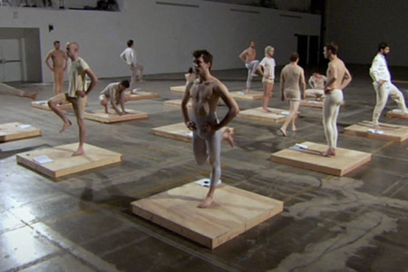
4. Artopia Award for Best Dance
Jesse Aron Greene's video in which 16 young men, on a grid of 16 square platforms, "perform" gymnastic exercises from Daniel Gottlieb Moritz Schreber's 1858 manual.
Although popular in its time, Schreber's fitness regime has a dubious legacy. The bodily discipline he prescribed may have aversely affected his son, Daniel Paul Schreber, who recounted a mental breakdown in his well-known book Memoirs of My Nervous Illness (1903). This lucid autobiography, in turn, prompted several early psychoanalytic studies on paranoia, sexuality, and paternal authority.
Green's video, based on nondance movements, is the best dance offered by the Biennial, whereas offerings based on "real" dance are not all that interesting. Voguing? Expressionist masks? Help!
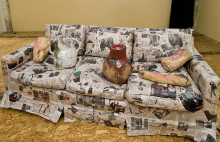
5. Artopia Award for Best Political Artwork
Jessica Jackson Hutchins' Couch for a Long Time. A couch from the artist's childhood has been entirely pasted over with Obama news-clippings. A few pieces of handbuilt ceramics dent the cushions.
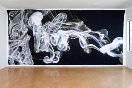
6. Artopia Award for Best Appropriation of Traditional Crafts
Pae White's gigantic silk tapestry depicting curls of smoke is too pretty to be real art, but too big to be just craft.
* * *
Counting up the three suggested Purchase Prizes and three Artopia Awards, we find six artworks -- close as can be to the Perreault Percentage!
FOR AUTOMATIC ARTOPIA ALERTS: perreault@aol.com
-thumb-300x207-13916.jpg)
