[From Greg: I’m happy to introduce the first of our guest bloggers. Lara Downes seemed like a perfect choice, because she’d already emailed me about some classical CD covers she likes, and because the explosion of comments on her own CD image almost cried out for a response from her. I’m happy that she made one — in a very friendly, companionable way — and I’m delighted to think we might hear from her from time to time about all of her work. She’s a fine example of an entrepreneurial classical musician.]
 Well, I’ve been enjoying the lively debate about Greg’s comments on the cover art for Exiles’ Cafe. It’s so interesting to see the wide range of personal responses to any image – I think we all process imagery through so many layers of personal experience, reference, and taste.
I thought I could share my part of the story behind the image that was chosen for the Exiles’ Cafe cover. But first, a little background about the project itself. I realize that most of Greg’s readers haven’t heard the CD, since it doesn’t come out until the end of this month! I hope you’ll listen, and enjoy what you hear. Collecting and curating this music has been a labor of love and a voyage of discovery.
[A note from Greg: Although the album hasn’t yet been formally released, you can hear it on Spotify, as I did. I like it quite a lot.]
The Exiles’ Cafe is a construct I devised around the concept of music written in exile. I think of it as both a real and a metaphorical place – real in the sense that cafes have historically housed and sheltered exiles and emigres in every corner of the globe, through so many journeys and displacements. My inspiration was this quote by the German novelist Hermann Kesten:
If one lives in exile, the café becomes at once the family home, the nation, church and parliament, a desert and a place of pilgrimage, cradle of illusions and their cemetery…In exile, the café is the one place where life goes on.
And metaphorical in the sense that this Exiles’ Cafe of my imagination is hosting exiles from Chopin to Kurt Weill to Mohammed Fairouz, allowing music from 180 years of various wanderings to mingle together under one roof.
So that’s the title.
The image came out of a photo shoot that was done at a very real cafe, the Revolution Cafe in San Francisco, where Classical Revolution was born and raised. We shot during a busy morning in the Mission district, making use of the slightly gritty, run-down look of the space, and featuring the beat-up old upright that has been the backbone of this important musical movement for the last 5 years. We shot several images that were much more specifically descriptive than this one – me with a vintage suitcase, sitting alone at a cafe table (one of those shots ended up as the back-cover image on the CD).
In the end, the design team at the Steinway Records label chose the more abstract image that you see on the cover. The idea, I think, was to draw in the viewer with an image that was strong and evocative without being directly explanatory. I came to see the strength in that approach and I feel that the choice was a good one!
Here’s where the question of personal perception comes in. It’s interesting to me to see that some people find the image too suggestive, some object to the out-of-focus angle, and some have a very positive response that aligns well with the creative team’s goals.
I also think that one response we’re all experiencing in common is the frustration about the format in which we view album art these days. We’ve lost the opportunity to browse in the record store stacks, pick up and examine a cover that catches our eye. We’ve lost access to the kind of storytelling that took up the 12 square inches of an LP or the 4 square inches of a CD cover. We don’t get to hold an album in our hands and experience it in a physical way. Most of the time, we’re viewing album art in a thumbnail version on Amazon or Itunes, and that is such a restrictive frame! We’re having to narrow down our visual intake, while still relying on our response to that visual input in forming our opinions. When I think of all the old record covers I love and treasure, that wouldn’t work at all in a thumbnail version – Glenn Gould’s 1955 Goldbergs comes first to mind, so many wonderful, iconic covers… But this too, just like the rapid changes in our performing environment, has to be a catalyst for adaptation, in production and perception. Let’s see where it goes!
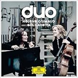
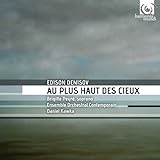
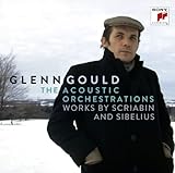
Meanwhile, this debate has made me examine my own preferences for album covers, and tease out what speaks to me. Here are some I really like:
There’s something about this – it feels modern and fresh, I like the sense of movement into the foreground/future, especially with the Bach Suites in tow!

Here you see a relationship between the artists in an ensemble project, and they draw you into that relationship. I like the simplicity of the title and the unexpected font.

I love this, in the non-artist-focused category. The image is arresting and right on target contextually.

I wish classical artists would do more stuff like this: cool and personal and edgy:

And then there is something to be said for the simple power of a great-looking icon, depicted with affection and good cropping!


I think you seized on something important. If I were in a record store and saw your CD, I would probably be attracted enough to pick it up. But then I would turn it over and see what it was about, and the image then might make sense. I would see what’s on the disc and understand your packaging and your storytelling as a whole. Your cover, to me, could be jazz, classical, folk, rock. If I don’t know you, I have no idea. But if I had the disc in my hand … there would be no confusion.
When I look at some of these other covers you posted — it is clear at first glance what the disc is about. So the trick is how do we do arresting covers (and I do like your cover) that also tell us something more about the works on the disc, or does that matter in a digital age?
Anyway, here is a link to a photographer who does CD covers for both rock, bluegrass, and classical musicians that are nothing if not original and evocative. I wonder if this is where we are trying to go — http://www.michaelgstewart.com/gallery/cd.htm
Hi Jason,
Thanks for your comment! Yes, I think we’re living through a difficult moment, when so many of our experiences of the world around us are being resized to fit within the screens of our smartphones!
I think sometimes the storytelling element is very challenging in this format. Of the covers I selected as examples, I don’t think that all are explicitly descriptive of the content (the Wispelwey Bach Suites, for one). But all are arresting enough to draw you in so that you investigate the content! And, I would argue that yes, in this digital age, there’s something to be said about a lack of genre-identification solely from cover art. We’re trying to reach outside of the traditional classical audience after all – maybe engaging imagery is one way to do that. Ultimately, it’s just a question of attracting an audience to the music. It’s the music that has to do the hard work of wooing that audience and keeping it enthralled!
Thank you for turning us on to Michael Stewart’s work!
I had the same thought about covers, if they even matter anymore since so much of the musical content we consume is done digitally. I thought it was interesting that comments were made about blurriness of the image when if you watch any contemporary TV or movies, they use that technique all the time.I think the future might be in shooting promo videos or music videos and loading them onto YouTube more than coming up with an evocative CD cover. There are number of classical artists doing this and I am 10x more likely to listen to them then peruse iTunes for album covers which might contain some great classical music.
I would be interested in your thoughts on that aspect of promotion through YouTube and have you done any of that yourself.
Thanks Matthew!
I absolutely agree that there are new frontiers for promotion and illustration, video being the most accessible medium, and an ideal one for exploring the dramatic and narrative expression of the music. My colleagues Anderson & Roe have had tremendous success with some great videos they’ve produced, several in support of their recent album When Words Fade.
And yes, I’m currently in production on several individual music videos for Exiles’ Cafe, as well as a full-length video installation for use in live performance. Those will be released next month.
Here’s the trailer for Exiles’ Cafe, which I put out last Fall.http://laradownes.instantencore.com/m/video.aspx?ItemId=985956.
Anderson & Rowe’s videos are well worth looking up. I’ve assigned them to my Juilliard classes. (Which is especially appropriate, since both Greg Anderson and Elizabeth Rowe took my course on the future of classical music.)
Your Exiles’ musi videos, and your whole approach to giving the album such varied life — something for future guest blog posts? Not that you don’t also have other ideas!
Yes! I would love to share about the storytelling process around Exiles Cafe, which is taking on more and more layers as time goes by. For example, I’ve developed this interactive Tumblr site as a platform for listeners far and wide to share their own stories of exile, whether physical or otherwise. My hope is to create something shared and universal out of many personal narratives, to explore all the meanings of exile in our lives. Another way to grow community and dialogue, I hope. http://laradownespiano.tumblr.com/
Hi, Matthew,
I haven’t used YouTube myself for promotion, but a friend of mine in the business — an entrepreneurial violist/composer/teaching artist, who plays and writes music than spans many genres — has used it with great success. Not that he’s alone! It’s a tremendous promotional tool. Thanks for mentioning it!
Greg,
Though there are several videos on YouTube of you interviewing various people involved in classical music, which were very fascinating to me. Did you set those up on your own or were those done through an organization? I thought your discussion with Ralph P. Locke was especially good. http://youtu.be/u34OUaRupac
Glad you liked these, Matthew. Those were done for a website aimed at orchestra musicians, Polyphonic.org, run out of the Eastman School of Music. I did them a few years ago, 10 or so, if I remember correctly. I’m glad you think they still hold up!