[Lara Downes was the first of our guest bloggers here, and she began with a post about classical CD covers she likes. And about how she came up with the cover for her own latest album. Her list — along with mine, and others that I hope will come later — can serve as a resource for people looking for inspiration and encouragement.]
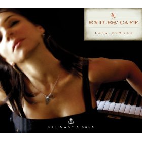
 Well, I’ve been enjoying the lively debate about Greg’s comments on the cover art [on the right] for Exiles’ Cafe. It’s so interesting to see the wide range of personal responses to any image – I think we all process imagery through so many layers of personal experience, reference, and taste.
I thought I could share my part of the story behind the image that was chosen for the Exiles’ Cafe cover. But first, a little background about the project itself. I realize that most of Greg’s readers haven’t heard the CD, since it doesn’t come out until the end of this month! I hope you’ll listen, and enjoy what you hear. Collecting and curating this music has been a labor of love and a voyage of discovery.
[A note from Greg: Although the album hasn’t yet been formally released, you can hear it on Spotify, as I did. I like it quite a lot.]
The Exiles’ Cafe is a construct I devised around the concept of music written in exile. I think of it as both a real and a metaphorical place – real in the sense that cafes have historically housed and sheltered exiles and emigres in every corner of the globe, through so many journeys and displacements. My inspiration was this quote by the German novelist Hermann Kesten:
If one lives in exile, the café becomes at once the family home, the nation, church and parliament, a desert and a place of pilgrimage, cradle of illusions and their cemetery…In exile, the café is the one place where life goes on.
And metaphorical in the sense that this Exiles’ Cafe of my imagination is hosting exiles from Chopin to Kurt Weill to Mohammed Fairouz, allowing music from 180 years of various wanderings to mingle together under one roof.
So that’s the title.
The image came out of a photo shoot that was done at a very real cafe, the Revolution Cafe in San Francisco, where Classical Revolution was born and raised. We shot during a busy morning in the Mission district, making use of the slightly gritty, run-down look of the space, and featuring the beat-up old upright that has been the backbone of this important musical movement for the last 5 years. We shot several images that were much more specifically descriptive than this one – me with a vintage suitcase, sitting alone at a cafe table (one of those shots ended up as the back-cover image on the CD).
In the end, the design team at the Steinway Records label chose the more abstract image that you see on the cover. The idea, I think, was to draw in the viewer with an image that was strong and evocative without being directly explanatory. I came to see the strength in that approach and I feel that the choice was a good one!
Here’s where the question of personal perception comes in. It’s interesting to me to see that some people find the image too suggestive, some object to the out-of-focus angle, and some have a very positive response that aligns well with the creative team’s goals.
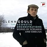
I also think that one response we’re all experiencing in common is the frustration about the format in which we view album art these days. We’ve lost the opportunity to browse in the record store stacks, pick up and examine a cover that catches our eye. We’ve lost access to the kind of storytelling that took up the 12 square inches of an LP or the 4 square inches of a CD cover. We don’t get to hold an album in our hands and experience it in a physical way. Most of the time, we’re viewing album art in a thumbnail version on Amazon or Itunes, and that is such a restrictive frame! We’re having to narrow down our visual intake, while still relying on our response to that visual input in forming our opinions. When I think of all the old record covers I love and treasure, that wouldn’t work at all in a thumbnail version – Glenn Gould’s 1955 Goldbergs comes first to mind, so many wonderful, iconic covers… But this too, just like the rapid changes in our performing environment, has to be a catalyst for adaptation, in production and perception. Let’s see where it goes!
Meanwhile, this debate has made me examine my own preferences for album covers, and tease out what speaks to me. Here are some I really like:
There’s something about this – it feels modern and fresh, I like the sense of movement into the foreground/future, especially with the Bach Suites in tow!

Here you see a relationship between the artists in an ensemble project, and they draw you into that relationship. I like the simplicity of the title and the unexpected font.

I love this, in the non-artist-focused category. The image is arresting and right on target contextually.

I wish classical artists would do more stuff like this: cool and personal and edgy:

And then there is something to be said for the simple power of a great-looking icon, depicted with affection and good cropping!


