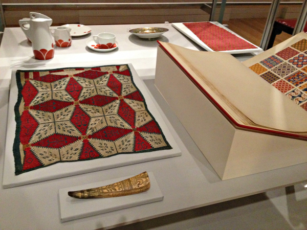
 Aside from the maltreatment of its beautiful historic building, which I wrote about here nearly three weeks ago, something else is deeply wrong with the new incarnation of the Cooper Hewitt National Design Museum: the display and the contextualization of the objects in the displays simply don’t measure up to minimal standards. To be sure, visually they are often attractive. But frequently they are very dumbed down, witless and perhaps even misleading.
I think the museum’s leadership meant well; I really do. But I think they misjudged their task and perhaps their 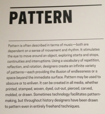 audience. As last time, when I posted pictures of current displays within the historic rooms, I will let you judge for yourself.
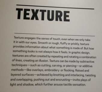
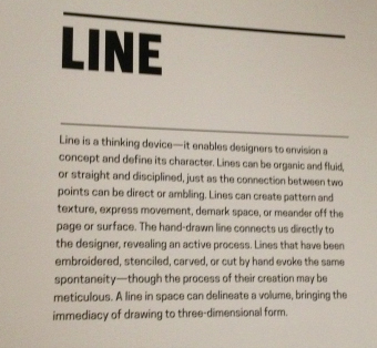
Here are four wall labels (apologies for the tilted pictures–I shot them with my phone and sometimes it was difficult, given the other people in the galleries, to stand in place where I could get a direct shot) about elements of design. They set the scene for displays on the second floor.
They are not in the order in which the galleries proceed–but then again, the galleries can be entered, as I recall, from at least two points, so I don’t think the labels were necessarily intended to be read sequentially.
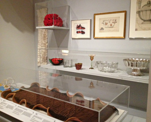
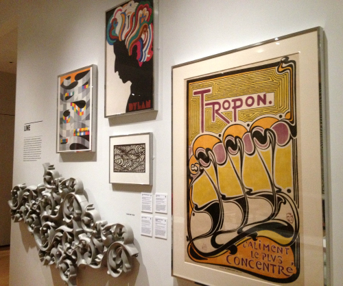
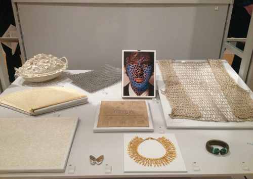
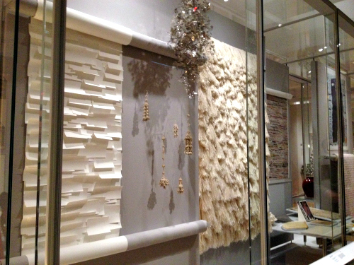
 The displays themselves are a jumble; the objects are not arranged
chronologically or relationally. I am guessing that the objects in the cases were chosen simply to illustrate a theme–to show many objects that have, for example, patterns. It’s all very simple.
For evidence of these simple thematic displays you can see the pictures at the bottom of this post.
I know museums of all stripes are dealing with visitors, particularly younger visitors, whose education is substandard. Many, many public schools–and some private ones, I’d bet–have meager offerings in art or design.
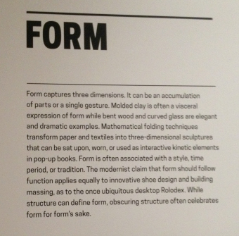 But the definitions I’ve posted here don’t provide much enlightenment. Is “a vocabulary of repetition, reflection and rotation” a clear definition of “Pattern” or is it jargon? And btw, designers do not “create an infinite variety of patterns”–they merely have the potential to do so.
You, dear reader, can find your own examples of imprecise or misleading language in these labels.
As for the themes on view, yes, you can see texture–or pattern, line, etc.–in some displays. But what else do you learn when a 1604 engraved English shoehorn is placed near an 1886 book of patterns open to an “Egyptian” page? Or a 2007 poster hung next to an 18th century Greek cushion cover? I don’t know.

