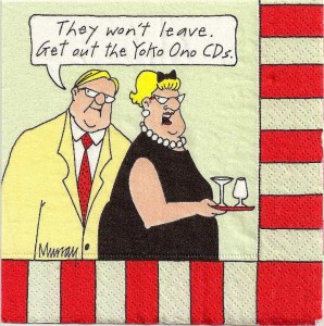
Quite a few years ago I found a packet of cocktail napkins with the image pictured below in a little house furnishings store in McKinney, Texas, where my mom lives. I had had some contact with Yoko Ono at the time, and had garnered quite a collection of her CDs, and it seemed like a hilarious idea to save these for just the right party, and hand them out to guests. It didn’t occur to me at the time that I don’t have any friends, and so parties aren’t a very regular event in my life, and so years later here they are, still in the original package. So what do I do with things that I can’t find any other use for? Post ’em on my blog.
It’s also an excuse to call attention to my new blog format, which came down from headquarters last week, and which puts a thumbnail of whatever image is in the post on the front page excerpt. Arts Journal Grand Vizier Douglas McLennan tells me that readers are five times as likely to click on a post if there’s an image attached. God, you guys are cheap. Like Pavlov’s dogs. I don’t take well to change except when I initiate it myself – I am given to impulsive total makeovers – but I’m glad one person has already found the new format friendlier. I’m going to miss the front-page differentiation among the sizes of the articles. I never liked the teaser-and-after-the-jump format. I’m proud to be one of the world’s most long-winded music bloggers, and when I post a 4500-word entry, I want the reader to glance down his screen at this Burj Khalifa of print and wax vertiginous. Only serious readers need apply. (It’s funny, I’m very populist about my music and completely elitist about my blog.) I have two kinds of posts, pretty much – brief comments and epic poems, and I’d prefer to have the distinction right out there, instead of a surprise. Oh well. Comments are a little easier to handle on WordPress, the software we switched to, and images certainly upload faster. We’ll see how it works out. In any case, at least I know how to make you click, you suggestible lab rats.

