In Cesar Franck’s Prelude, Chorale, and Fugue, the crescendo which is marked in measure 65 probably continues to m. 67. In the Henle edition of the piece (and others), there’s a line break after m. 65. Playing for me, a young pianist finished the crescendo at the end of the printed system (where the line break occurs), not continuing the swell into m. 67.
Pianists are visually suggestible. Switching to a new edition of a familiar piece, with different pagination and line breaks, can be surprisingly confusing. In playing scripted pieces memorized long ago, there still may be remnants of the visual appearance of the written music entwined with musical memory. “That passage is at the beginning of a right-side page …”
In the making of modern editions that intend to represent a composer’s text, spacing, lineation, and pagination have been insufficiently considered. Music has been treated as prose. In editing a poem, such casual changing of line breaks seldom occurs. (Very long lines of poetry make for some problematic exceptions.)
In new less-bounded, electronically-configured texts, what stops us from representing a 30-minute-long piece of music with one very long horizontal line scrolling across a screen?
Generally we’re moving toward a practice of musical notation in which a particular amount of horizontal space signifies a constant amount of time, or beats passing, within a piece, or within a tempo area. Music notation software is reinforcing this space equals time constancy. It was not always so.
Music written on paper or scribed into an engraving plate by a human hand tends to be more widely spaced in areas of high musical activity with a lot of notes, even if brief duration is signified. Spare music with few notes tends to be compressed along the horizontal axis. Ian Pace has written that in Karlheinz Stockhausen’s Klavierstuck X, the varying visual spacing of rhythm may beneficially influence the reader/performer away from an exactly equal rendering of beats.
There are conceptual implications to these habits. In older notation, there’s a more steady flow of information to the reader (as opposed to a representation of a steady flow of time as experienced by a listener). Once, efficiency in the use of “paper” might have been a consideration. (A respect for an economy of character spaces led us to discard double spaces following periods in English prose?) The evening-out of information-flow in the old scores seems related to “compression” in sound recording, or to the common practice of adjusting recording levels up, to most efficiently capture sound information in a piece of music being recorded.
We live with a presumption of steady beat, and simultaneity of attack — that is, all the voices notated on a particular beat are presumed to be represented as played and perceived at the same time. 18th- and 19th-century chord notation looks different and that difference may be suggestive of different practice. In recent musical parlance, “chords” may be referred to as “simultaneities,” a polemical term.

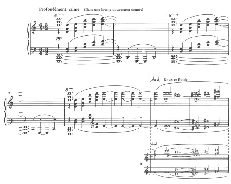
The enigma of beat equivalences in Claude Debussy’s Sunken Cathedral is exacerbated by lineation found in most printed editions of the piece. From Debussy’s piano roll recording of the music, we can judge that the flow of quarter notes at the beginning of the piece may be nearly the same as the notated half-notes at m. 7. This beat-equivalence is written parenthetically into the text in Roy Howat’s edition, part of the new collected works edition of Debussy’s music. (This edition contains the first examples of a composer’s “recordings” being used as a primary textual source.) How could such a puzzle of notation as Debussy’s 6/4 = 3/2 have been left by the composer? A look at the autograph manuscript reveals that — at this exact transition point, at the end of bar 6 — there’s a line break.

Debussy: … La cathédrale engloutie

As a composer, I enjoyed the read and your analysis. Thanks for sharing.
Re: “A respect for an economy of character spaces led us to discard double spaces following periods in English prose?”
Bruce, I enjoyed this post very much! The single- or double-space after period dilemma has to do, in modern times, with the transition from typewriters to the variable-width fonts available on computers. We used to type two spaces after the period, since one space didn’t set off the sentences clearly enough on a monospace typewriter. An i taking up as much space as an m (or a period!) creates havoc with the recognition of black and white space necessary for quick reading. With variable-width fonts, just one space is fine, as the eye picks up the demarcation between sentences quite nicely (as long as we’re not using Courier).
But I’ve read old books with beautiful (variable-width) typography that do insert two spaces after the period, so it’s not just the typewriter. I’m not sure if it’s more prevalent in British as opposed to American typography (as it is with the issue of enclosing the period within a quote mark), but it certainly all has to do with the friction between two ideals: recognition and flow. Which is the same as with music notation, as you’ve said.
For my own compositions, one thing I’ve picked up from very old notation that has been almost forgotten these days is variation in beaming; that is, I like to beam notes differently to show differences in phrasing. Rather than inconsistency, it’s just another way of transmitting information to the performer. And with you, I believe that the performer picks up on it immediately, and will comprehend six 8ths beamed together in a 3/4 bar differently from the same notes beamed 2+2+2 (or even a momentary 3+3, breaking the rule by not changing to 6/8). Cheers,
Kile
Bruce Brubaker responds:
Let me report that Barry Brook did offer this explanation for adopting one blank character space follwing a period. He claimed it was a consideration when RILM was being inaugurated.
There’s a lot going on with this changing convention/custom.