 The 4:3 television screen ratio came to represent present tense — the “narrow slit of ‘now’,” to use Bill Viola‘s term. With the increasing preponderance of widescreen 16:9 ratio, those of us who spent thousands of formative hours with the cathode-ray norm find that video suddenly got more narrative. With the new proportions, since the information in view is just a little too much (too wide) to see in a glance, my entire sense of the medium and its relationship to time is “recentered.” It takes me a moment to scan the whole thing, the image continues changing, and so, there’s a “story.”
Would Mandarin speakers prefer a vertical box? 9:16? Terry Gilliam’s Brazil notably substituted up and down movements for the side to side conventions of movie making and editing. (Films have been wide for a long time.) The habits of our written native language (for me, reading left to right) probably affects strongly the way we make sense of our perceptions.
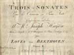
 Eighteenth-century keyboard music was printed oblong. The staves were laid out wide — “landscape” in the terms of the computer printer. Most organ music still looks like that. Right around 1800, music for the still-quite-new piano started to be printed with paper turned up-and-down. (Upright pianos?)
So the new widescreen YouTube format makes me wonder: Did the grown-up readers of Beethoven’s newest piano sonatas perceive the passage of time differently once printed music started appearing taller than it was wide?

For some reason Earle Brown’s December 1952 comes to mind where the page layout makes ALL the difference to the score.
While the repositioning of Landscape to Portrait in the 19th century may have been a practical matter (taking into account design changes of the piano) – the score’s layout conveys an important psychological impact on the score’s intention(s). As a composer, whether I choose Portrait or Landscape creates an impact on how I want my music understood by the performer. Many aspects of the “time frames” (measures) don’t translate well between the two profiles. This has come into focus as I am currently working on a piece for piano and electronics where “open frames” need a space that is not available in the Portrait layout.
Well-written and informative post!! I really enjoyed reading this post.