I’ve been steadfastly avoiding The Internet for two days, since I’m waiting for my sister to come home from her trip so we can watch the Lost finale together tonight. I even changed my Firefox homepage from Google News to Life’s a Pitch on Sunday, since this is the only site I can guarantee will not have Lost spoilers on it. My antics are, as usual, ridiculous, but after…I don’t even want to think about how many…hours of my relatively short life have been spent watching this television show, I will not have @JoeSchmoTweeter65 or Tumblr XY ruin it for me. It is interesting, though, that we exist in an age in which it takes more energy to avoid information than to find it.
Moving on. Kind of. Did everyone see that Entertainment Weekly recently devoted an entire issue to Lost, complete with 10 different covers? (I would link to Entertainment Weekly, but as you know, I’m avoiding the internet.)
 OK, not an ENTIRE issue—I have a physical copy here, Jack cover–but about 20 pages of an issue. What do we think of souvenir covers like this? Obviously a gimmick, but a good one or a bad one? Should Opera News (check out their schmancy new website, by the way) create different covers with different singers for their September issue around The Met’s new Ring Cycle? (And no, this isn’t just a ploy to get Eric Owens on the cover!)
My sister Aliza is requesting her Jack-covered Entertainment Weekly back so she can save it, and I have had a pink Time Out NY cover that was also a multi-cover promotion hanging on the fridge for four years. I also think multi-covers for classical music magazines might be a good excuse for the marketing folks at the publications to reach out to venue gift shops or bookstores (the Barnes & Noble by Lincoln Center?) for special displays. The element of “Collect all X” is interesting, too; I’m sure people ran around town buying every Lost cover, and I’m not entirely sure why I haven’t procured a Sawyer cover for my fridge, yet. The point of a cover is to grab potential readers’/buyers’ attention, and multiple versions certainly achieve this effect. Maybe Gramophone or BBC Music Magazine could do different covers for the BBC Proms one summer. Whether or not it’s cost-effective, though, for the smaller runs of classical music magazines (relative to an Entertainment Weekly, for example), I don’t know.
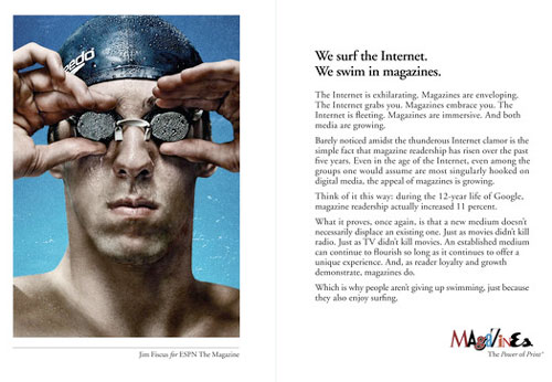
And typing of print, has anyone else seen these print ads…for print…in printed magazines…? The Wall Street Journal, presumably print and online versions, has covered the campaign:
Magazine executives spent much of last year telling anyone who would listen that they were taking their brands digital.
Their message this year: Print rules.
Five
leading magazine publishers have pitched in on a multimillion-dollar ad
campaign touting the “power of print.” They say nearly 1,400 pages of
the ads will be sprinkled through magazines including People, Vogue and
Ladies’ Home Journal this year.“The Internet is fleeting. Magazines are immersive,” says one ad,
which is slated to appear in May issues of the participating
publications. The first spread features a photo of swimmer Michael
Phelps from ESPN The Magazine, with the headline “We surf the Internet.
We swim in magazines.”
We swim in magazines, and if you don’t believe us, here’s Michael Phelps…a swimmer!

So, I’m reading a magazine, that presumably I paid for, and then I see an ad telling me…that I’m awesome for reading print magazines? That I’m Not Alone? Wouldn’t this Don Draper-esque copy (“The Internet grabs you. Magazines embrace you.”) be better online, where I’m looking at free content and maybe considering a print subscription? And besides, everyone knows that Video Killed the Radio Star. Sheesh.
