Having read his music coverage on The Awl, which you should all be reading if you’re not, and in The New York Observer, I decided that NY-based writer Zachary Woolfe would be the perfect person to pitch a Gabriel Kahane story to around Gabriel’s March 3rd American Songbook date.
When I get it into my head that a writer I don’t know will be a good fit with one of my clients or with a specific story, I go into crazy “Discovery” mode and try and find out everything I can about what they’ve covered and how in the past. Fortunately, I live in 2010 and am in possession of the HTTP://World Wide Web, so this research/stalking doesn’t take terribly long. (A friend of mine constantly gets asked about basic things he’s already been asked in interviews, and he always wants to respond–and I think did, once–“Simple. Google. Search.”)
All this is to say that in my Google frenzy, I came upon the (new?) New York Observer website, and it’s really beautiful. Look how they lay out authors’ profile pages:
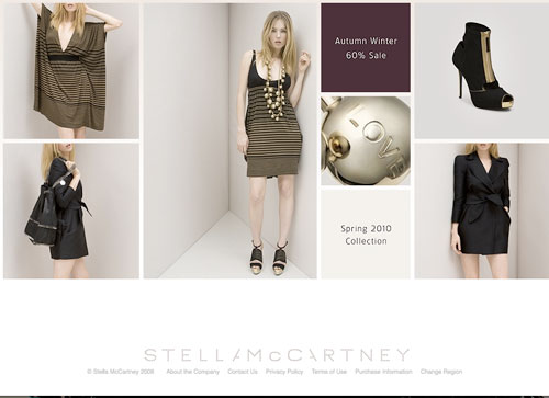
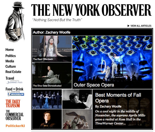 When you hover your mouse over a photo, the title, author name, and first sentence of the piece appear. It’s actually nearly identical in form and function to the old Mac Cosmetics site, which I also loved but that they seem to have changed. We based Measha Brueggergosman’s homepage on the old site, to give you an idea of the look. Also, the Stella McCartney online store has a similar feel, though not as bright and snappy (which is fine, because her clothes are neither bright nor snappy):
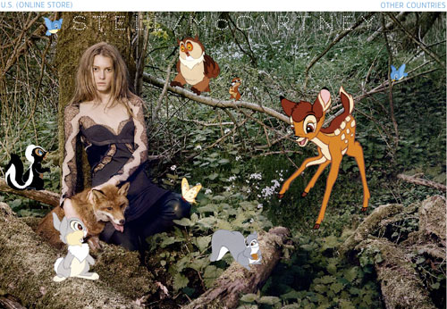
 Exceedingly Unrelated: I’m wondering which of my clients I can talk into adding Disney woodland creatures to their press photos a la the current Stella McCartney homepage:
 ?
?
 But I digress. My point is, the New York Observer site makes you want to spend your precious time exploring it. They use production photos to draw you into the articles. This is, after all, performing arts coverage: why not use the visuals to your advantage? And performing arts coverage aside, we are just generally a visual people who are, at this point, accustomed to Flash functionality (just in time for web developers to move away from it!).
One more thing about the Observer’s site: there’s a feature called “The Big Board” that points their readers to coverage in other publications that may interest them. We’ll call this “The Progressive Car Insurance Model”: Stick with us because we don’t care if you look elsewhere, and actually, we’ll tell you where to look. Because we’re just that cool and confident.


You realize, of course, that talking David into letting you use that (awesome) new version of his picture is a moot point, right? It’s gonna get used.
If you realy want to do Gabe Kahane a favor, you’ll get someone else to write Lincoln Center’s marketing copy. This:
“One of the most astute young minds in New York’s contemporary arts scene, Gabriel Kahane is a versatile singer, pianist, and composer. His work consistently proves to be well-crafted and sophisticated, yet accessible and relevant to contemporary life, breaking into new demographics with his popular Craigslistlieder, based on real texts from the infamous web site. Kahane performs a variety of new works with a chamber ensemble, including music from his recent self-titled album, in an evening of intelligent experimentation.”
Makes it sound like a snoozeathon. An evening of intelligent experimentation? Does that come with a cup of Constant Comfort form Celestial Seasonings too? Will Jonathan Schwartz be there to do a set of Sinatra afterwards?
I feel like the translation of this is: “Dear [Older] Lincoln Center Audience, We guarantee you that you will not be made to feel anything during this evening, except for a slight sense of smug superiority when you leave. Love, Lincoln Center”.
Astute? Well crafted? Sophisticated? Is Gabe Kahane a new line of smoking jackets? No, it’s f*ing music. Is it beautiful? Will it move you? Does it have any thematic content beyond its own craft? There has to be something beyond its cerebral quality that attracts people to his work. But you’d never know what it is from this description.
sorry, i just realized i flew way waaay more off the handle that i meant to in that previous comment. i don’t know why that marketing language angered me as much as it did. i think it was how bloodless it was, which connects to a kind of bloodlessness in a lot of new music that aggravates me. again, apologies. whoo. need to check myself before i wreck myself, evidently.