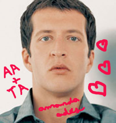
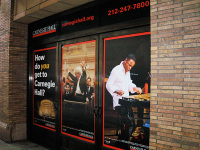
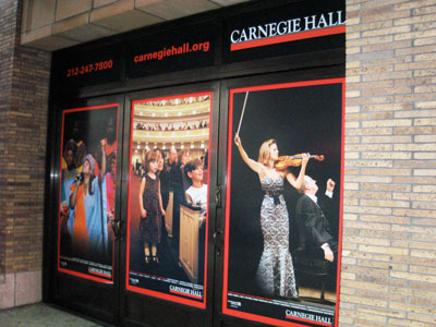
I was en route to Molyvos last night and, even though I was extremely late and exceedingly hot, I stopped to look at the striking, massive images lining Carnegie Hall‘s 7th avenue wall. Just one other thing in the four years I’ve lived in New York (two of which were spent working next to Carnegie Hall) has stopped me outside that building, and that was when I was inexplicably, over-the-top attracted to one of Thomas Adès’ press photos. Oh, here it is:
 (I sleep with a copy under my pillow every night.)
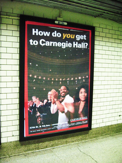
Carnegie has been running a “How do you get to Carnegie Hall?” ad campaign around the city this summer (most notably on subway platform walls), and frankly I’m thrilled to see them hemorrhaging money on such a worthy endeavor. The ads are eye-catching, contemporary and aesthetically appealing while not compromising Carnegie’s existing image and what the institution stands for. Now, they’ve blown up the performance shots used in the campaign for the 7th avenue Zankel wall, and it really looks fantastic. Wallking by the building, you actually get a sense of what goes on in there, which is as it should be. Great things do go on in there! Great things that are not so much expressed by press shots of pianists in front of their pianos. It’s not TV screens or music, but I’ll take it.

 From the Hilton Corridor of Penn Station:


How awesome. The arts MUST appeal to the masses, not just in this economic downturn, but in perpetuity.
eye-catching, contemporary and aesthetically appealing
Um… no they’re not, especially that last one! Boring design, boring font, boring photo.
Nice to hear a story of an arts organization expanding their marketing right now, rather than cutting it!