I was looking at Playbill.com and got very confused by the top banner ads:

I thought, “I can’t imagine anyone calling Wicked ‘ferociously funny’. And I’ve never seen it described anywhere as a ‘new comedy’.” I refreshed – refreshed – refreshed the page and, to my surprise, got to this:
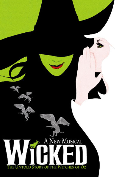
![]() Why are you using the Wicked colors, Becky Shaw?? “…newlywed couple fixes up two romantically challenged friends: wife’s
Why are you using the Wicked colors, Becky Shaw?? “…newlywed couple fixes up two romantically challenged friends: wife’s
best friend, meet husband’s sexy and strange new co-worker.” No one mourns the wicked, sexy and strange color-stealing co-worker!
Upon closer Photoshop inspection, I may have overreacted: the Becky Shaw green is Pantone 366 C and the Wicked green is 382 C, but it’s pretty close. Do we think Second Stage intentionally channeled Wicked ads to get our attention? If they did, it worked for me.


Some online advertisers often see more click through results if ads are similar to the website color layouts or other shows. The company may have “borrowed” from Wicked because they assumed they would get more click through results.
And I’m totally the chump who fell for it! -AA