The New York Philharmonic has a new logo:
 Questions, comments, concerns?
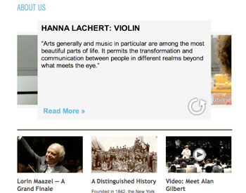
I do like this (new?) iTunes cover flow view-esque feature in the About Us section of their site, though:

 Love the natural-but-professional photos, love the quotes, love the flip animation. The design doesn’t quite match the rest of the section, but we’ll take it.
Update 1/14: the new Philharmonic logo is being analyzed over at Logo Design Love dot com.

I LOVE the NYPhil website.
My 13 year old son could have designed that logo in Microsoft Word. How much money do you think they spent on it?
Why don’t good taste in music and good taste in aesthetics go hand-in-hand, one wonders.