I am all-for copying good marketing ideas: if something works in another industry or for another company, apply it to your own and see how it goes. But there’s copying a concept – if a talking duck can sell insurance, why can’t a talking gecko? – and then there’s…stealing, which is frankly just too comical to be effective.
A few things I’ve noticed around town in the past week:
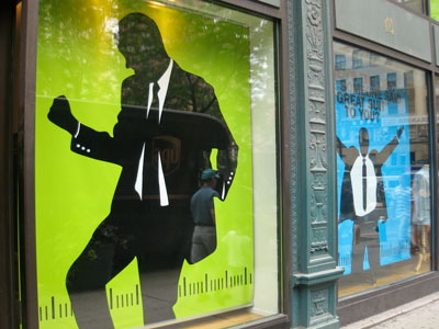
1. This suit company on 32 and Broadway, whose ads look…exactly…like iPod ads and commercials.

2. The new Verizon FIOS TV commercials with the cool (” “) young guy installing Verizon and the lame chubby bearded guy (un)installing Time Warner Cable. Hi, I’m a Verizon and I’m a Time Warner Cable.
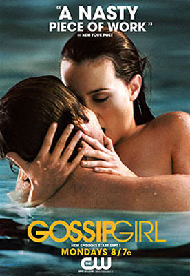
3. The Brooklyn Academy of Music’s Next Wave Festival and The CW’s Gossip Girl ads: twins separated at birth.

 [I don’t actually think BAM “copied” The CW, but it’s amusing nonetheless.]
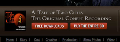
4. The Broadway production of A Tale of Two Cities using the Les Miserables font in their print and web advertisements. It’s an embarrassment:
 And speaking of embarrassments, is this a typo on the homepage of their website? “Conept” Recording? Do they mean “Concept” Recording? Perfect.
 5. Rent live-broadcasts in movie theatres, a la The Metropolitan Opera. This is actually a good copy-cat move, and frankly, I’m shocked that Broadway is just starting to do it now.
Be on the look-out for successful advertising and marketing campaigns, but emulate while maintaining your organization’s identity. As with anything in this-here-life, simply applying someone else’s model to yourself – no matter how effective it may be – just isn’t going to work. Oh, and spell things correctly on your homepages.
Thus endeth the life lesson.

I love the Gossip Girl ad campaign (mostly because I’m a fan of the show). But it reminds me of the ad campaign for New Burbage Theatre in the show Slings and Arrows.
Actually they are two different fonts. Click the following link for a side by side comparison.
http://ilocker.bsu.edu/users/jjgunn/WORLD_SHARED/talevslesmis.jpg Both are completely to scale. You could argue however that both fonts are variations on early type faces. I would argue the Two Cities font is more modern and clean in appearance when viewed in a side by side comparison. Of course, I understand how it would be easy to confuse the two if you did not see them side by side.
That’s good reconnaissance work! I’m impressed. But I was talking about the “Join the Revolution” font, not the logo – I should have been more clear. Can you compare “Join the Revolution” with the Les Mis logo? I’m serious – I’m very curious just how alike they are. Thanks for commenting! -AA