About a week ago, the Detroit Symphony Orchestra launched a new website. Props to them for caring about their online presence, which is more than I can say for some people. But, sadly, the site is strange, distracting and illogical.
I like the homepage, which uses the facade of the building as navigation. This is useful because 1. it’s intriguing to see what Flash magic is going to happen when you click on a door [SPOILER ALERT! Nothing happens.] and 2. it (hopefully) leads folks to recognize the real life facade as the home of the symphony when driving/walking by. The rollover calendar on the left is really nice, since there are few things more annoying than waiting for calendars to load, and I think the faux marquee is cute. Cool and cute. Coote.
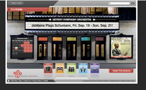 When you click on a door, however, it doesn’t virtually take you in the door, it just takes you to another page. As a friend pointed out, if you’re going have fun with a site, might as well carry the theme all the way through.
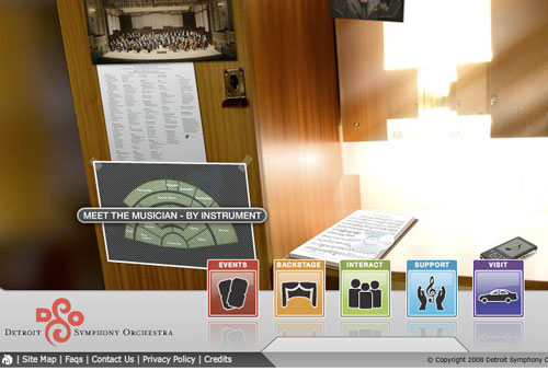
And then, like most things, it gets complicated. If you’re on any given page, you have the option for both quicklinks and five boxes of navigation at the bottom, both of which unexpectedly scroll up and down into the mainframe, and neither of which is fully or partially expanded at any given time. Some links lead you to virtual rooms – but not all links – and it’s challenging to figure out how to get from one “room” to another (you click on the colorful subject boxes at the bottom and select “x homepage” at the top of each menu). But then the clickable navigation features in the rooms don’t quite line up with what the site wants you to do. Would I know to click on the Blackberry on a restaurant table for Contact information? Probably not. Should I have to rollover everything on a page to find what I want? Definitely not, hence the need for a very clear, text-based navigation bar that stays consistent throughout the pages.
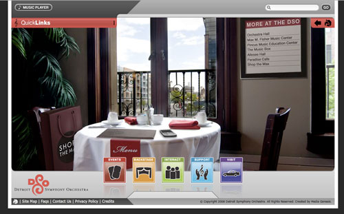 Website navigation is complicated: you need to appeal to the greatest number of peoples’ logic while (hopefully) maintaining the creative features and aesthetics you desire. Usability should always be king, though, since websites – especially those for presenters, artists and orchestras – exist primarily to provide information. The CGI rooms are entertaining for circa 5 seconds, and then the user thinks, “No seriously – where’s the number for the box office?”
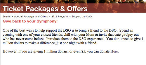
I also think that, when we get ahead of ourselves in fancy land, small-yet-noticeable mistakes are made. Like the use of two different fonts in the HTML sections:
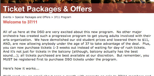 And a few typos, like MEET THE MUSICIAN, a (very useful) category later listed as MEET THE MUSICIANS:
 I say all this out of love, I really do, because I hate to see presenters spend money they don’t have and miss the mark. We all know what good websites look like – we use them every day to function. Try too hard to be cool/different/unique/”groundbreaking”, and you’re probably not going to be. And think about your users; you want to draw people further and further into a site, not frustrate them. It’s great to include interactive features, but not at the expense of usability.
UPDATE – a few minutes into 9/17 – Stardate 40234, I have just discovered the rhyming Slatkin hologram that (who?) pops up when you click on “Meet the Director” widget on the homepage. I can’t decide whether he reminds me more of this or this.

Seems to me that the Detroit folks had enough time and money to spend doing a really lovely front page, but that when it comes to the rest of the site, harsh reality sets in. Organising a whole, complex site to work as beautifully as that and seamlessly with it is a hideously complex (= time-consuming = expensive) job, and fairly unrewarding for the people doing it – the ratio of nasty repetitive grunge time to fun creative time is depressingly high.
By way of comparison (if not to say shameless plug), I’d love you to look at Bachtrack (http://www.bachtrack.com), the site that my wife and I started back in January. We’ve tried to address an even more complex problem: how to present listings of live classical concerts and opera worldwide in a way that will be most useful to people looking for what they want to see, as well as linking the works to recommended recordings. You can see our take on how to find what’s on in Detroit by looking at our Find classical concerts in Detroit page: pages for other places work similarly.
Clearly, we haven’t been able to lend the same sort of pizazz that the theater facade on the Detroit Symphony’s site achieves, but I do think we’ve put in some great ideas on usability. The problem is that people want to search by several different dimensions (composer, work, place, date, performer, etc), often more than one at the same time, but that they start the search really not knowing what’s going to be in the database, so you have to stop them getting bored when the chase down blind alleys.
Do take a look and see – being a start-up, we’re ever grateful for visitors and comments.
David Karlin (aka Bachtrack webmaster)
“Rome was not built in a day.” Stay tuned.
Word.-AA