I have to go to work tomorrow for the first time in over a year. If you think I’m not picking out my outfit tonight and making sure I have push-pencils
and a calculator, you are mistaken.
So I’m going to work to begin my limited
engagement as director of publicity for a record label (cue obligatory
“boo’s” and “hisses”) while the current director is on maternity leave,
which means I have to sneak in a post about classical music album art
today.
What I Hate About You, Classical Album Covers
by Amanda Ameer
1. Instruments.
If an album says “Hilary Hahn, Violin” and lists the violin repertoire
she’s playing, must she have her violin in the photo to, what, prove that she’s a violinist because she…has one?
2. Mood.
Why so serious? ALL THE TIME. Some repertoire is serious, yes, but some
is fun! The photos should match the mood and general aesthetic of the
pieces on the disc, obviously. I hate to bring Mischa Barton into this, but
imagine how (much more?) terrible these ads would be if her body language, make-up,
hair, expression and general look were the same for a Keds ad and an Iceberg ad:
 3. Photos.
Must there be a photo at all? How many high-selling albums actually
have photos of the artists on the covers? Not that high sales are the
most important thing, necessarily (although check back in with me after
tomorrow), but how many “popular” albums have photos? I took a gander
at the top five albums on the general Billboard chart and the top five
albums on the classical chart this morning:

Actually,
there were more artist photos on the “mainstream” album covers than I
thought (do we think that cute, cute baby is “Lil’ Wayne”?), but my
point is that not having a photo on a classical album is barely even an
option these days, whereas you see albums with different art and photography on
albums in other genres all the time.
4. Fonts. Script
= classical, right? Sometimes I find it hard to believe that the
designers even thought about the repertoire and the artist when
choosing fonts for the artists’ name, the album title and the
accompanying information. If it were up to me, the artist’s name would
be in the same font on all of their albums (and on their website and in
their press materials) and only the album title and track listing would
change fonts.
5. Refusal to have fun. Some rep is kind
of funny, and actually, some artists are kind of funny, too. Think
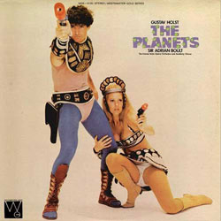
outside the box set! Here are two I like a whole lot:


6. Titles.
Why can’t a Bohème album be called “Boho chic” or something? How about
“Quando”? Surely we could have come up with something catchy for an
album of Schoenberg and Sibelius concertos…feel free to submit some.
7. Lack of collaboration with visual artists. Something
I never thought I’d say to record labels: crossover! Why don’t
contemporary visual artists lend their talents and perspectives to
classical album art? It could only benefit sales (the original artwork
could be on display somewhere with a credit and featured in fine
art publications), and would provide a really interesting insights into artists and repertoire. Here is a Steve Reich album
with artwork by Roy Lichtenstein:

All I want for Christmas is Art Spiegelman doing a Schoenberg cover.
8. Lack of information. If someone picks up a classical album in
the store of an artist or piece they don’t already know, what sells
them on it? I was thrilled that the back of Hilary’s last album had a
sentence about the concertos (still no sentence on her, but…), simply
because it gives the potential buyers some context with which to listen
to the album. A statement from the artist about why they are recording
these pieces at this time would be especially powerful, I think.
Not to fear – I’ll fix this all between tomorrow and December 1.

Accessible liner notes on the back of album covers – that’s what used to sell records (to me, anyway). What a tragic loss that was, and there’s never been anything to compensate for it. (Sorry, typical old man rant, glorifying the past with nothing constructive to suggest.)
I haven’t purchased a CD in more than two years. My last purchase was when the local Tower Records store was going out of business. So it’s been that long. For me, the art on the cover has no influence on me. What’s more important to me now is that I am able to preview online the recording I am about to (maybe) purchase.
something that peeves me is when classical musicians try too hard and it ends up looking uncool or like trashy budget porn. it’s not exactly an industry with the most fashion-forward people. i think crossing over and collaborating is a great idea that would help a lot in situations where it is difficult to give a musician a marketable look on the cover.
And talking about trashy budget porn, how about trashy gangsta-rap-cum-Beethoven? I’m thinking of the cover of Awadagin Pratt’s Beethoven Sonatas CD of as dozen-or-so years ago. EMI thought that showing him in a gangsta leather coat would scream “I have something different to say about Beethoven”. They were wrong.
Ah, you take me back to my youth. I was driving in Boston one day in 1988 or so when I heard Paul Harvey on the news say that Sony/Columbia was going to stop making LPs. I pulled over into a home improvements warehouse parking lot and let the grief come over me. LPs meant for me that I sometimes could get wonderful art for the cost of the music alone (Igor Kipnis on a ladder in his personal library-wonderful portrait, a Kandinsky once, Miles portrait on In a Silent Way), and that I could find out lots of things that I’d never learn anywhere else, by the liner notes. Plus, the physical object could move with a human-sized rhythm, 33 times a minute. It’s gone. All gone.
Who actually looks at the CD package now? The real design point is the miniature that shows up on blogs like this or the Amazon or iTunes sites. I had hoped that I’d not live see the day that miniaturists were back in fashion, but the wheel has turned. (And the tiny splash of color that shows up on the iPod screen isn’t even worth perseverating over – it is like a favicon.)
The baby is not actually a baby photo of Lil’ Wayne, of course, just as the iconic baby on the cover of “Ready to Die” (to which the cover of “Tha Carter III” refers) was not the Notorious B.I.G. as a young’un. I suspect this issue might have gone unaddressed otherwise.
Here’s an article I wrote partly about classical album covers a long time ago (when I was in college):
http://spam-o-matic.org/culture/sexandviolins.html
Lara St. John, where have you and your barely covered hooters gone?
My favorite extremely unfortunate classical CD covers were the ones EMI was doing with Stephen Kovacevich for his Beethoven cycle, which initially came out a disc at a time. They were all black and white, and made him look incredibly creepy in subtle and diverse ways.