The designers of The New York Times Magazine are at it again. Do they think edgy makes sense when their design looks like the cover was badly trimmed? Yes, the headline reads “UP, UP AND AWAY FROM IT ALL.” But if the rationale for the design was to get so far up and away, why take half measures? Why not clip off the name of the magazine entirely?

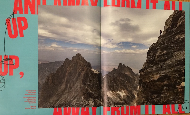
Now have a look at the off-the-page design of the spread, complete with layout markups, which introduces the cover story on page 43. My guess is the editors want to persuade us the magazine is spontaneous and improvisatory (as in no longer the Gray Lady of legend, which it actually hasn’t been for many years).


