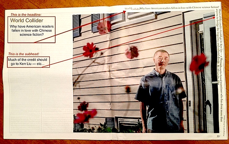
The print edition of the New York Times this morning made note of the “Corrections We Remembered in 2019” (see the renamed, redesigned online version), pointing out that correcting a mistake is “more than a procedural obligation … it’s ‘an ethical responsibility.'” In that spirit I might as well point out that The Times can screw up badly when its highly trained and forward-looking designers push the envelope too far, particularly in the print edition of the magazine. Have a look at this layout. The placement of the head and subhed is so peculiar it must have been intentional. (The notations and arrows are mine.)

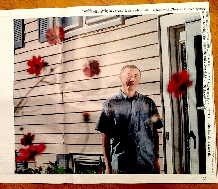
For a more legible look at the center spread’s egregiously misplaced headline and subhead:

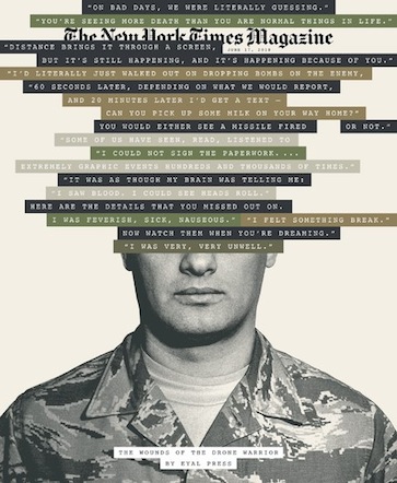
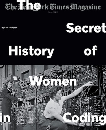
The magazine’s designer department has never explained or apologized, at least not publicly. Meanwhile, it has gone in for typographical overprinting so often on the magazine covers that it has become a fetish. Sometimes the fetish looks great and makes an editorial point. These covers do.


When it chooses to use conventionally centered texts and captions, The Times also produces some of the most well-designed print and online pages anywhere. (See “How the Immigrant Dream Died in an Automotive Shantytown”). I’ll leave it at that.


I appreciated these comments on the way newspaper typography or art design can lose its way. Sort of thing going on for a long time I think, with layout people wanting to be artful innovators but can’t understand that the content of story has to be served, not obscured by their genius. Full credit to the ones that get it right. Also not sure about taking liberties with flipping photos like a couple in your Shantytown link, especially if there is so much “text” in the image subject it is obviously wrong. Otherwise a really fine article, beautifully designed.
Holy shit, man! You’d think I would have noticed. I hadn’t even realized they flopped the photos — by my count at least seven of them, where you can see the lettering is backwards, and possibly more where the images may have been flopped with no way to tell. I can’t believe the flops were intentional. They MUST be a mistake, which oughta be corrected. Thanks for pointing this out. The credits list “Photo editing and production by Jeffrey Furticella and Meghan Louttit. Design and development by Michael Beswetherick.” I hope somebody alerts them. They should be able to fix it on the web site, easily.
PS: I’ve just emailed the NYT editors, asking about this.
Just so we don’t leave this hanging, here is the reply from The Times:
Dear Ms. Herman,
Thank you for your note. The photographs were made in recent months using a technique common in the 19th century. The images, captured on plates called tintypes, are reversed.
Best wishes,
Will Dudding
Assistant, Standards and Corrections
The New York Times
I thanked him and took the liberty of pointing out that I myself am not a tintype and that perhaps I should have appended a note to my email to explain that I am male.
(For quick reference, here is the Shantytown article with the photographs we’ve been taking about:
https://www.nytimes.com/interactive/2019/12/18/nyregion/willets-point-development-queens.html?smid=nytcore-ios-share — JH)
aw hell, to be clear about all this, I wrote back:
Dear Will Dudding —Thanks for your swift reply. Yes, I realized that because when I began examing [sic] the production more closely, I saw there was a note pointing that out at the very end of the article in small type about methodology. Perhaps that note should have been included much higher up to alert the reader immediately. Besides, this is the 21st century and 21st century readers are looking at the article.
btw, i am not a tintype. the last time i looked i was male: Mr. Jan Herman. Perhaps I should have made a note of that for you? (with a puzzled-looking emoji)