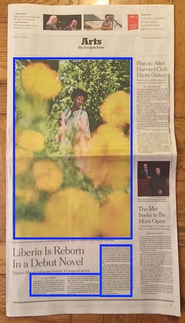
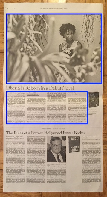
 They are at The New York Times, it seems. My tut-tutting staff has noticed they have been for some time. Yesterday the print edition provided the most recent example in which the ratio of photo to text, for a book feature no less, is ridiculous. The subject of the article, having written an evocative novel, happens to be strikingly beautiful. But two posed photos, too?

Arts, Media & Culture News with 'tude
This blog published under a Creative Commons license
an ArtsJournal blog

Excellent reproof! Some us literary-heads like reading text. We expect writers to have the space to put words back in the picture, not to be sidelined by the picture. Same dolt-headedness filling space with huge pictures in the U.K.
Yes, “dolt-headedness!” Thnx for that. I can understand when an ad drops out at the last minute and the space has to be filled on deadline, or when a story is dropped. But this is a regular thing. Embarrassing.
It’s news for the Instagram generation.
Ah . . . the Instagram generation. I hadn’t thought of it that way. But does the Instagram generation even see the print edition?
And so much of the color photo is superfluous – blurry foreground used as framing. At least half of the photo could have been cropped away to make room for more, you know, words.