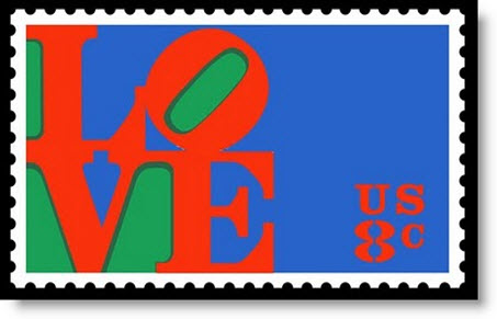
Self-designated “sign painter” Robert Indiana recently bemoaned the success of his ubiquitous LOVE logo. With the aid of the ever-cooperative N.Y. Times he was prepping us for his Whitney retrospective, subtitled “Beyond Love” (to Feb. 2).
In 1964, MoMA commissioned the LOVE device for a Christmas card, and then commercial-art hacks ripped it off. Even worse, the public to this day identifies Indiana with the LOVE icon, even if to the art world proper he is usually considered one of the Pop Art innovators, along with Andy Warhol, Roy Lichtenstein, Claes Oldenburg and James Rosenquist.
Indiana’s story has changed.
In 2003, he told a New York Times reporter, “I’ve always wanted “bigger and bolder ‘Loves.’ The biggest anyone has done is 12 feet. I’m still waiting for a 24-foot ‘Love.’ “
Last month, in another Times profile, he changed his tune:
“I am a father to a bad child,” Mr. Indiana said. “It bit me.”… LOVE — with its tilted O — wasn’t properly copyrighted, it spread to all sorts of places and products he didn’t want. And that broke his heart. “Rip-offs have done a great harm to my own reputation,” he said.
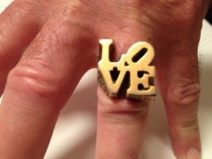
It must be very annoying indeed to see your clever design used on placemats, posters and shopping bags without earning you a cent. In the late ‘70s, I bought my beloved an unofficial LOVE ring at Manhattan’s much-mourned 26th Street flea market. It is wonderfully crude and could serve as a brass knuckle. LOVE was, and still is, everywhere. We have a now-grungy, but official LOVE-mat at the door to our apartment in the East Village.
Do I feel guilty about the LOVE ring? No. Indiana’s complaint is a little bit like crying all the way to the bank. Without the success of LOVE, would the artist have received so many paid commissions for the public “statues” of same? I doubt it.
I don’t think Andy Warhol would have given a damn about rip-offs; he might have produced his own JACKIE coffee mugs. Once you start peddling emblems, you are asking for it. Let’s put it this way. There are no de Kooning, Newman, Rothko or Ad Reinhardt mugs, rings or doormats.
Here is some offical LOVE junk you can buy at the Whitney Store:
Statues Are Not Sculptures
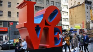
Note that above I say “statues.” While photographing a legitimate LOVE on Sixth Avenue at 55th Street, a stone’s throw from MoMA, I discovered the awful truth that they are such. LOVE has a front side. LOVE doesn’t look so great from the back, which is, of course, a mirror image. In Artopia, sculptures are interesting from all sides, whereas statues are frontal.
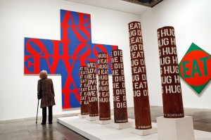
Indiana’s “herms,” which crowd the Whitney show, are inspired by the ancient Greek quadrangular statues or boundary markers of that name. Grecian herms were topped with realistic depictions of heads, but offered no arms, no bodies. Sometimes … penises. Indiana’s herms, totemic assemblages stenciled with words, are sometimes sculptures and sometimes statues. Although initiated before his word paintings, none are quite as good as his two-dimensional work.
Oh no, the curatorial Will to Completion once again rears its ugly head. Why, instead of a forest of herms that stand in the way of the paintings were we not allowed even a single LOVE statue, if for no other reason than to compare the 2-D and 3-D manifestations of that million-dollar logo?
It’s Only Words!
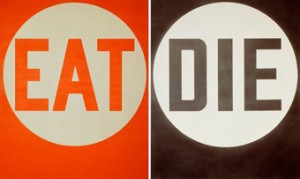
“Beyond Love,” believe it or not, is the 85-year-old artist’s first retrospective. As such, it’s a grand effort to move Indiana above and beyond that ubiquitous logo of his. Please, no more type-casting: he painted many other words: EAT, DIE, MEN, SEX, and numbers. The single-word presentations are nicely blunt, but we like the more complicated works too that use place names, like “Coenties Slip,” the East River site where he and Ellsworth Kelly, Jack Youngerman, Agnes Martin, Jim Rosenquist and Lenore Tawney once had studios in Lower Manhattan. We also like his painted homages to Walt Whitman, Herman Melville, Gertrude Stein, Joseph Stella, and Charles Demuth.
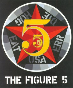
The Figure Five, 1963. Smithsonian Museum. Copyright 2013 Morgan Arts Foundation/Artists Rights Society, NY
We like God Is a Lily of the Valley (1961-62), a painting of exactly those words, and certainly the series centered on the names of Confederate states (1966), those same states that even now plague us. One of the things we have always liked about Indiana is that he is not afraid of propaganda: “I never made a painting without a message.”
With few exceptions, Indiana’s painting are only words: flat words, words in circles, words like … signs on diners or pinball machines. But sometimes very powerful words. A friend, the Argentine conceptualist Eduardo Costa (a student of Luis Borges) once announced that Lichtenstein, because of his comic-book balloons, was the greatest American writer of the ‘60s. I beg to differ. That honor goes to Robert Indiana. And he is a pretty good poet, too.
And the paintings qua paintings? Are they abstract and non-objective or representational?
I once criticized critic Lucy Lippard for suggesting, in 1963, that Indiana was too representational to be Pop: “Indiana’s paintings portray signage,” I wrote. “They show words at work. Words like EAT and TILT tell us immediately what they represent: diners and pinball machines.”
In a recent interview, Indiana claims he is Hard Edge and not Pop. But as we all know artists are not always the best ones to consult about the categorization of their own work. Cat’s think they are lions; angels think they are people.
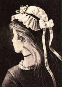
I now have the insight that his paintings are both — not either abstract or representational, but both. Not Hard Edge or Pop, but both. It is a little bit like the famous perceptual illusion of a lady and a witch. Look at the drawing below. Is it a lady or a witch? Sometimes one; sometimes the other. But on another level it is both. This “bothness” is one of the things that makes Indiana’s paintings art. I used to tell my students that “if you don’t know what it is, it’s probably art.”
Judging the Tree by Its Fruit
The Whitney press release claims Indiana’s art provides precedent for such text-based artists as Jenny Holzer and Barbara Kruger. I would push it further and include the first generation of text-based workers: Lawrence Weiner, Robert Barry, Joseph Kosuth and that whole lot. Indiana’s word-paintings, with one foot in the realm of Concrete Poetry, can indeed be seen as the antecedent of conceptual art. I myself have hypothesized that conceptual art is an attempt to solve the thorny problem of how to get content into totally abstract (i.e. non-illusionist, non-image) art.
Barnett Newman, Mark Rothko and Adolph Gottlieb (sometimes called “the subjects of artist group” after their short-lived E. 8th Street art school) tried to tackle this puzzle. Newman, for instance, used titles to suggest the underlying content of his work. Zim Zum (1969), one of his more mysterious of these, is a term from the Kabbalah. Onement (1948) and his 14-panel Stations of the Cross (1958-1966), need no explanations. To those who might claim that these titles make Newman’s paintings representational, I would say, no more so than Mondrian’s Broadway Boogie-Woogie.
If you do not think of words as images or, further, as representations of images, you could say that conceptual art threw out the paint and canvas and showed the titles.
In the ‘60s Indiana thumbed his nose at power-hungry, politically right-wing critic Clement Greenberg, who eschewed content and representation of any kind and insisted upon flatness in abstract painting. Indiana seemed to saying: If you want flatness, I will give you stenciled words; I will give you paintings of imagined signs; I will give you paintings that are signs, signs the world can read.
John Perreault is on Facebook. Links for John Perreault website & John Perreault’s art.

