The Rules of the Game
Brought in by my poetry elder John Ashbery in 1961, I was interviewed and then hired by the editor of Art News, Thomas B. Hess, a famous critic of that time. The avuncular Mr. Hess offered two rules:
1. Never write a review of artworks you have not actually seen.
Reviews were supposed to be published when the exhibitions were still up o readers could cross-check your descriptions. (Only newspapers manage that now.) This meant the Art News reviewer had to make studio visits. Or, if the art were by a dead artist or someone abroad, you had the dealer pull the canvases out of some rack in the back. In both cases there could be a switcheroo, but you were mostly covered.
I now think that some reviewers must have been caught not seeing the art, relying on photographs supplied by the gallery, if anything at all. Studio visits and/or dealing with art dealers was a lot to ask for $4 a review.
Reproductions were not appended to each entry, by the way. It was all definitely on the cheap. And there lingered over everything Harold Rosenberg’s hatred of color reproductions as misrepresentations of artworks. Better to have nothing at all. Did he foresee the MoMA Syndrome?
In his diatribes, Rosenberg did not compensate for a lack of imagery by peppering his words with vivid descriptions. He did not even cite titles of particular paintings. Despite his passion, and insights that were closer to the art and the artists than Clement Greenberg’s formalist frames, one had the feeling you were thinking about art in some dark room — a very large dark room, but a dark room nonetheless. Is a dark room better than a brightly lit Greenbergian morgue?
If reading this, you feel you have slipped into a time warp, don’t worry. You actually have. Back in 1961, critics at Art News, which was pretty much the only game in town, were chosen from the latest crop of poets, not from graduate programs in art history or art “theory,” as became the pattern at places like Artforum, with dire consequences.
Poets Ashbery and Frank O’Hara had worked out, so why not try the next generation of poets, such as Carter Ratcliff, Peter Schjeldahl, David Shapiro and even long-haired John Perreault? And if Perreault, why not Vito Acconci?
#2. Never write about your friends
Hess’ reason for urging his army of poets not to write about their friends — notice the assumption that poets would have artists as friends, which was likely then, but certainly not now — was that no matter how much you praise your friends, it will never be praise enough. Oh, that Tom Hess, he certainly knew artists.
The point is not that one should or should not write about friends. My point is this: Hadn’t Hess himself written about his buddies Willem de Kooning, Larry Rivers, Barnett Newman, and Fairfield Porter?
So in the spirit of Hess’s “good for the goose but not for the gander” advice, I offer some new rules for art critics, poets or not.
And of course, in the sprit of Thomas Hess, I will break my own rules.
Judith Bernstein: Are You Running With Me Jesus? (1967)
I Wrote the Rules Today
#1. Never judge an exhibition by the title.
“The Last Newspaper” (New Museum to Jan. 9, 2011) is billed as “A major exhibition inspired by the ways artists approach the news and respond to the stories and images that command the headlines.” If it is an exhibition about how artists have used newspapers in their art, it cannot in any way be about what the title says it is.
* * *
Hans Haacke: News (1969)
2. Never judge an exhibition by the press release.
Contrary to the intention of the curators and perhaps even to the intention of the artists, the mostly familiar artworks in the exhibition — such as Hans Haacke’s 1969 chestnut News, a wire-service news feed — are really about newspapers becoming content over and above the news they supposedly convey.
But even this information does not make the play-it-by-the-numbers, grad-school assignment at work here any less dull.
The 27 artists in the exhibition purportedly “all disassemble and re-contextualize elements of the newspaper in an effort to take charge of, and remake, the transmission of information that defines our daily lives. Using methods of collage, mimicry, and repurposing, these works deconstruct the newspaper and address the ambiguity about what is ‘news.’ “
Luciano Fabro’s 1967 Pavimento is a grid of newspaper pages mimicking the Italian custom of covering newly washed floors with same. How does this reflect “the mechanics of dispersal”? How does it “address the ambiguity about what is “news”?
Do Thomas Hirschhorn’s newsprint dresses “deconstruct the newspaper”?
In order to see the vase, you may have to take out the flowers.
* * *
3. Never judge an exhibition by the art (or the art left out).
The examples included in the exhibition (some fine artworks in and of themselves) show news (Haacke) and/or newspapers (Robert Gober) as art material and/or subject.
Nevertheless, works from the late ’60s also express the first wave of newspaper shrinkage that resulted from television subsuming news. Although most of the “classics” of what might be called News Art are on the 4th floor (and in the case of Hirschhorn’s dresses, the 5th) and the new efforts on the 3rd, the exhibition is curiously ahistorical.
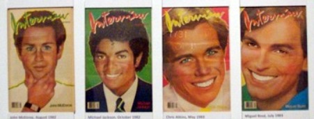
Where are copies of Andy Warhol’s Interview?
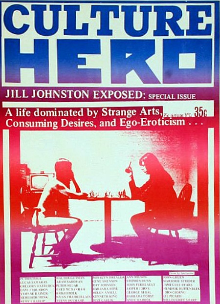
Les Levine’s Culture Hero?
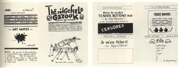
But why not go back even further? Picasso and Braque referenced newspapers in their Cubist smash-ups. Then I would have included Man Ray’s four-fold broadside Ridgefield Gazook of 1915, featuring a drawing of grasshoppers mating.
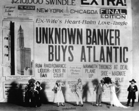
I would have reproduced Gerald Murphy’s 1923 backdrop for Cole Porter’s Parisian curtain-raiser Within the Quota.
#4. Never judge an exhibition by comparing it to the one you would have done.
In my exhibition — which, of course, would have to have a different title and appear in a different, more educationally oriented and critically focused museum — I would find a place in the exhibition itself for:
—Historic photos of newsstands, newsboys, and at least one printing press, to provide a context.
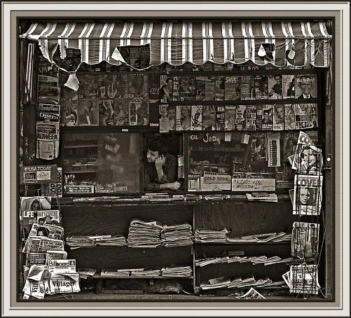
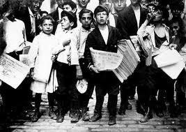
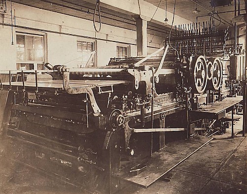
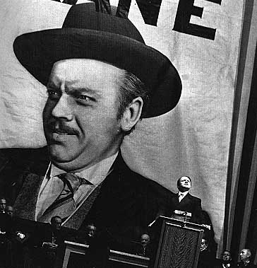
–Screenings of Citizen Kane and His Girl Friday.
—I would have shown newspapers once available in a particular year or within a selected decade. For instance, when my very own father, who read every newspaper in sight, for a short time had a newspaper delivery service at the Jersey Shore, here are the newspapers (c.1950) he handled:
Of local origin: Asbury Park Press and Trenton Times
Philadelphia: Philadelphia Inquirer, Bulletin, Philadelphia Daily News
North Jersey: Newark Star-Ledger, Newark Evening News, Jersey City Journal
New York City: New York Times, Herald Tribune, Journal American, Daily Mirror, Daily News, World-Telegram & Sun, Wall Street Journal, N.Y. Post, Jewish Daily Forward
Much to my father’s annoyance and embarrassment, someone even demanded the Daily Worker.
—And I would have shown the tabloid-format papers that proliferated in New York City in the ’60s and ’70s.
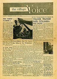
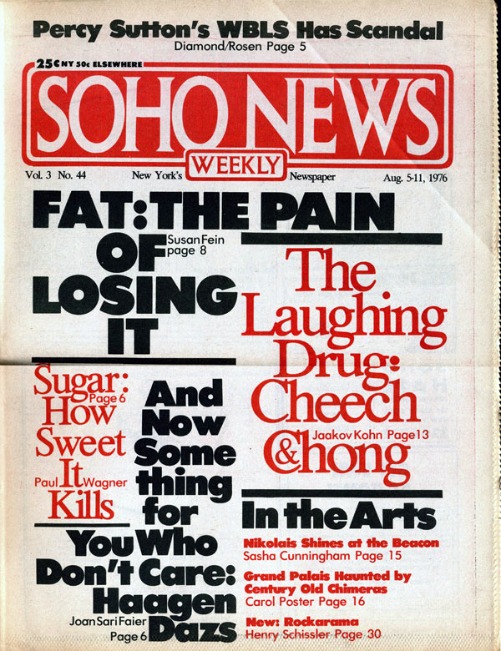
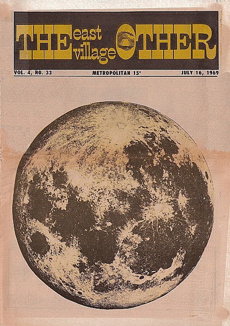
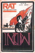
When I as art critic shifted from the Village Voice to the fledgling Soho Weekly News, there were many other tabloid-format weeklies, bimonthlies, monthlies. The East Village Other, Avatar, Rat, New York Free Press, Screw, New York Review of Sex, and that old stand-by the Villager come to mind. And there were others in cities across America.
![]()
In New York, the East Village Other and New York Review of Sex both offered art coverage. Lil Picard wrote for EVO, and Gregory Battcock, who had already debuted his series of art anthologies for Dutton (The New Art, etc….) wrote for the NYRS.
Read this LINK for the inside dope from a designer who once worked the underground newspaper field.
* * *
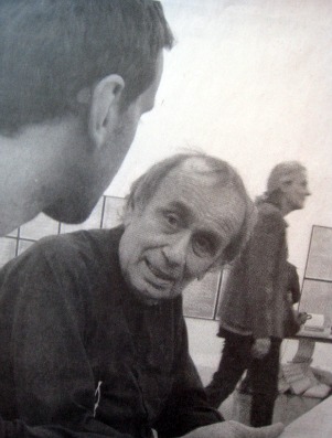
5. Never judge an exhibition by the catalog.
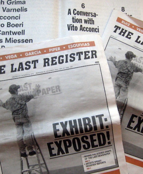
Viewing the production of a newspaper called The New City Reader tells you why the internet now rules. Newsprint is too labor-intensive. Or is it? Here I only saw two or three young men sitting in a kind of stupor. Perhaps they were thinking up headlines or ledes or kickers? Seeing the newspaper process implanted in the New Museum is a bit like watching paint dry, but at least in the issue I acquired there’s an interview with artist/architect Vito Acconci. And we like the large format, intended to allow paste-ups on public walls.
Also offered is The Last Register, a free weekly that at the end of the whole shebang will serve as the catalog for the exhibition. True, in the issue I took home there’s an article about artist Francesc Ruiz, who creates newsstands as sculptures, of which there are photos. None is in the exhibition; instead he creates cartoons for the back page of each Last Register issue. The paper is not badly done, but it is no substitute for a real catalog that one might want to consult when the exhibition is still available to be seen.
* * *
6. Never judge an exhibition, negatively or positively, by the curator’s track record.
“The Last Newspaper” was organized by Richard Flood, chief curator of the New Museum, and Benjamin Godsill, curatorial associate.
Richard Flood is Chief Curator of the New Museum. Prior to his 2005 appointment at the New Museum, Flood was Chief Curator of the Walker Art Center, Minneapolis, where he organized a wide range of exhibitions, including “Brilliant!: New Art from London”; “Zero to Infinity: Arte Povera 1962-1972”; and solo exhibitions on the work of Robert Gober, Sigmar Polke, and Matthew Barney. Flood was previously curator of P.S.1, director of the Barbara Gladstone Gallery, and managing editor of Artforum magazine.
I Read the News Today
Newsprint rubs off on your fingers, leaving smudges on your nose. Oily, smelly. Extra, extra. Stop the presses. Men in rolled-up shirt sleeves pounding gigantic Remington mechanical typewriters. Stop the presses. Sheets of paper ripped from Remington rollers, crushed into balls and thrown on the floor. Spencer Tracy, Rosalind Russell. And, yes, director Sam Fuller, who once worked in a newsroom. Headlines, deadlines, breadlines, and blind items. Gossip columnists and racing sheets. Murderous art critics, as in Laura. The funnies and the daily dose of buxom cuties, baseball stars, movie stars, and machine-gunned corpses. Newsboys, newsstands, the special fold that turned a daily into a square flying saucer that could be skimmed to a porch. And where else would we get the phrase “phoning it in,” i.e. by rote, composition by cliché.
And of course the ever-present fate of yesterday’s black-and-white-and re(a)d- all-over: birdcage liners, fish wrapping, sponges for puppy pee and kitty poo. Or, in the hinterlands, sheets of outhouse toilet paper.
Newspapers are unclean.
Citizen Kane is a pain.
Should we pull the plug on print?
Don’t have to. It’s a done deal.
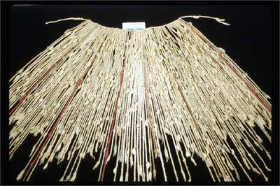
Inca Khipu — knot language.
Books and libraries are next and probably art museums, which leads one to fantasize that there once was a totally digital world-wide civilization and then a passing comet demagnetized the files, unknotted the strings, caused a wave of amnesia that resulted in everyone forgetting how to open the files or what the knots meant. There is now, of course, not much physical evidence that such a civilization, along with its great art and magnificent literature and sprung-rhythm accounting system, ever existed.
FOR AN AUTOMATIC ARTOPIA ALERT E-MAIL perreault@aol.com
NEVER MISS AN ARTOPIA ESSAY AGAIN!
John Perreault is on Facebook.
You can also follow John Perreault on Twitter: johnperreault
