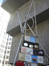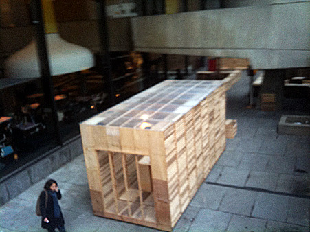
Theaster Gates: Cosmology of Yard, 2010
Beyond the Moat
No fancy title. Only 55 artists, all American. A few midcareer artists. More than half of them female.
You win some, you lose some. Reading the reviews, you would think “2010,” the Whitney Biennial, was a revolution of some kind. Please. Except for the long-demanded (but apparently unplanned) increase in the number of women, it is back to square one, save a single exception. With more and more interest in installations and projected-video formats, a Whitney Biennial with fewer artists than the last allows more space allowed to each — and lessens the visual and audio cacophony we routinely gird up to face as we plunge into this or that sideshow of contemporary art.
In preparation for the mandatory take on the premier U.S. biennial, I reread my last two overviews of the Whitney non-bellwether. If only I knew then what I know now.
Yet Another New Term You Need To Know
Surely you have realized how easy it is to change something you posted in haste on your very own website. Now newspapers are being asked to change and expunge past “news,” such as embarrassing drunk-driving charges, jail time and the like. And some of them do. Or so says Melinda Burns in Unpublishing History. This is a slippery slope.
It’s not just a matter of whose hand was caught in the till, but soon may concern big things that did or did not happen. What invasion of Iraq? What weapons of mass destruction? What Republican use of the reconciliation tactic?
Herewith is the Artopia problem: Should I correct irregular punctuation, misspellings, and deadly run-on sentences incurred before I had my brilliant editor? Yes; no problem. Change errors of fact? Well, probably, if suitably noted. Change opinions? Given 15 years of spare time, I could rewrite John Perreault and at the end, because even my opinions change, begin rewriting all over again, ad infinitum.
Nevertheless, some corrections might be in order.
Tiravanija and de Suvero: Peace Tower, 2006
The Last Biennial? Better Than an Art Fair and Faster, Bigger, Darker
In my Artopia post of April 7, 2006, I was, I now know, too optimistic. I did note, however, there were some ambiguities about the title.
Two innovations this time are of note. The Biennial has a title: “Day for Night,” after Francois Truffaut’s film (not his best) L’Nuit Americaine. “Day for night,” translated into French as “American night,” means filming in daylight with filters to create the look of nighttime. Does this mean that what some now perceive as The American Night is an illusion? Is the war in Iraq only a Hollywood fantasy? The other innovation: non-Americans included.
I should have stomped out pretentious and ambiguous Biennial titles then and there, because it only led to pretentiously titled Triennials and Biennials to come. I should also have pointed out that showing more artists does not necessarily mean more good art, or that including foreign artists, although it might reflect the current art world market, can result in just another bigger and no better mish-mash of bad art.
Fritz Haeg: Animal Estates, 2008
The Whitney Biennial: Good News
In regard to the Biennial of 2008 and my Artopia post of March 11, I was totally wrong about one thing; I followed the subhead “Is This the End of Art for Dummies?” with the following message from Pollyanna Perreault:
Don’t believe everything you read; the Whitney Biennial isn’t all bad. In fact, as a crystal ball, it is cause for hope. But before we start reading tea leaves, we can indulge in quantifications. We may be getting only Beuys-Lite, Acconci-Lite, and Haacke-Lite, but art is back on track. The ’80s hijacking of art by bombastic egotism and Picabia parodies suddenly seems an ancient, commercial diversion.
If only!
10%
Perreault’s Percentage
You know that we long ago discovered what has come to be known as Perreault’s Percentage. No matter how talented the curator(s) or how vast the pool of artists, not more than 10 percent – Perreault’s Percentage — of any large survey is worth looking at. Why is this? Judgments are limited. Plus, art worth saving is simply too hard to make.
Perhaps Perreault’s Percentage should be lowered even further. For purposes of comparison, and as a way of evaluating the current Biennial, let’s put it to the test.
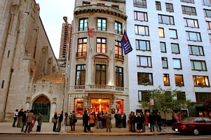
Thomas Cole Rolls Over in His Grave
“185th Annual Invitational,” National Academy Museum, 1083 Fifth Ave., to June 7.
You already read the headlines about the ill-advised 2008 sale of a Frederic Church landscape from the National Academy’s permanent collection in order to make ends meet; neither Artopia nor the American Association of Museums was pleased. Now, go to the National Academy website and read the history of the place. The Academy, founded in 1825, was progressive for its time, a heady, artist-run venue for American artists. In the 20th century, however, it was vehemently antimodernist.
Time to turn over a new leaf? Since 2002 there has been an invitational of non-member artists every two years, sharing the non-spotlight with the more traditional members show on an alternating basis.
On the Academy website you can also find a list of all living Academicians, including the latest crop, all of whom are still required upon acceptance to donate a work of art. And have it sold to pay the utility bills?
I told you so. That’s what happens when you let artist run things. Furthermore, when selecting artworks or electing members, they elect their friends. They support the status quo.
But it is their status quo.
So I walked the walk.
As others have noted, some rooms are empty. But so are those that have art in them.
As I walked, I wondered: Does this 185th Annual Invitational follow Perreault’s Percentage?
We are told that the 65 emerging and established artists have been CHOSEN BY ARTISTS ON VIEW FOR ALL (their caps). The artists who did the choosing are not on view for anyone. Who were they? But never mind. A little ambiguity because of an ungrammatical motto is not a sin. The Fifth Avenue building is charming; the gift shop is full. But will there be at least six-and-a-half artist worth looking at?
If I count the established or, more correctly, nearly established artists (and in some cases once-established artists), it’s a yes.
It is good to see Judith Bernstein’s cocks/bombs/bullets on a color ground for a change. Petah Coyne’s wall piece and Valerie Jaudon’s Pattern Painting, although too small, are likewise worth seeing. I was heartened as well by Nina Yankowitz’s Buried Treasures; Secrets in Science, an installation (at the Academy! With projected texts!), recounting uncounted women contributors to the progress of science, from Cleopatra to Mrs. Einstein. And then, unaccountably, Brazilian favorite Cildo Meireles is represented by a photograph of the artist himself standing on his head on one of Manzoni’s “Base of the World” cubes. I would have awarded Meireles the sculpture prize, and not just out of perversity.
 But Richard Van Buren won that award for a piece far different from his sculptures you may have seen in the late ’60s. His Green Movement looks like a wacky, enlarged ring-holder tree made of plastic and decorated with seashells. The prize for Traditional Landscape Painting went to the well-known “Photorealist” Richard McLean; it’s a beaut.
If, however, I limit myself to artists I have never seen before, we are in deep trouble – though not as much trouble as we’d be downtown at the Brucennial (see below). One clear exception is Stena Kohler, whose Spell is a spectacular Victorian fainting couch covered with sheets of felt held together with tweezers and hung vertically on the wall in the hallway.

Miami Break, but No Escape From Art
The Bruce High Quality Foundation is a collective that has broken through to art stardom. Their piece in the Whitney Biennial (see below) is a knockout; and their hi-jinks (serious) and projects (maybe satirical) have even found their way into Artopia. e.g. their art-world zombie movie; their panel discussion. I was, however, chagrinned to come across a card in our Belle Isle, Miami hotel room.
The Standart Video Series — at all Standard Hotels, including the one now looming over Manhattan’s High Line park – includes an offering by the BHQF: “L’Eau de Vie, un film de Jean-Luc Godard.” Here is an online description of the Creative Time/Standard project and there you can see a Marilyn Minter video.
Miami? What was Artopia doing in Miami? And not during ArtBasel?
Sick of snowstorms and sick of art, we were taking outdoor mud-baths, sun-basking on the surround of an infinity pool with a view of Biscayne Bay, on an island — the only “real” and original island not made from dredged sand — that supports the Venetian Causeway between Miami and Miami Beach. We were hiding out at the Standard Spa.
 This secret hotel maintains the original ’50s “Lido” sign, dating from when this ex-motel became a spa for Jewish grandmothers, one of which I am not. Although it may not really be by Morris (“Too Much Is Never Enough”) Lapidus of Fontainebleau staircase-to-nowhere fame, the sign was retained.
And now it is a spa for…? Well, for those who are sick of Ocean Drive hubbub and disco thump and like to eat organic-y breakfasts, lunches, and dinners and nap in modest all-white beds draped by sheer white cloth. If you squint, that textile could be tropical netting that, if you live in the eternal Hollywood of the mind, could make you – male, female, or whatever – feel like Marlene Dietrich behind von Sternberg’s age-defying bolts of fabric.
So, thinking we would have an art-free vacation, I open up the info-pac and there it is: Bruce High Quality Foundation. Wouldn’t you know that those sneaks would honor Godard? Will unfashionistas or gym girls and gym boys care?

Note: We also had a preview of the about-to-open Villa (by Barton G.), the restored Versace mansion on Ocean Drive in Miami Beach proper. Based on Christopher Columbus’ son’s family home in Santo Domingo, it remains a 1930s Alhambra fantasy amid the Flash Gordon deco fantasies and Buck Rogers bungalows I wrote about in 1981 for Art in America. The superstar designer was shot down on the steps, and morbid folks from as far away as Idaho still pose for snapshots in front of the wrought-iron gates.
Now fully restored (and then some), the Villa outdoes Patterning and Decoration. Never before have I seen so much onyx and so many mosaics, such elaborate fabric and gigantic pillows, so much — patterning and decoration. J-K Huysmans would have loved it.
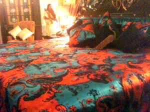
The Villa offers 10 suites, one of which was Madonna’s favorite when she came to visit. But, art collectors, start saving your pennies: the tariff ranges from $2,200 to $5,200 per night. I’ll take the latter! Although there is no Bruce High Quality video offering (yet), each suite comes with your very own butler, male or female, on call 24-hours a day.
Former Versace bedroom (detail)
And we were taken to see the Margulies Collection in Wynwood: a kind of private museum in a warehouse, which is the fashion in Miami. The early acquisitions on display are spectacular (LeWitt, Segal, Heizer).
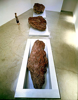
Michael Heizer: Elevated Surface Depressed, 1981.
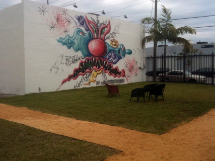
Nearby was Wynwood Walls, an ambitious Jeffrey Deitch project that debuted in December. If you care about such things, this might let you in on what L.A. (where dealer Deitch will be the new director of MOCA), might be facing.
Back in New York
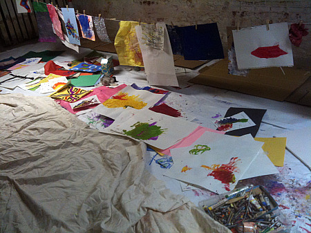
Bruce High Quality Foundation University, Play Workshop, at Recess
For the Love of Bruce
“The BRUCENNIAL 2010: Miseducation,” The Bruce High Quality Foundation, 350 West Broadway, with “educational” projects at RECESS, 41 Grand St., to April 12.)
Alas, back in the Big Apple, the BRUCENNIAL is being promoted by the Bruce as its “signature public program, as well as the most important survey of contemporary art in the world ever.”
I particularly like the use of the word ever. One hopes Bruce is being satirical:
Following the triumphant successes of BRUCENNIAL08: Doing It Again (Bushwick) and BRUCENNIAL09: Smithumenta (Carol Gardens), BRUCENNIAL2010: Miseducation brings together 420 artists from 911 countries working in 666 discrete disciplines to reclaim education as part of an artist’s ongoing practice beyond the principals of any one institution or experience.
By now you already know there is a Bruce High Quality Foundation University in which all the “students” seem to make combines using green schoolroom-blackboards chalked with incomprehensible sentences and diagrams, mocking (I hope) Joseph Beuys and his interminable lectures.
The BRUCENNIAL itself is a jumble, works brought in by the artists and hung or placed helter-skelter; first come, first served. Artist names and titles are penciled on the walls next to the individual masterpieces of rampant self-expression. Looks like, feels like the art you would see in any community art center, anywhere, only less neatly displayed, proving that presentation is a large part of creation. I am not saying that curators are artists, far from it. But, let’s face it, a Salvation Army shop hit by a hurricane is not an ideal way to see any art.
Or is it?
The founder of Artopia once found a signed Dennis Oppenheim print at a Salvation Army store for $10 and an unsigned baby Warhol in a junk shop for $8.50. Maybe here too at the BRUCENNIAL, you should use your Salvation Army eyes.
A painting by poet Rene Ricard? Is this the same Rene Ricard of Factory fame? It’s a little boy with a shotgun, partially obliterated by the words: “Eros. Don’t forget the Cupid’s quiver, the dart of love is mixed w/plain old arrows.” I love it, I want it. How much is it? I give it the Artopia First Prize for Painting.
And then, amid a jumble of stuff, I spot a simple black square on a white canvas; then a music stand with a sheet of music on it: the song on display is Will I Grow Up to Paint a Square? (“Words and Cover by Carmelle Safie, music by Beachniks”).
First Verse “I made a paint-ing of a square. D’you no-tice it? Is it way too spare? Does it make you a lit-tle more aware? Would it look good n a wall that’s bare?”
Second Verse: ” I made a paint-ing of a square. And I know you may not e-ven care, But it’s some-thing that I-d like to share. So if you like it you can hang it any-where.
Refrain: If it’s drawn in ink will it catch your eye? Will it make you think? When it’s pain-ted black is it coming t’wards you? Is it moving back? Does it need a pair? Could it have more flair? Like a shape that’s rare. Is it your nightmare? Or just another step in the stair?
Copyright 2010.
Artopia First Prize for Sculpture goes to: Carmelle Saffie.
Along with Salvation Army Treasure Hunting and awarding prizes, you can also play “spot the bad works by famous artists”: Julian Schnabel (awful, except for the frame) and David Salle (the worst). Or good works by George Condo (a painting done in 1987) and Ron Gorchov (nd).
If there are indeed 420 artists, which I doubt, Perreault’s Percentage dictates 42 artworks worth looking at. Sorry, wrong number.
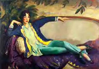
Robert Henri: Gertrude Venderbilt Whitney, 1916
Gertrude Vanderbilt Whitney Rolls Over in Her Grave, Again
“2010,” Whitney Museum of American Art, 940 Madison Ave. (to May 20).
Now on to “2010,” in which there are far too many excruciating video projections, too many artist-curated entertainment platforms, too many wretched abstract paintings. Each genre has its own form of awful.
But are there at least six works worth looking at?
Inspired by the National Academy Annual, I’d rather give prizes, and since the Whitney prides itself on the number of sterling artists it has gleaned from Biennials past – see here the concurrent “Collecting Biennials” ( to Nov. 26) — I will urge some acquisition prizes.
In my notebook, I had starred only three entries for possible purchase. So in preparation for writing, I thought I had better recheck my findings by going to the Whitney website, where all works are illustrated, plus wall texts and links to various writings about each artist.
This is such a good website — you can even curate your own show from the permanent collection — that you may not want to actually visit the Whitney. Must you really see most of the art in person? After all, what do you lose? Scale, texture, exercise, annoying visitors from out of town, people in wet shoes coughing and sneezing?
You actually do have to experience my three proposals for acquisition in real life. About others, I am not so sure.
This may be the most important aesthetic question of the next decade, akin to reading newspapers and magazines online as opposed to reading them in real life, as it were. Or we could call it the New York Times Conundrum: if you give it away free, who will be left to buy it? Plus, if you don’t give it away anymore, who will bother? I think the Times, set to charge for certain online content next year, will again be unpleasantly surprised.
And Artopia’s 2010 Whitney Biennial “Purchase Prizes” Are…

The Ghostbusters Miller-Meteor Cadillac, not the BHQF multimedia version
1. Better at Art Than at Group Shows
The Bruce High Quality Foundation: We Like America and America Likes Us
The title refers to Joseph Beuys’ famous 1972 U.S. performance: I Like America and America Likes Me. Here, however, as a sign of the times, a Cadillac ambulance/hearse (a prop from the movie Ghostbusters) offers its windshield for a rear projection of a media montage accompanied by a mournful, poetic voiceover personifying America: “We Like America and She…etc.”
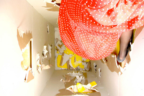
Seen from above, inside a column Gilmore kicks her way to the top (video still).
2. Kicking Up a Neo-Feminist Storm
Kate Gilmore: Standing Here
Trapped inside a double-walled, almost ceiling-high column of her own making, Gilmore, in a polka-dot dress, is seen from above kicking at the internal walls with her high heels trying to get to the top of the column, revealing glimpses of yellow. Will she make it to the top to escape, or at least to turn off the video camera? Artopia forbids spoilers. At the Whitney, what you will see is the video of Gilmore’s action/performance and the column itself, with a few holes she poked through it while sealed inside. In the meantime, go to the Whitney website to see her related video Shoe Shopping.
3. In Contrast to the Empty Gallery As an Artwork
Michael Asher’s proposal requires the museum to stay open for 24 hours for seven days during the Biennial. Not only is it a clever piece, but the Whitney, which did not have enough money to present the whole piece as proposed, owes it to him. As it stands now, the Asher-framed Biennial will be open to the public less than three days, from noon May 26, around the clock, to midnight May 29
Other prizes:
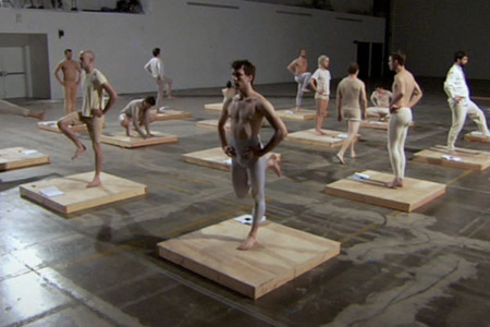
4. Artopia Award for Best Dance
Jesse Aron Greene’s video in which 16 young men, on a grid of 16 square platforms, “perform” gymnastic exercises from Daniel Gottlieb Moritz Schreber’s 1858 manual.
Although popular in its time, Schreber’s fitness regime has a dubious legacy. The bodily discipline he prescribed may have aversely affected his son, Daniel Paul Schreber, who recounted a mental breakdown in his well-known book Memoirs of My Nervous Illness (1903). This lucid autobiography, in turn, prompted several early psychoanalytic studies on paranoia, sexuality, and paternal authority.
Green’s video, based on nondance movements, is the best dance offered by the Biennial, whereas offerings based on “real” dance are not all that interesting. Voguing? Expressionist masks? Help!
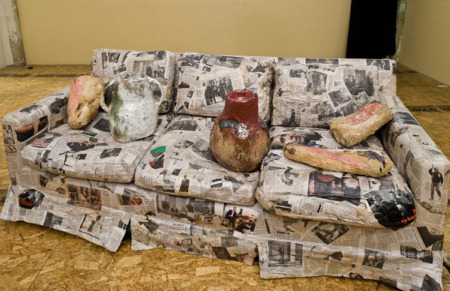
5. Artopia Award for Best Political Artwork
Jessica Jackson Hutchins’ Couch for a Long Time. A couch from the artist’s childhood has been entirely pasted over with Obama news-clippings. A few pieces of handbuilt ceramics dent the cushions.
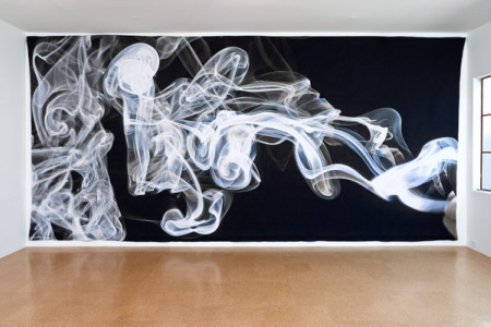
6. Artopia Award for Best Appropriation of Traditional Crafts
Pae White’s gigantic silk tapestry depicting curls of smoke is too pretty to be real art, but too big to be just craft.
* * *
Counting up the three suggested Purchase Prizes and three Artopia Awards, we find six artworks — close as can be to the Perreault Percentage!
FOR AUTOMATIC ARTOPIA ALERTS: perreault@aol.com

-thumb-300x207-13916.jpg)
