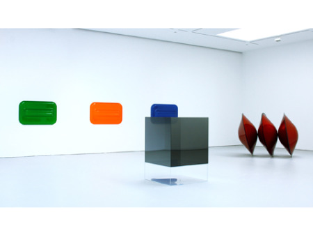
Craig Kauffman: Three Untitled Wall Reliefs, 1968. Vacuum formed Plexiglas
Larry Bell: Untitled, 1969. Mineral coated glass
De Wain Valentine: Triple Disk Red Metal Flake – Black Edge, 1966. Fiberglass
reinforced polyester
Primarily Atmospheric
Mr. McGuire: I want to say one word to you. Just one word.
Benjamin: Yes, sir.Mr. McGuire: Are you listening?
Benjamin: Yes, I am.
Mr. McGuire: Plastics.
The Graduate, 1967
Distance can make things clearer. It’s now obvious the ’60s were a kind of Cambrian Explosion of art styles.
Five hundred and twenty million years ago there was a biological Big Bang in which millions of new creatures were created. Some became the phyla we now know; countless others are forever gone. The discovery of the Burgess Shale in the Canadian Rockies in 1909 unveiled the imprints of many soft-bodies animals not previously known.
I was turned on to this by Steven Siegel who in 2008 completed a series of 52 wall sculptures called “Wonderful Life” after Stephen Jay Gould’s exposition concerning the Burgess Shale.
The Cambrian Explosion as revealed by the lagerstätte of the Burgess Shale gives the lie to the popular notion that evolution proceeds in steady, diagrammatical increments, one step at a time. This may be why the Explosion is not part of common knowledge.

D. W. Miller: Cambrian Explosion, N.D.
Mary Parrish: Hallucigenia
 In any case, I have taken to calling the ’60s — up to the mid-’70s? — the Cambrian Explosion of Art. So many styles, schools, movements came to the fore that it still boggles the mind and defies synthesis. L.A. Finish Fetish, nominally our Artopia topic today, was only one of dozens of style clusters, not the least of which was Pop Art and Minimal Art. Soon there was also: Anti-form, Video Art, Fluxus, Performance Art, New Realism, Photorealism, Kinetic Art, Conceptual Art, Earth Art. Finish Fetish, Funk, Hairy Who, Psychedelic Art, Neo-Dada, Environments, Installations, Mail Art and on and on. And although the U.S. bore the brunt of the explosion, a burst of new art appeared in Europe, Asia, Latin America too.
Yet we have about as much explanation for the Art Explosion as for the Cambrian one. The Cambrian Explosion may have been caused by a radical change of environment, such as the break-up of Gondwana, then
earth’s solitary land mass. Or maybe something else.
Hasn’t everyone noticed that an unprecedented number of art styles fluoresced in the ’60s? It is all pushed under the rug of art history and dismissed by the formalists, structuralists, and poststructuralists as “pluralism” — before the official pluralism of the ’70s, also disdained. Art styles are supposed to succeed one another in an orderly fashion, just like those quaint illustrations showing a neat staircase from amoebas to fish, fish to reptiles, reptiles to apes, apes to Man — just as socialism was supposed to be the logical outcome of capitalism. Simultaneity, discontinuity, multiplicity, backsliding, mutations, detours and braiding are not allowed. I need only refer you to the recent exhibition “1969” that, though it did include some samples from the Finish Fetish group, left everything else out except Minimalism and its offshoots. probably because MoMA’s collection, the source of the exhibition, largely does the same.
Well, never mind. Though sometimes I think my brain is the Art Explosion lagerstätte, we can’t keep the facts hidden for long. Everything old is new again. Products pushed aside are once more viable, hence the various commercial gallery ventures into recent histories.
But the question of why there was the Art Explosion still needs to be answered, so here are some theories about the phenomenon in the United States:
Because of the G. I. Bill, more people than ever were privy to art education. And for those who passed through the academic mill, there were teaching jobs too.
In the ’50s, “beatnik” subculture and Action Painting in the pages of Life magazine planted the seeds. Disillusion with such official government activities as the Korean War and the Red Scare made art seem righteous and noble. The election of Kennedy sealed the deal, and good times were afoot. Or so it was thought.
Being an artist became an honored career choice. By 1960, it was obvious that some were becoming rich from art, even artists — rich and, more important, famous. Art and artists suddenly made good copy.
The National Endowment for the Arts individual-artist grants started in 1965.
Just as in fashion, art needed something new each season. The art world, newly born, graved new artists, new styles, new copy, new products, new news. There was suddenly an art public, and that mob was voracious. Elizabethans constantly craved new plays, Venetians went mad for new operas and new singers, and Victorians coveted new and newer serial yarns. In the ’60s, New Yorkers — and art-lovers in all major cities — coveted the new in art.
There was a void to be filled. After the Man in the Gray Flannel Suit, the world needed new art and new artists in hip clothes. Down with unproductive, boring, unsexy conformity. New art equals new thoughts. Rock ‘n’ roll had already loosened things up. Bombarded by TV images, the public wanted more.
Nothing was sacred. Because of an idiotic war, sexual liberation, recreational drugs, and assassinations, Western society was going through a cultural Gondwana. Chaos opened the door to innovation.
The Art Explosion was, like the Cambrian Explosion, overdetermined. Then why did it stop? There were some ’70s aftershocks: feminist art and P&D. From then on, though there were individual artists of great talent, the packaging become increasingly forlorn. Neo-Geo? Graffiti Art, Neo-Expressionism? The Pictures Generation? In comparison, boring Minimalisms now seem sublime.
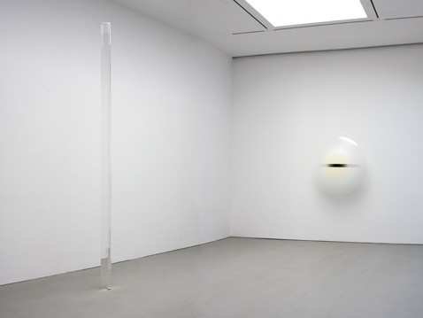
Robert Irwin: Untitled (Acrylic Column), 1970-71
Untitled, 1969. Acrylic lacquer on acrylic plastic.
Collection: San Diego Museum of Contemporary Art
What Minimalism Wasn’t
1. Californian.
2. Beautiful.
3. About perception.
4. Made of plastic.
5. About light and smog.
6. About surface perfection.
Curator Kynaston McShine’s “Primary Structures” at the Jewish Museum in 1966 lumped them all together: Anthony Caro, Phillip King, Tim Scott and other Brits, major Minimalists; Park Place sculptors (for instance, Forrest Myers, Peter Forakis, David von Schlegell) and two Finish Fetish folks from California, Larry Bell and John McCracken. Also included were Judy Chicago and Robert Smithson. The important aspect of this mélange was that none of the artists were Abstract Expressionist sculptors. There weren’t too many of these who looked like they were going to count. Seeing Caro as David Smith’s successor was a stretch. But McShine was casting a wide net.
The closer you look at things, the more they fall apart.
Now, with the wisdom that time confers, we can see that the “Primary Structures” exhibition, which seemed not to please any of the artists, was rather like putting elephants, cats, monkeys and mice in the same room, merely because they all have tails. The elephant might know there was something wrong, but would not have the wherewithal to explain that cats meowed, monkeys chattered, and mice squeaked. Certainly none of them smelled like elephants.
We have nothing to say about Caro, nor much occasion to say it. The same can be said for the Park Place gang. But because of “Primary Atmospheres: Works from California 1960-1970” — another museum-quality show at David Zwirner (519, 525, and 533 West 19th, to Feb. 6) — and because of my offhand dismissal of the Finish Fetish group included in “1969,” recently at P.S.1, we have a bit more to say about California “Minimalism,” which came on the heels of the New York brand, and was — surely we can see that now — a different kind of animal.
The “Light and Space” artists (I don’t remember them being called that way back when) are not pseudo-Minimalists — as I opined recently, alas. What they share with the pioneering MInimalists is a commitment to simple geometric structures, the avoidance of a handmade look, and the denial of anything gestural or expressionist. I purposefully say “the avoidance of a handmade look” because sometimes this look is gained by laborious hand-work, as in the hand-crafted color planks of McCracken. Without the layering and sanding and polishing, they would not be nearly as slick as the surfboard surfaces they imitate — or as color-saturated, in their monochromatic density.
There was a reason that the art now dubiously labeled “Light and Space” and sampled under the better title “Primary Atmospheres” at Zwirner was sometimes referred to as California Finish Fetish. The space-industry emphasis on perfection is in itself reason enough to divorce the art from Minimalism per se.
Although Donald Judd sometimes went after some fairly fancy finishes, Minimalism in general was not about finish and surface (yes, call it what it is), but about objectness, even when that objectness is expressed by store-bought fluorescent lights and was in part defined by the light emitted as well as the fixtures and tubes.
Using the rubric “Light and Space” makes it easier to justify the inclusion of artists working with light, such as James Turrell and Robert Irwin.
But isn’t plastic the common denominator of this group? In the ’60s, plastic wasn’t the Neo-New, it was the New Bad. It was bad everywhere except Southern California, where plastic, we on the East Coast thought, was a way of life.
Well, there are two handsome oil-on-canvas paintings by Irwin in the Zwirner survey. The cubes by Larry Bell are actually glass. And Turrell’s light projections are certainly not made of plastic.
Simple geometry? Craig Kauffman’s three vacuum-molded wall pieces and De Wain Valentine’s Triple Disk Red Metal Flake — Black Edge are hardly illustrations of that.
I tried to make a chart to show what Peter Alexander, Bell, Laddie John Dill, Irwin, Kauffman, McCracken, Helen Pashgian (new to me), Turrell, Valentine, and Doug Wheeler actually have in common.
There is no common denominator, no necessary characteristic. Neither light, space, plastic, nor simple geometry will do the trick. Finish Fetish doesn’t apply to all of them, either. How can Turrell’s projected light, as in the two pieces shown here, have “finish”?
So Finish Fetish is an art movement without a common denominator and with a somewhat derogatory name.
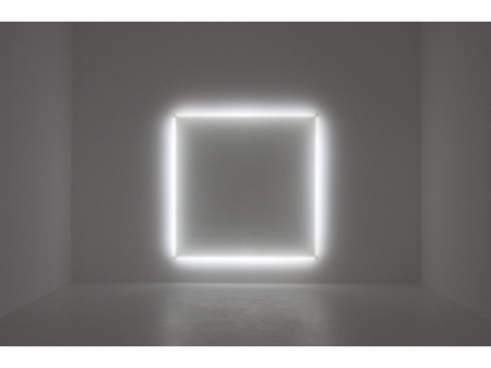
Doug Wheeler, Untitled, 1969. Acrylic, neon tubing and wood.
And the Solution Is…..
I was puzzling over the lack of a necessary and sufficient characteristic, until I suddenly remembered a pedagogical strategy I used in the ’60s derived from Ludwig Wittgenstein’s later philosophy: the anti-Aristotelian Family Resemblance. A category can consist of items that have a family resemblance rather than a necessary and sufficient common denominator. On a macro level, family resemblance can be used to delineate art in general; on a micro level it can be used to describe a style or art movement.
I have my father’s steel-gray eyes and reddish beard, but my mother’s soma-type (I hope). Whereas my sister has my mother’s blue eyes, my father’s soma-type, and my aunt’s tendency to indulge in monologue. My brother has my father’s eyes; my mother’s blond hair and my grandfather’s weak heart. I have my grandmother’s and my mother’s green thumb, but my brother doesn’t. He has instead my father’s mechanical ability, which neither my sister nor I possess. One big, happy family, with enough cross-references to enable identification as such.
Well, O.K. But couldn’t you say the same thing about the varied art in the 1966 “Primary Structures” exhibition, that there was indeed a family resemblance?
No strategy is perfect, and Wittgenstein wasn’t entirely right. It is how you use a strategy and what you use it for that counts. And let us not forget that classification can be ossification. Categories should be for illumination and comparison, not for control.
Family resemblance works for showing generosity to things you like; “necessary and sufficient” works if you want to weed your garden and get rid of all the plants you didn’t plant, like dandelions, although dandelions are perfectly edible. They are sometimes just in the wrong place.
But surely there are other strategies, such as sorting by hindsight.
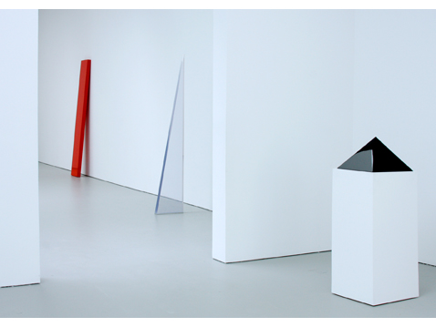
John McCracken: Red Plank, 1967. Polyester resin, fiberglass and plywood.
Peter Alexander, Blue Wedge, 1970/ Cast polyester resin.
McCracken: Black Pyramid, 1975. Polyester resin, fiberglass and plywood.
Insight by Hindsight
If we still must judge art by its influence on future art — a very big “if” — then how does Finish Fetish come out? We can say that Minimalism itself influenced Anti-Form and Earth Art, and certainly Conceptual Art. But so far we see no developments out of Finish Fetish. Reactions against, no doubt. Mess instead of finish and finesse, which we decline to find game-changing or even interesting. Finish Fetish is a sport.
On the other hand, what U.S. city has its own art movement? New York has had dozens. But in all the rest of the United States of America, there are only three. L.A. produced Finish Fetish; Chicago gave birth to The Hairy Who; San Francisco briefly floated Funk. All are worth reexamining.
Was Finish Fetish the beginning of New Age art? Unlike in Minimalism, a lot of the work in “Atmospheric Structures” looks semi-mystical. This is certainly true of Irwin’s demisphere with light and shadows. And, as we shall see, of McCracken’s planks. Simple geometry, unless you are very careful, will always suggest the Platonic.
 Coda: Readymade, Shop-made, or Handmade
The New York Minimalists rediscovered the idea that you didn’t have to make things yourself in order for them to turn out to be art. We know that Duchamp did this first with his Readymades, but for some reason Dada was anathema to Judd, Flavin, LeWitt. Was it Duchamp’s Dandyism? His odd connection to the lingering decadence of Surrealism? Certainly not his friendship with the rich and well-positioned, since no artist ever turns down a free meal, no matter how expensive the china.
Perhaps you cannot honor Dada when you are trying to sell made-to-order art for handmade prices and questioning art would queer the sale. So let us say instead that the major Minimalist “didn’t make art” in the same way that Duchamp “didn’t make art.” A Minimalist eschewing the handmade meant something different than what Duchamp meant by selecting his urinal or his bicycle wheel.
I am tempted to say that Minimalism, although producing unique objects, embraced the mass-produced — or it looked like that. Minimalism wanted the matter-of-fact rather than the pristine.
On the West Coast, the surface was the subject, and perception rather than philosophy was the point. Or to make light of it: not what light might mean, but how light could be seen — on a clear day, theoretically without smog, when gazing at your surfboard or the fender of your car. West Coast Minimalism might really be abstract Pop — Pop without dust or imagery. If you really want to get at the difference between Minimalism and the best of the Finish Fetish folk, compare anything written by Judd to this statement by McCracken:
I was always primarily interested in form alone, but then to make a form, you have to make it out of something. So color seemed a natural material to use, because color is abstract. If you make a form that appears to be composed of color, then you have something, an object, that’s pretty abstract. Just form alone would be more abstract, of course, because it’s just a mental idea, but you don’t have anything there for your perceptions to grapple with unless you make it out of a material. However, if you make it out of metal, or stone, or wood, or whatever, then you have something that to my mind may overemphasize the physical aspect and therefore be difficult to perceive as purely mental. An important thought behind this is that all things are essentially mental – that matter, while quite real on the one hand, is on the other hand composed of energy, and in turn, of pure thought.
John McCracken quoted from an interview with Thomas Kellein, August 1995, in the catalogue McCracken, Kunsthalle Basel 1995, p. 22. Courtesy Gallerie Tanit, Munich.
And that’s not all. There is a difference between early ’60s and mid-’60s, by which time New York Minimalism was already something to subsume or survive. On the West Coast, beauty did the trick, where beauty meant perfect and shiny. A decade later, the P&D artists had another definition of beauty and another answer to Minimalism. And now we can no longer think about beauty at all.
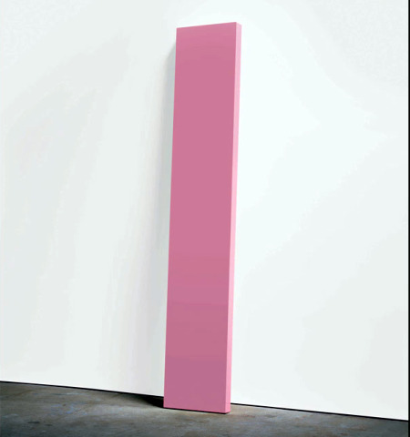
McCracken: Think Pink, 1967. Polyester resin, fiberglass, and plywood.
Where Is the Aura?
After my aura riff last time around, I now use the term whenever I need a space-holder for something unexplained. Don’t know why one painting is worth millions and another less than the cost of the canvas and paint? Aura!
Can’t figure out why you are moved by de Kooning and not Robert Motherwell? Aura!
Find it difficult to understand how an appraiser can tell a fake Mondrian from a real one? Aura!
Puzzled by the positive experience afforded by an early Frank Stella contrasted to the boredom inspired by later, more varied work? Aura!
So…
Does any of the art in “Primary Atmospheres” have an aura? You would think that works by Irwin and Turrell, or even the boxes of Bell, having so much to do with light and perception, would have auras. But that is the case only if you assume that aura has something to do with the spiritual, a dubious premise. Auras in art are not like halos. Nor do art auras have to do with perception.
Although I have doubts about his columns and other forms, McCracken’s planks have aura. He makes them by hand in the same way surfboards are made. Neither fish nor fowl; neither paintings nor sculptures but both, they have the oddness of the interstitial. And we all know from anthropology that everything interstitial is aurific.

NEVER MISS AN ARTOPIA ENTRY! ASK FOR THE AUTOMATIC ARTOPIA
ALERT: perreault@aol.com
