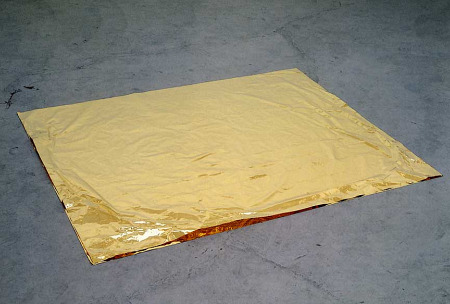
Roni Horn: Paired Gold Mats for Ross and Felix, 1994-95.
Beauty Needs Its Own Space
In her recent review of “Roni Horn a.k.a. Roni Horn” (at the Whitney), Times art critic Roberta Smith damns with faint praise. Smith, who once worked for Donald Judd, seems peeved that Judd was a Horn supporter and even purchased some of her art. More often than not I tend to agree with Smith, but in this case she is off base, if you will excuse the sculptural pun.
Horn’s sculpture is wonderful. Horn almost succeeds in convincing me that beauty is at the core of Minimalism. Or is her Late Minimalism or Neo-Minimalism something else? Post-Minimalism it is not. It is too neat.
Smith goes wrong in her criticism of what she sees as the sparseness of the installation. The work is “given too much acreage in the galleries.” Two floors “are one floor to many.” And “It seems excessive, for example, to limit the museum’s large fourth floor gallery to only Ms. Horn’s ‘Pink Ton.’ ” This is not quite right, but I am sure you get the picture.
What these comments expose is the writer’s horror vacui, her cenophobia, symptoms of which still plague the art world: feelings of panic, terror, dread, anxiety and rapid heartbeats when faced with empty or near-empty rooms. Just remember this: Aristotle was not always right. Nature does not abhor a vacuum; if nature did, there would be a lot less emptiness among the stars and between subatomic particles.
The Horn exhibition would be better with less work. There is too much photography, all the drawings could have been eliminated, and I am afraid — I, who am rewriting the entirety of the Emily Dickinson oeuvre — I find little of interest in Horn’s Dickinson quotation pieces that lean against far too many perfectly handsome empty walls, whereas the adjacent Pink Tons (2008) — see below — is sublime.
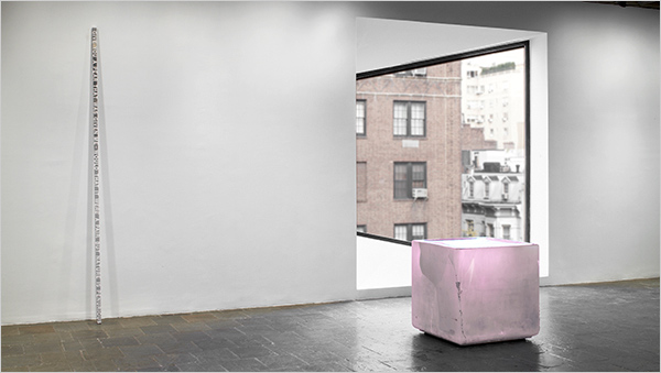
Artists, listen up. Curators and critics are not to be cursed; they should be able to weed out the minor stuff, cull the glut. In Horn’s exhibition, a little more nerve would have produced a much greater result. Imagine what a spectacular exhibition this would be if only the solid, three-dimensional sculptures were offered, surrounded by empty space. Then one could really see the glass, the metal, the gold; feel the weight and perceive the beauty … and, I am almost ready to confess, the profundity.
Curators, please stop internalizing market forces. No matter what the pressure from dealer or artist to include samples of all saleable commodities, cut to the bone. We have no time for images that would be better appreciated on the internet. There should be a real difference between a midcareer exhibition and a catalogue raisonné.
Most artists believe everything they produce is in the masterpiece category. They have to. It is the Picasso Syndrome writ large. But even Picasso wasn’t as good as he thought he was.
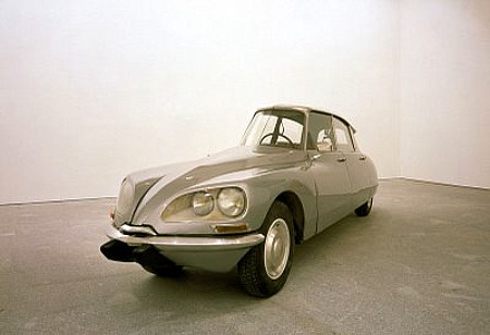
Gabriel Orozco: La DS,93 (modified Citroen DS), 1993
No Bones About It
Another museum exhibition that really should have had less art is the Gabriel Orozco survey at MoMA. Much less. This too was a show eagerly awaited. Here the artist would fare better if represented only by major pieces — oh, but not by the whale skeleton hanging inanely in the atrium, exposing that sometimes spectacular space as the best suicide drop of all time.
Eliminate all the photos; eliminate the table of materials-oriented trials and experiments. Orozco is not Beuys. Eliminate most little sculptural things. And, please, eliminate the really dumb, neo-modernist, neo-neo-constructivist, crowd-pleasing, collector-pleasing but I hope parodic, computer-aided gilded paintings. They are too handsome for words and the only reason to include them is that they might make you wonder how the same artist could be responsible for the brilliant My Hands Are My Heart (1991), Shoe Box (1993), and Yogurt Caps (1994) as well as these more recent “Samurai Paintings.” They make you question the sliced and rewelded Citroen, alas. Only the clay heart, the empty shoe box and the yogurt tops remain uncontaminated. And they are among the earliest sculptures presented.
Think, however, how much more effective the shoe box would be in a really large, empty room.
Perhaps Orozco should have stopped when he ran out of ideas, when success ruined the mystique of the wandering artist without studio, without permanent home. Perhaps — though I hate to think this — these “ideas” occurring to him in the early ’90s should be read only as footnotes to or parodies of Minimal and Conceptual art. Perhaps there was nothing much to sustain. The evidence accumulated at MoMA might point to this conclusion.
I, however, prefer to think that these ancient pieces, which still have a certain freshness about them, show that Minimalism and Conceptual art were not quite over in the ’90s and, in fact, are not over yet. In a world clogged with art, we need some breathing space.
Let There Be Light…and Space
Unless there is some important aesthetics of materiality involved, please in the future dump all photos, sketches, texts, films, videos on the internet, where they belong; where they will preserved for eternity in some “cloud.” And where they will be accessible to all and no longer be the potentially fetishistic, hard-to-take-care-of possessions of a few collectors and museums.
Space is luxurious, which is precisely why museums should use it more flamboyantly. Since Minimalism, most sculpture eschews the pedestal. The empty room is the pedestal.
Galleries in Chelsea — cued by the Dia in its glory days — have, believe it or not, set a standard that museums are not yet willing to match. The Manzoni retrospective at Gagosian, last February, should have been at MoMA, although — who knows? — it might not have held up in those cramped rooms.
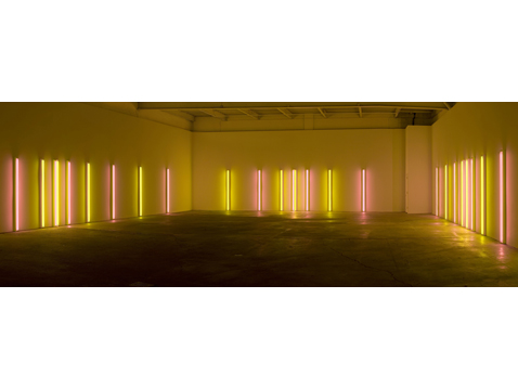
The Dan Flavin exhibition that just closed at Zwirner — “Series and Progressions” — was not only another exhibition suitable for one or another of our sleepytime museums, it illustrated perfectly the now essential, empty-room, anti-cenophobic exhibition style. In works such as Alternating Pink and Gold (1967), pictured above, It also inadvertently revealed the taboo beauty of Minimalism — which artists cranking out the stuff in ancient times tried manfully to deny.
Please note, Zwirner and Gagosian (and Mathew Marks) are commercial galleries you would think would want retail space for every saleable scrap. Yet they take the high road, which makes every scrap all the more valuable. At the Flavin show there are no prints, photos, drawings for the lower- or entry-level end of the market. There is only the big stuff, emitting space-defining light and looking better – for the time being — than when it will be squeezed into penthouses, country estates and the inevitable museums.
Art Criticism Art
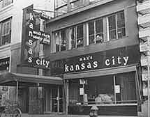
In response to a recent inquiry from a friend who is writing a preface to a new book of photographs of Max’s Kansas City, I was forced to look more carefully at two of the pages in last year’s “In Plain Sight: Street Works and Performances 1968 -1971” staged at The Laboratory for Art and Ideas — now, like Lab Director Adam Lerner, absorbed by the Denver Institute for Contemporary Art.
One page shows the announcement for poet/artist Hannah Weiner’s “Saturday Afternoon Show” at Max’s Kansas City. Max’s was the artist hangout and successor to the Cedar Bar of Abstract Expressionist fame. As a youth I visited the Cedar Bar, seeking the mythic window Pollock had thrown Kline through. Max’s, however, was cool. At Max’s, Andy’s table was in the back room; Bob Smithson’s was in the front. Movie stars such as Tuesday Weld and Dennis Hopper hopped back and forth.
From 2-3 p.m., on May 2, 1970, 14 artists and poets did performances or created saloon-specific artworks, mainly for one another and various mates.
The second document I found was a copy of my May 10 Village Voice account of the festivities: dancer Deborah Hay sat at the bar and drank one class of red wine very, very slowly for the entire hour. Adrian Piper wondered around blind-folded. Marjorie Strider created a fake, smashed plate-glass window out front. Weiner read aloud the official instructions for waitresses. I did not comment upon works by Vito Acconci or the absent Scott Burton.
There was already art there; a Judd, a Chamberlain, and a red fluorescent light by Dan Flavin; Mickey, the celebrated proprietor, traded art for meal-and-drink tabs. I remember the Flavin vividly because it inspired what I called Art Criticism Art. The red fluorescent piece had always annoyed me since it never added very much to the ambiance, nor vice versa. I pulled the plug and left the wall sculpture inoperative for the one hour of the “Saturday Afternoon Show.” At 3 o’clock, I plugged it back in.
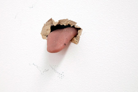
Urs Fischer: Noisette.(Motorized wall sculpture.)
Give a Dog a Bone
In regard to museum practice, I cannot sign off without adding a reference to the Urs Fischer exhibition at the New Museum. It takes up the entire place, or almost. Given the mingy scale of this really ugly building, this might not be saying much. However — and this is a very big however — how is it that this show of jokes and tricks, some of them amusing some of them really, really dumb (like the tongue sticking out of the wall), makes the museum look better than it ever has? Because basically the artist curated and — here is the key — installed his own show by leaving a lot of room around enough of the art to make a big difference.
A curator-in-charge would have, I hope, made Fischer eliminate the top floor display of silk-screened, mirrorized boxes. The images are so pointless they make you think of Rosenquist’s image-collages as profound. A curator-in-charge would also, I hope, have eliminated the Dali/Oldenburg collapsed piano, so that visitors could really judge the wallpaper made of photo-blowups of the walls it covers.
Nevertheless, Fischer kept it spare, leading me to suspect that his talent is probably in installations, like the missing-from-this-exhibition excavation of a gallery floor that got him so much attention.
That weak work selected and installed by the artist himself is better looking than anything so far presented inside this stack of shoeboxes says a lot. You figure it out.
FOR AN AUTOMATIC ARTOPIA ALERT CONTACT: perreault@aol.com
