Cake:
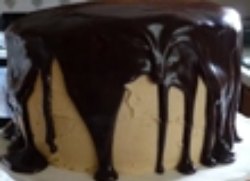 Oil: (Claude Zervas)
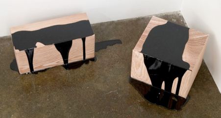
Regina Hackett takes her Art to Go
That old grade-school test question - Which of these does not belong? - offers a key to the aesthetics of the expressively hot, as opposed to the classically cool. The hint of crazy within the solid citizen, the blood in the water and the worm in the rose (mortal, guilty) move us in a way that visions of perfection rarely do. In honor of the flaw, a small survey of its recent, robust manifestations. Douglas Gordon Three Inches (Black) 1997 (image via) Susan Robb: Three from the last … [Read More...]
Filed Under: Uncategorized
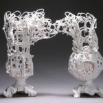
If human history were underwater, Alwyn O'Brien's ceramic vessels could serve as the bleached bones of the Ancien Regime, the decorative drained and dead on a dark sea floor. 4 Descending Notes 2010 Manganese Clay and Glaze 9" x 7" x 5 1/2" Hand-rolled coils make her lacy vessels. Born past their prime, they are in their own weird way pristine. Story of Looking, 2010 Porcelain and glaze, Two Pieces 12 1/2" x 14" x 5" Following Thelonious Monk, she knows how to use the wrong … [Read More...]
Filed Under: Uncategorized
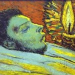
Collectors who hire experts to solve problems that don't exist till help arrives are responsible for the equivalent of bad face lifts on old masters. What the artists intended too frequently recedes under an abrasive cleaning or a deadening layer of varnish. Current practices discourage irreversible interventions. That means John Currin's work is a little safer than artists who preceded him, such as Picasso, although having the money to buy good advice doesn't guarantee it will be heeded. … [Read More...]
Filed Under: Uncategorized
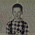
Nice to see David Wojnarowicz (wana-row-vitch) back in the news, making the monkeys dance. It's no surprise that the usual people want to use their deliberate misunderstanding of his work to rally their frightened base. It's also no surprise that the Smithsonian once again proves to be cowardly. Remember its Enola Gay exhibit from 1995? The examination of this country's use of the Atom Bomb started as scholarly and turned into a my-country-right-or-wrong cheering section, after suitable … [Read More...]
Filed Under: Uncategorized
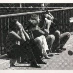
Humans see, humans do: After the first horse drawn on the first cave and the first pot incised with a decorative line, everything became imitation. You don't need a weatherman to know which way that wind blows, or that in the contemporary period, it blows harder. In selecting the 12 artists featured in Image Transfer: Pictures in a Remix Culture, associate Henry curator Sara Krajewski looked for those whose engagements with image recycling make them visual mix masters of note, those who … [Read More...]
Filed Under: Uncategorized
By Regina Hackett Leave a Comment
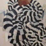
Mequitta Ahuja Wriggle, oil on canvas, 41"X26" 2008. Could have been titled, Medusa takes a nap. Geoffrey Chadsey Welterweight, 2002 Watercolor pencil on rag vellum, tape 57" x 24" Another great Chadsey figure with flowing locks. (Not safe for work.) Lauren Grossman Behold 2003 Iron, wool, steel. 13"x21"x12" Rolls on casters. Mequitta Ahuja, again. Flowback, oil on canvas, 68"X51" 2008 … [Read More...]
Filed Under: Uncategorized
Except for Ambach & Rice, which this year is part NADA, Seattle galleries will be largely absent this year in Miami.
Each year since 2005, when Seattle artist Jaq Chartier and her husband, Dirk Park, rented a sweet little motel on Ocean Beach and invited 35 galleries to join them, Aqua Art Miami was a real contender among what were known as the hotel fairs, satellites to the main event, Art/Basel/Miami Beach. Not only was Aqua’s lineup strong, the hotel itself was a draw: open, airy and full of light. Wandering through too many of the other hotel fairs felt like being transported to the hallway fire scene in Barton Fink minus John Goodman, tour guide to the life of the mind.
Scott Lawrimore, who hadn’t yet opened his gallery in 2005 but was invited thanks to the quality of his lineup, called Aqua the “single most important event for Seattle artists since Life magazine published The Mystic Painters of the Northwest. “
(Photo, Adam L. Weintraub, 2005: Ben Beres sleeping off a late night of partying on Aqua’s open-air second floor.)
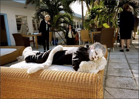 That was then. Lawrimore (who represents Beres) won’t be at Aqua this year and wasn’t in 2008. Thanks to the economy, turnovers in Miami are the rule this year, including at the main fair, with a 24 percent turnover. (Story here.) At Aqua, turnover is 75 percent.
Of the 8 Seattle galleries in the original Aqua lineup, none is returning, although Howard House will have its name on an artist project room featuring Robert Yoder, and Francine Seders has the same relation to a room featuring Juan Alonso.
Chartier said the issue this year was filling the space. She and Park called 40 galleries to reach one that was “even remotely interested.” Attending Aqua for the first time from Seattle is La Familia Gallery. The chances of La Familia being previously accepted into Aqua hover around zero.
In 2007, just in time for the first inklings of the crash-to-come, Aqua split in two to expand, occupying the hotel and opening a warehouse space in Wynwood. While the hotel version of Aqua was inspired, the Wynwood space was easy to lose track of in the overall Miami glut. This year, there is no hotel fair for Aqua, and Wynwood, such as it is, will carry on.
The lease on the Wynwood space runs through this year. Dirk and Chartier had to participate. If they continue next year, they face a steep climb back to hotness.
At Nada, Ambach & Rice will feature Jeffry Mitchell and Karen Sargsyan, with a couple of drawings by Eric Yahnker.
Aqua coverage in the PI from 2005, 2006 and 2007. I didn’t go in 2008 and (alas) won’t be going this year.
In her 30s, having destroyed all student work, Fay Jones started painting tiny, folkloric scenes on her kitchen table. She used tempera for a while, tried oil paints and didn’t like them.
In a 2005 interview, she explained her preferences for acrylics and watercolor.
What other people like about oil I don’t. It dries slowly. Others like the brush against the canvas. I hated to wait for the paint to dry. My paintings were mud. There’s no romance to acrylics, but they’re fast and worked for me right away. Oils have a life of their own. With acrylics, you have to mix them to get good colors. For me, watercolors are a sensuous experience. They are as close as I come to romance in the process.
By the late 1970s, she began painting larger than her hand’s span but continued to work on paper. She made the leap to life-size figures after she realized she’d figured out everything she needed to know to work small.
I wanted to go beyond what I knew. I don’t plan my work in advance. I figure it out as I go. The formal qualities that make the painting click I find as I’m working. When a painting is larger than I am, I have to keep moving. Everything changes. The eye stays in motion, and I feel freer.
My paintings are weightless. When they’re weightless, they’re mine. I could roll 10 years worth of painting in a tube and carry it.
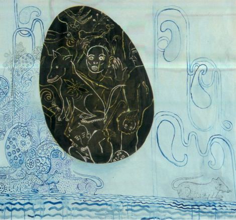
From Mike Leavitt’s Art Army.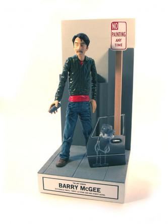
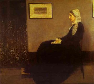
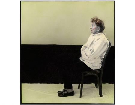
James Abbot McNeil Whistler, Arrangement in Black and Gray, No. 1, 1871 (Image via)
Last year at Howard House, from my review:
Ken Kelly has worked his way out of a decade-long slump to bounce back at the top of his game. For years his paintings labored under the effort of their making. By the time they were done, they had gone dry.
His new work is monochrome oil and enamel on a grid. Make that a subverted grid. Kelly offers Mondrian’s Broadway Boogie Woogie married to African mud cloth and lace dollies. It shouldn’t work but it does. As form snaps into place, you can almost hear the click.
These paintings are both maps and places. In their densities there is also air. Their patterns allude to landscapes, and shapes are suggestions hovering on the edge of fact. Kelly is once again the painter he promised to be, capable of merging force with grace.
Plot from the 2008 exhibit:
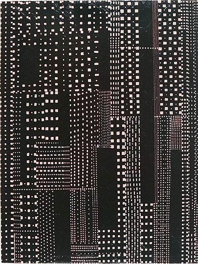 Second verse is not same as the first. The paintings in the current exhibit look like but aren’t stretched letters. He moved on from Mondrian to offer constructivist typography in a fun-house mirror.
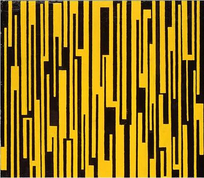 Kelly does not tape off. He pencils his shapes freehand onto canvas, which gives them, when seen in person, a tender intimacy that pushes against the loudmouth elan of their abstracted graphics.
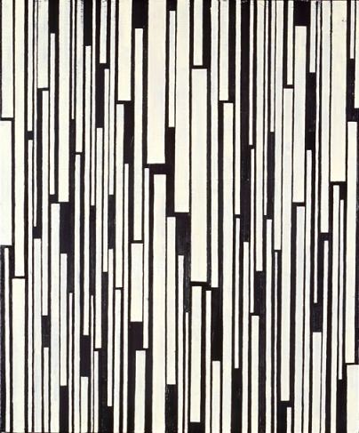 Through Nov. 28.Saturday, 1 p.m., Kelly talks about his work at the gallery.
In 2006, when Robyn O’Neil was at the Frye, I wrote:
Houston’s Robyn O’Neil
draws dense, dainty tableaus that make light work of heavy symbolism.
Her heart’s in the radical scale shifts and hallucinated oddities of
art history: Hieronymous Bosch without his silky spatial connectives, or Pieter Brueghel
without his interest in community. Her humans are loners and her
animals lost causes. Even when she crowds her space, nobody’s home.
O’Neil, The Passing
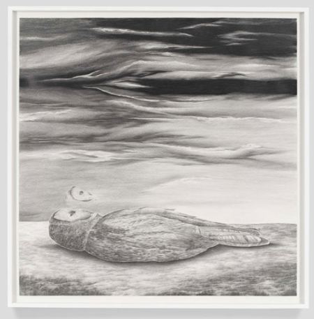 Jennifer Zwick managed to convey the same thing at the same time, wordlessly.
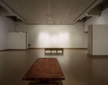
Zwick, Robyn O’Neil, Wall Text, 2006
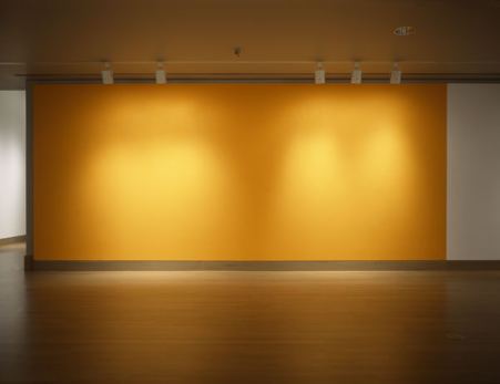 Zwick, Robyn O’Neil, Oh, How the Heartless Haunt Us All, 2006
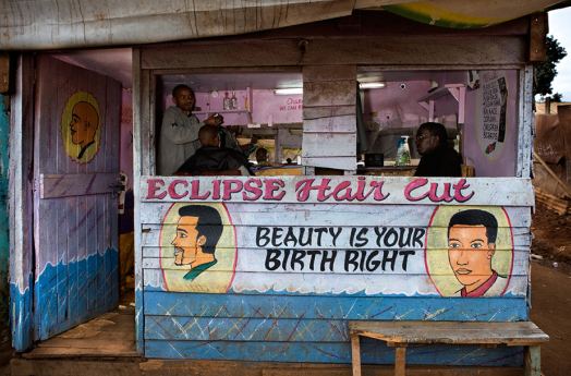
From Steve Bloom’s Nairobi Merchants via This Isn’t Happiness.
Why Eirik Johnson? There’s nothing wrong with Johnson’s work, but why him for a solo exhibit at the Henry Gallery? The Henry heaps few such honors on Northwest heads, which makes him an unlikely candidate. He’s a photojournalist with a solid idea. For years he has traveled through what’s left of the logging towns along the Coast, documenting life in the shadow of a once-flourishing industry.
I’d seen his work at G. Gibson Gallery and thought, nice enough, but it doesn’t inhabit its own experience. What Jasper Johns said about sculpture – Take an object. Do something to it. Do something else to it. – also applies to photographs. There’s something loose and unresolved about Johnson’s imagery. His are impressions too faint to score on their own. Had the Henry wanted to explore the myth of the West rattling around in the wrecked present day, it would have been far better off with Glenn Rudolph. Each of Rudolph’s images is a world.
The exhibit turned out to be better than I imagined. Turns out, loose and unresolved can be virtues in the right context, like mist on a moor.
Chief Henry curator Elizabeth Brown gave Johnson the chance to rise to the occasion of his formidable backstory. In smaller galleries leading to his are 19th and early 20th century logging photos by Darius Kinsey and Carleton Watkins. They capture the grotesque sublime of a booming industry chomping its way through forests as if other old growths would rise magically in their wake to be logged in turn.
Magic is gone by the time Johnson shows up. He documents the makeshift instead of the magnificent.
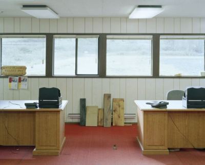

 He’s one of those artists whose work resonates in its own company. He offers not soloists but a chorus.
Johnson images via G. Gibson Gallery and Rena Bransten Gallery.
I was sold on this show until stopped by Morris Graves, whose Abandoned Homestead hangs in an adjancent gallery.
Graves, U.S. (1910 – 2001) 1934 – 1937, Oil on canvas 37 3/8 x 43 9/16 inches. Morris Graves Foundation — Robert and Desireé Yarber
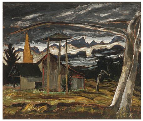 It knocked Johnson clear out of my mind, and I’d just seen him. Through Jan. 31.
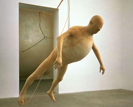
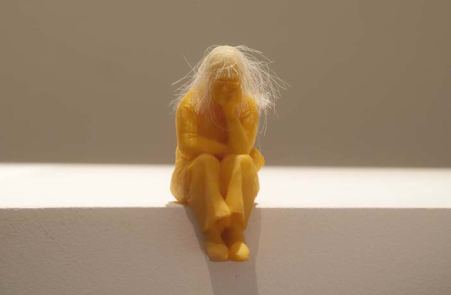
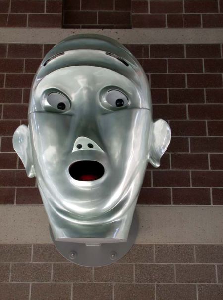
Neither here nor there but somewhere in between, standing on a ledge, looking over a curb or hanging in the air like a parade float:
Tim Hawkinson – Bloat is beautiful.
 Jeanne Silverthorne – Staring at her future, which is behind her.
 Christopher Rauschenberg – Feet in muddy water, head in a cloud. (detail)
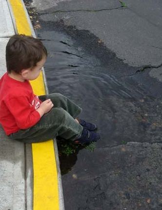 Juan Munoz -The isolation of the outsider.
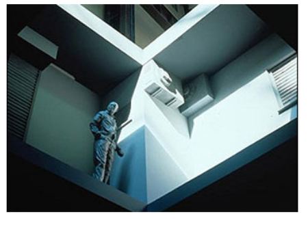 Claudia Fitch – Fear of heights, stuck in a high place.
an ArtsJournal blog


