The more advertising I see, the less I want to
buy.
Tom Robbins
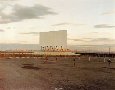 Ed Ruscha, via
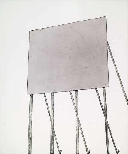
Regina Hackett takes her Art to Go
That old grade-school test question - Which of these does not belong? - offers a key to the aesthetics of the expressively hot, as opposed to the classically cool. The hint of crazy within the solid citizen, the blood in the water and the worm in the rose (mortal, guilty) move us in a way that visions of perfection rarely do. In honor of the flaw, a small survey of its recent, robust manifestations. Douglas Gordon Three Inches (Black) 1997 (image via) Susan Robb: Three from the last … [Read More...]
Filed Under: Uncategorized
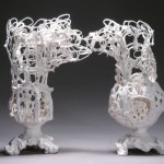
If human history were underwater, Alwyn O'Brien's ceramic vessels could serve as the bleached bones of the Ancien Regime, the decorative drained and dead on a dark sea floor. 4 Descending Notes 2010 Manganese Clay and Glaze 9" x 7" x 5 1/2" Hand-rolled coils make her lacy vessels. Born past their prime, they are in their own weird way pristine. Story of Looking, 2010 Porcelain and glaze, Two Pieces 12 1/2" x 14" x 5" Following Thelonious Monk, she knows how to use the wrong … [Read More...]
Filed Under: Uncategorized
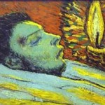
Collectors who hire experts to solve problems that don't exist till help arrives are responsible for the equivalent of bad face lifts on old masters. What the artists intended too frequently recedes under an abrasive cleaning or a deadening layer of varnish. Current practices discourage irreversible interventions. That means John Currin's work is a little safer than artists who preceded him, such as Picasso, although having the money to buy good advice doesn't guarantee it will be heeded. … [Read More...]
Filed Under: Uncategorized
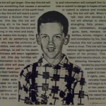
Nice to see David Wojnarowicz (wana-row-vitch) back in the news, making the monkeys dance. It's no surprise that the usual people want to use their deliberate misunderstanding of his work to rally their frightened base. It's also no surprise that the Smithsonian once again proves to be cowardly. Remember its Enola Gay exhibit from 1995? The examination of this country's use of the Atom Bomb started as scholarly and turned into a my-country-right-or-wrong cheering section, after suitable … [Read More...]
Filed Under: Uncategorized
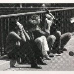
Humans see, humans do: After the first horse drawn on the first cave and the first pot incised with a decorative line, everything became imitation. You don't need a weatherman to know which way that wind blows, or that in the contemporary period, it blows harder. In selecting the 12 artists featured in Image Transfer: Pictures in a Remix Culture, associate Henry curator Sara Krajewski looked for those whose engagements with image recycling make them visual mix masters of note, those who … [Read More...]
Filed Under: Uncategorized
By Regina Hackett Leave a Comment
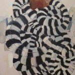
Mequitta Ahuja Wriggle, oil on canvas, 41"X26" 2008. Could have been titled, Medusa takes a nap. Geoffrey Chadsey Welterweight, 2002 Watercolor pencil on rag vellum, tape 57" x 24" Another great Chadsey figure with flowing locks. (Not safe for work.) Lauren Grossman Behold 2003 Iron, wool, steel. 13"x21"x12" Rolls on casters. Mequitta Ahuja, again. Flowback, oil on canvas, 68"X51" 2008 … [Read More...]
Filed Under: Uncategorized
Heading into the fourth episode on Wednesday night, Work of Art: The Next Great Artist has provided a few surprises. Despite a lackluster beginning, auctioneer Simon de Pury has come into his own as a coach, dispensing genuinely helpful advice. On the other hand, Jerry Saltz has yet to emerge. The editing of his remarks has to be brutal.
If this were Saltz before editing:
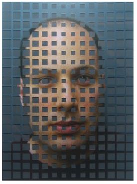 This would be him after:
 (Both images details from Drew Daly’s altered photographs via Greg Kucera Gallery)
In my previous post about this show, From
Bravo: the next barely adequate artist, I wrote that the show would depend on Saltz. Wrong. Others have emerged in the forefront, and by that I mean the artists. Out of 14, four shouldn’t be there, and three are gone. (One to go.) The rest are capable of working within the framework of a reality TV show and putting their stamp on it, and I love that they can’t be counted on to stand there and be judged.
Best line from the show still belongs to Nao Bustamante, who told the judges on the first episode, “I’m not responsible for your experience of my work.” On the second episode, artist Miles Mendenhall went further. Refusing to accept that the judges are the only ones whose opinions matter, he joined the panel to offer his own. For making an entirely accurate remark about the work of another contestant, he has drawn ire from critics, naturally enough. Judgments are their job. On Culture Monster, critic David Ng called Mendenhall an “emo-hipster backstabber.” Why? Because Mendenhall said something smarter than anyone else in the room.
Ng also noted that Mendenhall “talks endlessly about his obsessive-compulsive disorder and chronic insomnia.” On this show, it’s impossible to say who talks endlessly and who makes a couple of necessary observations. It’s called editing.
Speaking of chatter, there’s a lot of it currently about OCD. People who are a little distracted claim it, as if it were an honor. Mendenhall has it. Ng appears to have nothing but contempt for the artist, even though he’s moving mountains to make his appearances.
Personally, I’m sad to see someone that young and afflicted struggle with what looks like an untreated disability. Isn’t this the 21st Century? I’m also thinking of Tobias Wong. And I’m thinking of my father, a paranoid-schizophrenic novelist who self-medicated with alcohol and still managed to be both a terrific dad and artist. Such careers are necessarily short. I’d like to think there’s more help out there now, but I don’t see it.
On a lighter note, the excellent Sharon L. Butler (Two Coats of Paint) is hosting her own version of Work of Art on facebook.
Mauro Perucchetti Luxury Therapy 2008 Pigmented urethane resin, glass, crystals and metal
(via)
 Tobias Wong 24 Hours of Pure Silver Leaf 1998 (Image via New York Times: NYT obit here and possible reasons for the death of the 35-year old artist who misidentified himself as a designer here.)
 Damien Hirst Medicine Cabinet (one of many)

Art is math. Some artists add, some subtract. The rest multiply.
Among the multipliers:
Tara Donovan Toothpicks
 John Grade (at Suyama Space)
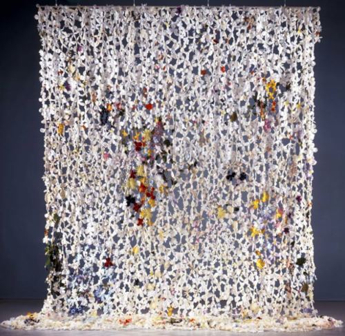
 Jim Hodges, Silk Flowers (image via)
 Tony Cragg, Stack 1975
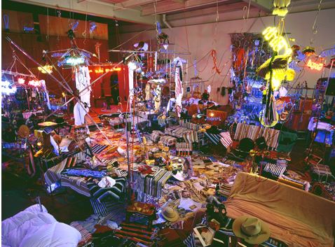 Annette Messager at the Pompidou
 Dale Chihuly, Victoria and Albert Museum, 2001
 Damien Hirst Pharmacy (Image via)
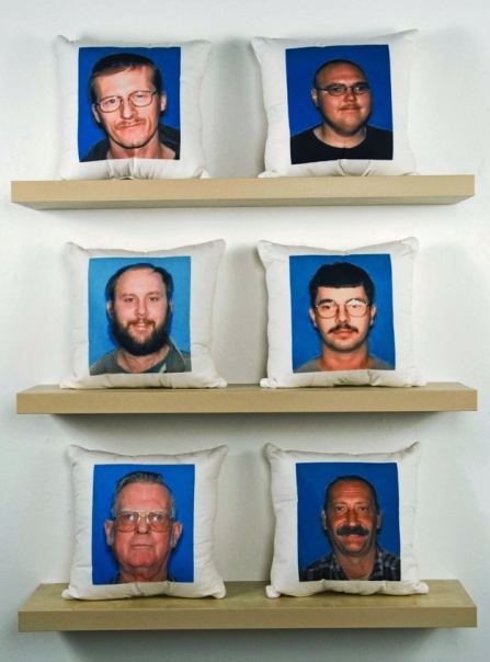
 Mike Simi Sex Offenders From My Hometown:Throw Pillow Series (Ongoing)
Printed fabric, found images
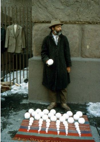
 Finally, the greatest example of simultaneous addition and subtraction in contemporary art, David Hammons‘ Bliz-aard Ball Sale on Cooper Square in NYC, 1983.
Stephen Nguyen‘s installation at Suyama Space, Migration, is a stage set that aspires to be a play. Instead, it’s a proposal for a play, an idea roughed out on a three-dimensional drawing board: Trace evidence of birds bursting through a drywall constructed for the purpose. Plot hangs heavy on Nguyen’s hands, but he is unable to give flesh to its outline. Nguyen is thinking, but not with his hands.
Nguyen, Migration, detail, 2010
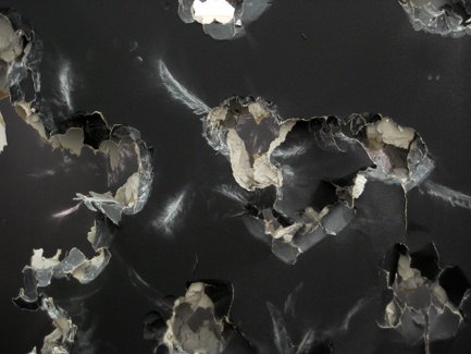 Nguyen’s best installations derive from teamwork with Wade Kavanaugh, who had his own solo show at Suyama Space in 2008. (Examples here.)
A lot of punching through the wall takes place in the name of painting. (See Target Practice: Painting Under Attack, 1949-78. Nguyen pales next to these primary sources.)
Nguyen at Suyama through Aug. 6.
Never doubt that a small group of thoughtful, committed
citizens can
change the world. Indeed, it is the only thing that ever has.
Margaret Mead
When I met Chris
Jordan, he was a Seattle lawyer representing a now-defunct pipe line company. Its product had
ruptured on June 11, 1999, allowing 236,000 gallons of gasoline to pour
into the Whatcom and Hannah creeks near Bellingham, turning them into fireballs. Two
10-year-old boys playing by the riverside were killed. Jordan’s job was
not to help anybody deny guilt. That trial was over. His more limited goal was to keep his clients out of jail. He did not succeed.
Some lawyers are able to recover from a case like that, and some have
nothing to recover from. They are, after all, just doing their jobs.
Haunted by the deaths and the river on fire through human negligence, however, Jordan didn’t give up his cushy corporate job and switch to the other side. He withdrew completely, never to practice law again.
But while he was still on the
case, he cold called me to introduce himself as a lawyer, not an artist. When he
couldn’t sleep, he said he liked to take a 4-by-5 camera on the streets
of his Belltown neighborhood late at night to photograph the trees. I don’t ordinarily do studio visits with lawyers who happen to pick up a
camera. But there was something compelling about him, even over the
phone.
Here’s part of the story I
wrote in 2001, the first in what is now a long and international list.
With no flashes or other lighting equipment, Jordan uses long exposures
to take advantage of the light that’s there: traffic signals, street
lamps and neon signs.
Granted, city trees have tough lives. That’s what interested Jordan in
the first place, their circumstances and secret beauty.This is their secret: Stranded in urban jungles, they are still able to shine. Neon light gives them a
gorgeous glow. In his photos, royal blues and jittery yellows, magentas and
silver-gold bathe long trunks, clustered leaves and twisted
branches in an artificial radiance.
“Planted in straitjackets of nutrient-poor, compacted soil, surrounded
by asphalt and haphazardly pruned to protect buildings and phone lines,
they struggle to live,” said Jordan, 37.
“Yet at night,” he continued, “the colored glow bathes them in wild
colors. They could be modern dancers on stage.”
Jordan’s most recent project is E Pluribus Unum, 2010 24×24 feet, laser etched onto aluminum panels
From his website:
Depicts the names of one million organizations around the world that are
devoted to peace, environmental stewardship, social justice, and the
preservation of diverse and indigenous culture. The actual number of
such organizations is unknown, but estimates range between one and two
million, and growing. To decode the strands, click here and click on the image. (Via Eyeteeth)
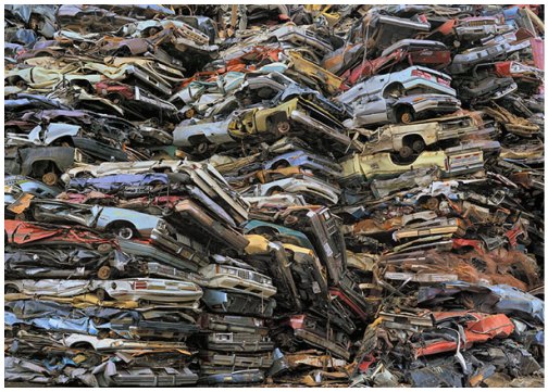
 In 2004, Jordan photographed in a Seattle scrap salvage yard and printed the results large, 4 feet by 6 feet, aspiring to the kind of scale he’d admired in Andreas Gursky.
In Jordan’s mind, he was still following the thread of color bursting from trees.
His friend and fellow photographer, Subhankar Banerjee, saw the new print and said, “This is a portrait of America.”
The idea turned on the lights in Jordan’s head. From it came his giant prints of consumerist waste products. Rivers of cell phones. Mountains of crushed cars. Circuit board moonscapes and sawdust cathedrals. Worlds of scrap metal.
 But even after the breakthrough, he was still just a guy with a camera.
After trying unsuccessfully to get noticed in Seattle, he self-published a book and distributed it to every curator and gallery dealer he thought might respond. One did, Paul Kopeikin Gallery in Los Angeles. In 2005, at a dinner arranged by another dealer, Jordan found himself sitting next to New York Times editor and photography writer Philip Gefter.
In 2005, Gefter’s essay on Jordan’s work appeared on the front of the Sunday Arts and Leisure section, with a photo taking up nearly a third of the page. Jordan was a classic outside who created opportunity where there wasn’t one, but the force and clarity of his work, the audacity of the manipulated printing process, carried him into the future, documenting what he calls the “slow-motion apocalypse” of a use-and-discard society.
The drive behind his environmental subject matter is a memory of two boys turned into living torches by the side of river. His challenge is to avoid didacticism, and if he can’t, set it aflame. E Pluribus Unum catches him in a quiet and entirely celebratory mood. It won’t last.
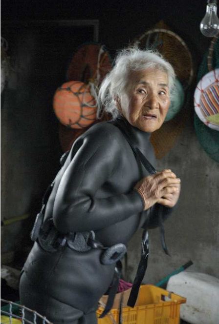
Possibly starting in the 5th Century but documented since the 19th, a tradition of women divers off the coast of the Korean peninsula. Photos, Brenda Paik Sunoo (Thanks, Rooney O’Neil)


I deemed the weather offensive, the way the air lay on me like a giant tongue – clammy, warm and gritty as embers.
Galveston Nic Pizzolatto
Sometimes the weather that isn’t there is all the weather you need.
Buddy Bunting 2004 ink on paper
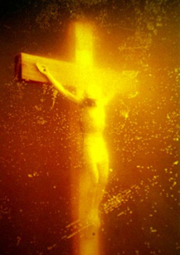
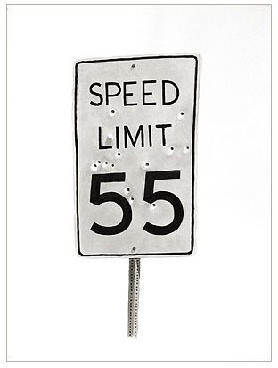 You can drown in it, even it you’re already dead.
Andres Serrano Piss Christ 1987
Debra Baxter, Spent, late 1990s
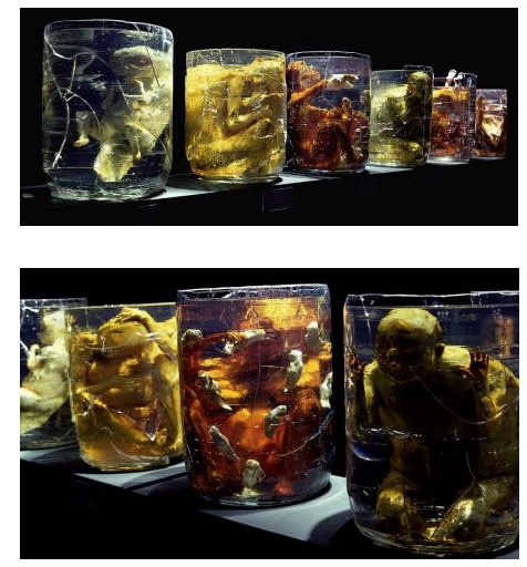
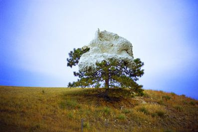 If your world is the inside of a jar, what surrounds you is your weather.
Lauren Grossman, 1989
 Too wet to plow: Juniper Shuey Untitled
c-print
12.5″ x 15.5″
edition of 3
2005
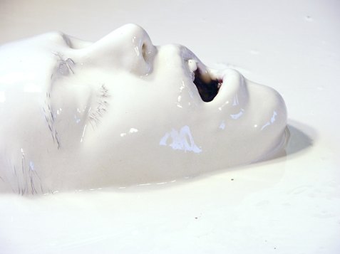 John Cheever once said he “missed the sky” in the novels of a contemporary. Elmore Leonard isn’t likely to say the same. One of his rules of writing is, “Don’t start with the weather.” Visual artists can make the weather primary without the burden of adjectives.
Grant Barnhart Killing Time with Sleeping Pills and Holding On
16×20, Acrylic on canvas (2009)
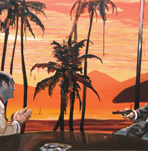
 In honor of Pizzolatto, whose debut novel Galveston is excellent noir, I’ll end with its weather equivalent.
Grant Barnhart, Two Road Agents Meet at an Impasse
48×48, Acrylic on canvas 2009 (Ambach & Rice)
Bravo’s Work of Art: The Next Great Artist made its debut in someone else’s prom dress. The format, the editing, premises and pacing were all worn first on Project Runway.
Instead of Project Runway‘s Michael Kors and Nina Garcia, Work of Art has art dealer Bill Powers and dealer/curator Jeanne Greenberg Rohatyn. Instead of make-it-work Tim Gunn, auctioneer Simon de Pury muttering into his manicured hands. Instead of Heidi Klum, “art enthusiast” China Chow.
As with Runway, the possibilities were determined before the first episode. By then, unnamed judges had picked the 14 contestants, unlike American Idol and So You Think You Can Dance, both of which offer a survey of the field and the process judges use to narrow it.
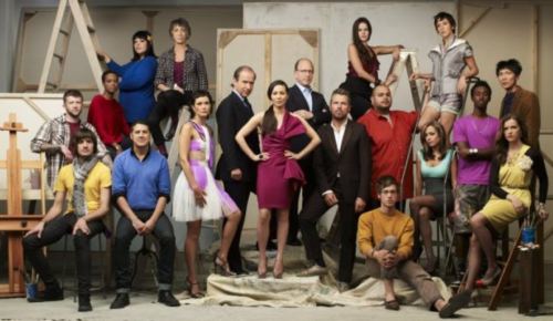
Work of Art judges, host and artists, image via Bravo
 Each week there’s a challenge; one person wins and one goes home. The only person on Work of Art without a Runway equivalent is critic Jerry Saltz. Although rigged against them, the show rides on his abilities.
The other judges fall short of their Runway relations. To date, Greenberg Rohatyn’s judgments are absurd. Powers is vulgar. He actually said he couldn’t “get off on” one contestant’s piece. With his lecherous-logger looks and intense-for-no-reason demeanor, his phrase creates an unwelcome image. Not that he was trying to create it. He’s one of those people who uses phrases without thinking about them.
Note to Powers: Read George Orwell’s Politics and the English Language. The next day, read it again. Underline this part:
As soon as
certain topics are raised, the concrete melts into the abstract and no
one seems able to think of turns of speech that are not hackneyed: prose
consists less and less of words chosen for the sake of their meaning,
and more and more of phrases tacked together like the sections of a
prefabricated hen-house.
Chow’s confidence gives self-esteem a bad name. Born wealthy and raised around art, she acts as if she earned it. De Pury appears to be bewildered, as well he might be. The artists on the show are outside the range of his consciousness, steeped as it is in the price points of masterpieces.
Ain’t nothing like that here. After a nationwide search, the overall quality of artist-crew is at best uneven. Who picked them? In his running commentary in New York Magazine (so far here and here), Saltz was quick to point out he didn’t. (Even if you’re not watching the show, reading Saltz react to it is worth the click.)
The first challenge, to create a portrait of a fellow contestant, showed the judges’ deficiencies in bold relief. They seem to believe that a portrait has to be a recognizable likeness. (See Martin Bromirski’s on his blog, Anaba, particularly…)
hey judges – Felix Gonzalez-Torres,
Untitled (Portrait of Ross in L.A.),
1991, Louise Bourgeois, Torso Self-Portrait, 1962-63, David Hammons, Esquire (or John Henry), 1990…
etc etc blah blah blah…
It’s major not to realize how diverse the contemporary meaning of a portrait is, and yet Saltz did nothing to clarify, either in his (heavily edited) remarks on the show or later in his NY Mag commentary. Instead, he sweats the small stuff. Talk about eye not on the prize:
No one in the art world calls themselves a “figurative” or “abstract”
painter. They just say they’re an artist or a painter. It was a sign
that the producers didn’t know the art-world lingo.
Note to Saltz: You and the 10 people with whom you like to dine might have decided that the terms “figurative painter” and “abstract painter” are dead, but I assure you they are still in use by tip-top art-smart people around the world. For you, their use indicates out-of-it, but nobody else cares. Sounds like you’re describing your secret handshake. Move on.
A great moment from episode one came from contestant Nao Bustamante, who told the judges, “I’m not responsible for your experience of my work.”
The tops and bottoms were hard to tell apart, aside from the artist who went home and deserved to via her leaf-strewn wallpaper. The judges liked Abdi Farah too much and Erik Johnson too little. Powers said Johnson’s face-on-a-palette painting resembled one of John Wayne Gacy’s clowns. I guess that’s where we are with clowns. Paintings of them used to remind people of Red Skelton. Now, a serial killer comes to mind.
Gacy and Johnson have nothing in common besides the subject matter, which means they have nothing in common. Gacy was a demented folk artist. Johnson is an expressionist. His figure looks like phlegm from a tubercular’s handkerchief, and I mean that as a compliment.
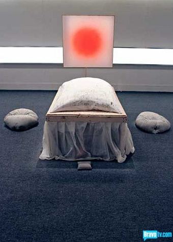
The second challenge went better: Make something from electronic junk. Guest artist Jon Kessler raised the tone, telling contestants to remember that objects have a memory. The bottom three richly deserved their status. I would have liked to see Peregrine Honig in the top three, but no quarrel with the two-time winner, Miles Mendenhal.
Miles Mendenhall, Worst place, 2010, mixed media
 In its glory days, Project Runway was a don’t-miss, art-world cult classic. I’m not sure this show will get there. Saltz aside, the judges need to be smarter and de Pury more forceful. He could help the artists in the studio, but his old-world manners prevent it.
One thing you can say about So You Think You Can Dance. Everybody who makes it on the show has every reason to believe it, and the judges, while frequently annoying, know from whence they speak. Responding to Alex Wong‘s brilliant work in a piece choreographed by Sonya Tayeh, judge Nigel Lythgoe said:
Sometimes we concentrate on the architecture of dance…and forget to dance because the steps get in the way. Tonight you’ve shown you have that structure and artistry melded together.
None of the judges on Work of Art have come close to that, but, of course, they’re not dealing with Wong’s equivalent. (Good question: Why aren’t they?)
More on Work of Art – recaps from Christopher Knight, Paddy Johnson and Jen Graves. Third episode Wednesday night.
an ArtsJournal blog


