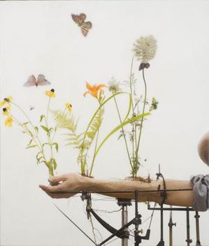
Amos Tutuola & Jocelyn Shipley
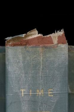
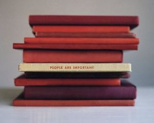
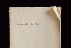
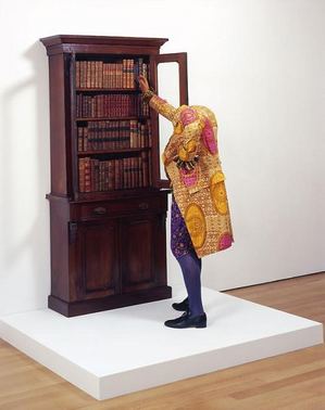
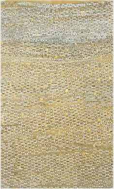
Amos Tutuola’s My Life in the Bush of Ghosts (1954) included a struggle with a treacherous monster who had eyes in her hands. Looks like, half a century later, Jocelyn Shipley has succeeded in disarming her.
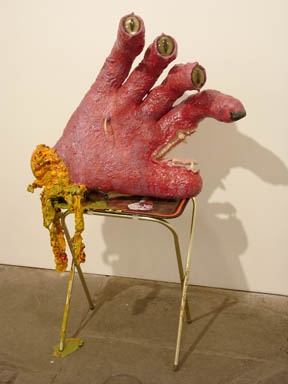
Peter Saul – shines online, dead on the wall
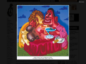
Peter Saul is one of those artists whose reputation would soar if his work was available only in reproduction. Online, he’s golden with a creepy gleam to his colors. In person, it all falls down. What gleamed is dull. Instead of silky, his form looks mechanical. Because I’ve spent years looking at him online, I forgot that he’s not very good. His retrospective at the Pennsylvania Academy of Fine Arts was a rude awakening.
Mario Naves gets it right in the New York Observer, link via Two Coats of Paint.
Philip Smith – all the insults artists are heir to
Culture Grrl was alert enough at a press preview for Pictures Generation at the Met to realize that one person worth talking to (Douglas Crimp) was there but not talking. (Her interview here.)
Pictures Generation builds on the base of Crimp’s Pictures exhibition at Artists Space in 1977. Crimp is good at theory, not necessarily on how it plays out in the work of individual artists. Also, with 30 years of hindsight, Met curator Douglas Ecklund is in a better position to judge who belongs in this media-saturated group.
My problem isn’t who’s in and out, it’s how they’re out. Philip Smith is the only artist in Crimp’s show who isn’t in the Met’s. (In Crimp’s own reevaluation of his exhibit in a 1979 issue of October, he played down Smith and added Cindy Sherman.)
Fair enough. Smith doesn’t fit. The glue of their ideas does not adhere to him.
But curator Ecklund goes out of his way to tell both Culture Grrl and Jess Wilcox (excellent Art in America interview here), that Smith’s work just doesn’t cut it aesthetically.
Crimp speculated to CG that Smith’s omission might be because he’s gay.
Culture Grrl: What do you make of Philip Smith’s absence from the Met’s show?
Crimp:
He was not so much of the group, of the social world, of the people who
formulated this. He’s gay and this [the Met’s show] is a very straight
configuration of artists. I don’t know what’s happened to him,
career-wise. It’s a slightly touchy subject: I think Philip is upset,
reasonably.
Well played, Mr. Crimp. You stuck it to the establishment without defending Smith at all. It’s the perfect expression of your porcupine position.
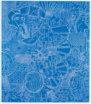
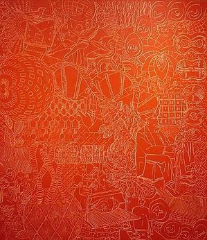
I haven’t seen Smith’s work in a number of years, but I remember it well. I’ll take him over at least half of the artists in this show. Within the arena in which he chooses to act, his dense yet fluid congestion of signs and symbols continues to ripple out, influencing others.
A 1996 review in Art in America by Lily Wei zeroed in on their specific qualities:
The seeming spontaneity of the drawing is balanced by the deliberate
richness of the meticulously worked grounds. These elegant surfaces,
marked out in broad bands or grids of mustard yellows, lucid
gray-greens, sea and sky blues, along with black and white, are toned
down from Smith’s works of a few years ago, when figure and ground
competed fiercely for attention. The appeal of these paintings is a
perverse one. They can stymie or enchant, according to the viewer’s
sympathies.
So did Michael Kimmelman in a 1992 NYT review:
It is understandable that Philip Smith’s paintings did not stand out at
last year’s Whitney Biennial. They’re quiet works that do not try to
compete for attention. The considerable pleasure of them comes from the
painstakingly constructed oil and wax surfaces into which are incised
myriad images, like hieroglyphs. Mr. Smith builds layer upon layer,
first painting abstractions on linen and then covering them up, often
with subtle stripes of color, and on top of these laying down the final
soft surface. The incisions reveal the painting underneath, so that the
result is a multiple image of swirls of color beneath geometric designs
beneath loopy drawn pictographs of matchbooks, corncobs, skyscrapers,
grapefruits, clocks, fingerprints, African carvings and much else. Mr.
Smith’s inspiration seems to have come from many directions, from Brice
Marden and Mark Tobey and Jackson Pollock and also from Egyptian art
and even from the graffiti carved in antique monuments. But there’s a
combination of slowness in his surfaces and patterns, and speed in the
rush of cacophonous imagery, that is distinctive to him.
I hope Ecklund’s haughty attitude comes back to bite him. Below are a few of artists in Smith’s debt.
Build the audience idea – photo of the month
Bootsy Holler, Fan. At $250 each print in an edition of 3, the venture can’t be profitable for the artist. Maybe it’s closer to what grocery stores used to call a lost leader. Fitting, considering she took the shot in a grocery store.
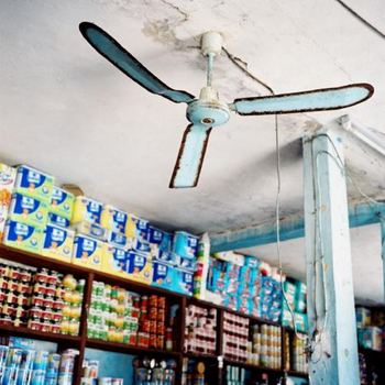
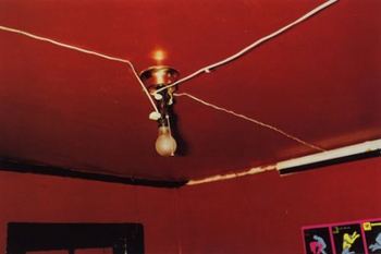
Fan owes to a lot to William Eggleston but isn’t a repeat of him. Her print has its own smeared and unraveled grace.
Laura Splan & the aesthetics of disease
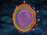
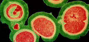
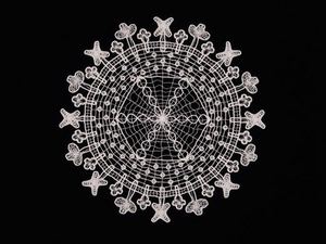
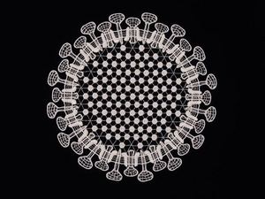
Bird flu, swine flu, Spanish flu and unnamed others in the same large virus family lead pale existences on the surface of human skin, awaiting entrance into the body. We inhale them, lick them or rub them into our noses. Inside us, they burst into pattern paintings.
Jaq Chartier and the memento mori of a color field
Jaw Chartier’s paintings are a merger of color-saturated bloom and blight. Using an eyedropper or a stick, she draws stacked coils or circles in colored stains on wood panel covered in gesso. After covering them with layers of white paint, she waits to see which ones bleed through to the surface and in what configuration.
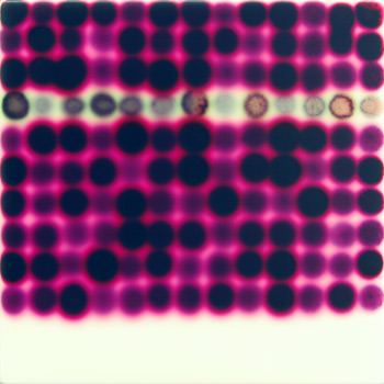 She likens her process to someone trying to paint over a water stain on a basement door. The stain tends to bleed through.
Exposing her painted panels to direct sunlight influences the chemistry of the color changes, causing some colors to blur. Occasionally she’ll cover portions of a painting with tape. The colors that are sun-exposed bleed, while those shaded tend to retain clearer contours, causing the clear and the fuzzy to collide.
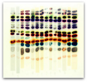 Computer love: If machines develop the consciousness to make art, they’ll undoubtedly want to hitch their search engines to Chartier’s star. Her dots in a stacked Q-Tip pattern and her blurred holes burning like distant stars appear to be glorified fragments of computer code, instead of what they are, abstractions in a serial mode.
Her current exhibit at Platform Gallery finds her in game mode, where she finds common ground with grid-based computer graphics of match-3 games, whatever they are.
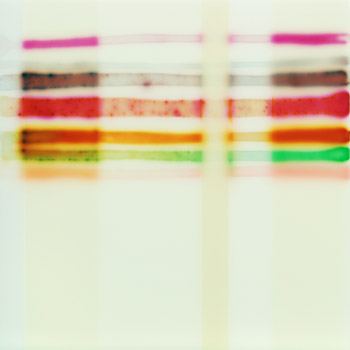
Competitive gaming is always a test, and that’s the real link between painter and the joy stick crowd. Each painting is an experiment that she engages on its own terms, subjecting her original patterns to chance decay but giving them the chance to assert themselves.
Assert themselves they do. Her vertical grids are what you might see if a heart monitor were hooked up to the universe.
Ultimately, what she explores is not science or fragments of genetic code. It’s an update of something as old as art itself, a new version of Dust Thou Art. Her coils are mortal, yet they flare brightly before their promised ends.
Thomas Wood – a furious intensity
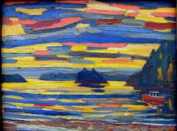
Bellingham’s Thomas Wood paints as if he were knitting thick threads into a coarse version of a landscape. His best work has a battered gleam, as if it had been through a lot. The awkward quality of his oils brings to mind Albert York, whom Calvin Tompkins once called the best unknown painter in America. Tompkins was referring to unknown in New York terms. Wood is largely unknown in Seattle even, though he lives a hour north of it and has shown in the city for years.
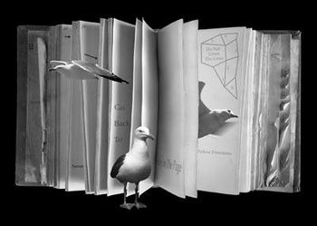
Robert Duncan & Olivia Parker
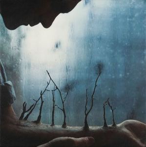
Body farming – the latest in pushing up daisies
From Robert and Shana ParkeHarrison, Winter Arm, 2007, and Summer Arm, 2008.


