When Alison Elizabeth Taylor was the subject of feature story last year in the New York Times, Tyler Green asked why:
In the last year there have been probably 100 Chelsea shows of
35-year-old-ish artists with so-so CVs. So why has the New York Times
decided that one Alison Elizabeth Taylor is worthy of a long profile?
(Note that I’m re-creating the NYT’s HTML coding, ha ha.) I mean,
there’s nothing wrong with Taylor or her work (which appears to be the
lovechild of Fred Tomaselli and Stephen Balkenhol), but why her and not
100 other artists?! The Carol Kino-penned story never makes that clear.
If the paper of record is going to declare one artist whose history is
indistinguishable from scores of others worthy of this kind of
attention, it should explain why.
Purely within the context of newspaper realities, I attempted to explain, nothing against Ms. Taylor.
Green’s not asking about reviews. He’s asking about human interest
stories with an art angle. What is it about this particular human —
Alison Elizabeth Taylor — that inspires press to scribble in a
notebook and arrange for a photo shoot? Green knows the answers but,
idealist that he is, must be hoping they aren’t true. They are. Always.
One size fits all. Every feature story in the mainstream press about an
unknown artist scores in at least one of these categories. (Story here)
I ended with this:
Extra points go to artists if they or their subjects are glam. Back to
Alison Elizabeth Taylor, which is, by the way, a great name for an
artist. She’s female, young, got a gimmick and is lovely, which is why
everybody runs her picture. If she weren’t spotlighted in the nation’s
top newspapers, she’d have every reason to complain.
Glam?
She’s not only lovely, she looks terrific posed next to her work, her
hair being the same color as part of the veneer behind her. (New York
Times photo.)
Taylor is included in Supramundane at at Ambach & Rice through the weekend, with Chainlink from 2008.
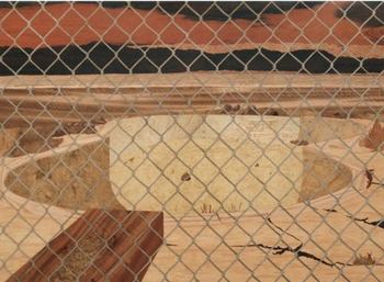 Curated
by Elizabeth Burke, it’s an excellent show (more later today) off the
deep end of the unruly expressive. The context throws her craft roots
in high relief, where they stifle her narrative content.
Taylor’s
inspiration began with a visit to the Met, where she was struck by 15th
century Italian marquetry, or wood inlay. Using techniques she mastered
from the period, she creates bleak landscapes with a charged
psychological content reminiscent of Eric Fischl.
What saves Fischl from being swamped by the inherent drama of his
tableaus is his paint handling, which is nervously silky. His content is his paint handling and the reason his edgy dramas continue to haunt.
Taylor
was raised in Las Vegas but is not interested in high rollers. She
focuses on what is bleak and dying in the sun, the trashed grounds and
working poor piling up around the edges of reckless high hopes.
She
calls her wall pieces paintings, which they are not. If she finds a way
to make the meticulous refinment of her production work for her
marginal narratives, she’d be unstoppable. What doesn’t work as a
painting could as a functional object, and she appears to be moving in
that direction. (Click through to Room, here.)
How about boxes that are boxes, or, as Marianne Moore
put it, “imaginary gardens with real toads in them”? She needs real
toads, real functionality. Her solution comes from Jasper Johns:
Take an object. Do something to it. Do something else to it.


