


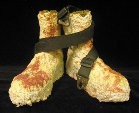
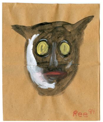
Heather Cook, 2008, via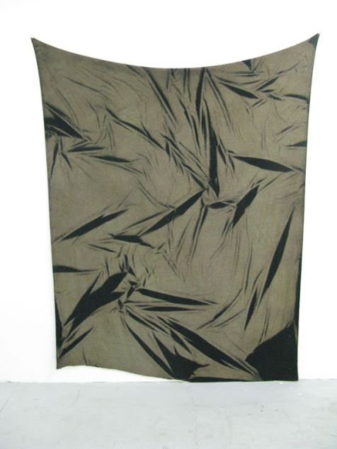 The brothers Eli Hansen & Oscar Tuazon, Tent, 2008
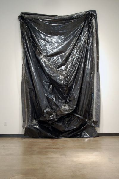
Regina Hackett takes her Art to Go
Heather Cook, 2008, viaThe brothers Eli Hansen & Oscar Tuazon, Tent, 2008
In the art world, there’s a remarkable outpouring of support for U.S. soldiers fighting on two fronts. Their government under Bush & Cheney lied its way into Iraq. Afghanistan was an afterthought. However justified a military response might have been for the latter, the result is a mess. Increasingly, the idea that there are better ways to win hearts and minds is gaining ground.
In the late 1960s, soldiers coming home from Vietnam rarely found anything but contempt from artists addressing the war. (He’s the universal solider and he really is to blame.) Forty years later, anti-war sentiment among artists is as strong as it was then, but denunciations of soldiers are rare.
Below, a sample of what’s out there, from the U.S. and beyond.
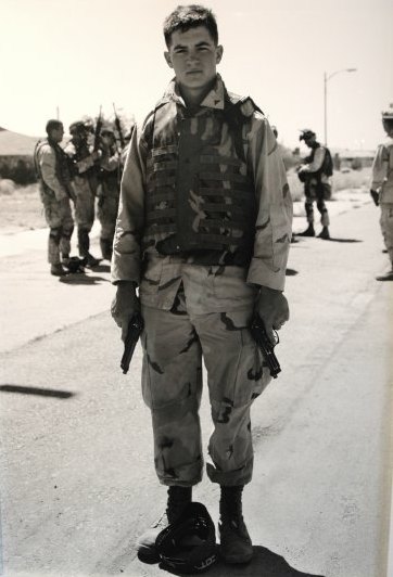
An-my Le, from 29 Palms, 2003-present. (Image via)
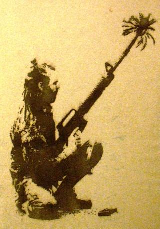
 Eli Wright, from the Combat Paper Project, 2009
 Jon Michael Turner, from the Combat Paper Project, 2008
 Emily Prince, from her series, American Servicemen and Women Who Have Died in Iraq and Afghanistan. Included by Robert Storr in his 2007 Venice Biennial.
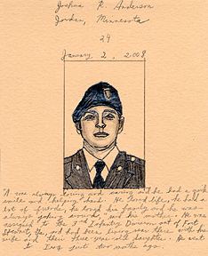 Prince:
The numbers
kept coming up in the daily reports. Five here, fourteen there,
one day after another. And then the growing figure mounting
over a thousand. Peripherally it was ever-present, but still
only an abstraction. It was no longer enough to know how many.
I needed to see pictures of them, to familiarize myself just
a tiny bit more with what was happening far from my warm home.
And it really isn’t much. It too is a mere summary, just
one more step beyond bare numbers.
Yet for me it is something. It means spending time with each
one. It is looking into their eyes to see who is now gone. It
is following the line of their brow and trying to perceive the
expression there. It is a visual and visceral exploration of
these individuals by way of their faces. It is my own eyes and
my hand tracing out some very slight acquaintance with what’s
occurring.
Krzysztof Wodiczko, The Veterans’ Project, 2009, ICA Boston
Wodiczko to Boston Globe art critic Sebastian Smee:
“The work I have made so far about veterans has been kind of ‘out
there.’ I want this one to be more about ‘in here,’ ” he says, tapping
his head.(more)
 Eros Hoagland, from Soldiers Fighting Our War In Iraq, ongoing. Eros is the son of famed war photographer John Hoagland, who died in El Salvador in 1984. He was 36.The bullet that killed him was U.S. Army issued.

The two best art critics still employed by a U.S. newspaper who don’t work for the New York Times are both in California: Christopher Knight at the LA Times and Kenneth Baker at the SF Chronicle.
There are no art critics on staff at daily newspapers in Seattle, Chicago, Miami, Dallas and Houston, among others. The admirable Douglas Britt works for the Houston Chronicle on contract. Even though he has the output of two staffers and has brought the paper back into the national discussion, the Chronicle has not said it will restore the position.
A newspaper art critic differs from colleagues at art magazines in one essential, and it’s not that the former is less savvy than the latter, although that is frequently the case. A critic at the newspaper aspires to a general audience. The chance to hook somebody with a review who’s flipping pages to get somewhere else is tantalizing.
Without newspapers, those accidents appear to be less likely to happen, but there is more depth and range in each separate field, with Web sites available to run on a constant scroll across the face of cell phones.
In that context, art coverage in Golden State newspapers remains golden.
Here’s Knight on MoCA. As ever he’s making the case for Los Angeles:
But this is not just a promotional treasure-house show. Installed
chronologically by chief curator Paul Schimmel, it also tells a story —
although one that’s rarely heard. The postwar rise of American art is
paired with the simultaneous rise of Los Angeles, from shallow
backwater to cultural powerhouse. (more)
Kenneth Baker is more detached. He makes his case artist by artist and doesn’t care about regional positioning:
[Read more…] about Newspapers with art critics: California shines
By giving to and buying from Suyama Space‘s garage sale. Donated objects include fancy chairs, tables, china, fiesta ware, silver, architectural accessories, toys, tiles, textiles, art objects and antiques.
Drop off contributions at 2324 Second Ave. till Dec. 1. Need pick up? Call 206-256-0809. Sale Dec. 5, 9 a.m.-5 p.m.
Sample wares:
Critics in the Northwest appear to be vying for the punchline position from an old anti-feminist joke:
Q: How many feminists does it take to change a lightbulb?
A: That’s not funny.
We fall all over ourselves in our haste to tell Portland’s Jim Riswold that he’s not funny. I’ve done it. Jen Graves has done it. Chas Bowie is doing it now, in response to Riswold’s show at Augen Gallery.
Me:
He doesn’t have the depth to compete with Mexican graveyard humor, even under the utterly false guise of a Hirst tribute.
(Not just false but utterly false. more)
Graves:
Riswold makes big, glossy, colorful photographs that reach for satire but amount to little more than low-calorie artistic cannibalism. (more)
Bowie:
It doesn’t take a degree in art history to get Riswold’s one-liners. One of the show’s better photographs, for instance, a small still life titled “Damien Hirst Gets a Fish for His Seventh Birthday,” alludes to Hirst’s infamous sculpture of a dead shark by imaging the artist’s boyhood fish tank, occupied by a singular fish skeleton. Seeing as Hirst first exhibited his 14-foot tiger shark in 1992, Riswold’s commentary is as culturally relevant as a Monica Lewinsky joke. (more)
Mike Leavitt cannot claim to be any more nuanced, but his home town (Seattle) hearts him. I post examples of his art toys on a semi-regular basis. In New York, William Powhida is as subtle as a sledge hammer. Reaction? Pant, pant.
What’s wrong with Riswold? Why do critics rain shock and awe down on his head? He moved to art after a big career as an ad man. Could it be (at least partly) the oldest of NW critical tropes, that commercial success, especially in a commercial field, is suspect?
Riswold’s Retired Jesus is pretty funny and, dare I say, well done.
Q: How many art critics does it take to change a light bulb?
A: That’s not funny.
Before he became director of Western Bridge, Eric Fredericksen was an art critic.
To wit, his review of Whiting Tennis in 2000:
WHITING TENNIS’ new work is dumb. Dumb as in dumb luck, dumb as in mute, dumb as in the best solution to a problem is the simplest one. In these forms, dumb is good. And in art, this kind of dumb is rare.
Art is rarely free of gamesplaying, of a strategically marked-out position that the artist can work from, of some role that defines readings and defends the value of the work. Tennis’ position for this show is dumbness. In his cogent, helpful artist’s statement (these two adjectives apply to almost no other artist’s statement) he writes that he’s “the kind of person who’s struck dumb by a child’s painting or a little canvas-board winter landscape with birds, and thought it odd that after 15 years or more of ‘painting’ I’d never sat down and tried to make a ‘picture.’ So I did, literally sit down and try.”(more)
Before he was an art critic, he was a singer, as in, he sang in the shower. Years of singing in the suds led logically to karaoke, and karaoke left him with theories he plans to share Wednesday night at 7:30 at On The Boards. Interview with Eric about his performance here.

It’s possible to be famous long past your lifetime on the strength of one piece. No one exemplifies that possibility as well as Meret Oppenheim, whose Object from 1936 is at the Museum of Modern Art.
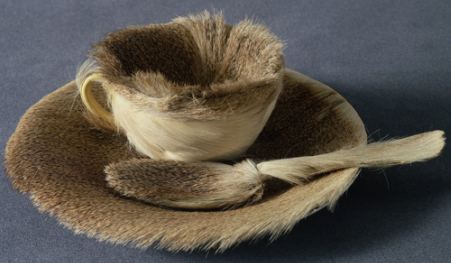 Its origins, from MoMA:
This Surrealist object was inspired by a conversation between Oppenheim and artists Pablo Picasso and Dora Maar at a Paris cafe. Admiring Oppenheim’s fur-covered bracelet, Picasso remarked that one could cover anything with fur, to which she replied, “Even this cup and saucer.” Soon after, when asked by André Breton, Surrealism’s leader, to participate in the first Surrealist exhibition dedicated to objects, Oppenheim bought a teacup, saucer, and spoon at a department store and covered them with the fur of a Chinese gazelle. (more)
Its influence continues.
In the anything-goes, free-form era of contemporary criticism, only those whose tenure is guaranteed can dare to be dull. They write to keep a well-fed hand in. Others tap dance. They’re as good as their clicks. Dull used to be the critical norm. Few long for a return to those days, but back then, attention came to critics who articulated a rigorous set of ideas, not necessarily a snappy approach to the sentence.
Personally, I’m all about snappy. And instead of possessing concepts which I bring to bear on the art, I respond to the ideas in the art. Paul Valery called it the equivalent of playing a card game whose rules change with every hand.
Undoubtedly, that approach is generational. I started at the tail end of the anti-Clement Greenberg era and never left. (Marat/Sade: We’re all normal and we want our freedom.) But there are limits. No, there aren’t, but there should be. Critics who free associate in front of an artwork aren’t critics. They’re flying kites in their heads. They’re taking a test for a psychology course.
Few artists attract as much snap, crackle and pop nonsense as Luc Tuymans. His paintings are slippery blanks, unpleasantly representational without being dark. His moments are worth missing yet there they are, the thin-lipped equivalents of gray days.
The Secretary of State 2005
oil on canvas, 18 x 24-1/4 inches David Zwirner Gallery
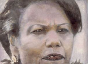 The image above is perfectly transportable. Seeing it reproduced online is not significantly different from seeing it in person, which is, of course, remarkable for an oil painting. Note the tooth and the Buddha ear. The tooth on the left is like one slightly-longer table leg tipping the balance out of true. The long earlobe? Not in this case an old-soul signifier.
Pigeons
2001, oil on canvas
128 x 156cm (Image via)
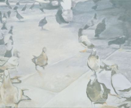 Exhibit A, part of an essay on Tuymans from the online Saatchi Gallery:
Luc Tuymans’s pigeons bop in dumb disarray. Dirty and disease-ridden, they’re a strangely curious mob, a metaphoric stand-in for ourselves. Painted in the muted tones of history, Luc Tuymans offers a chilling ultimate truth about humankind. He makes a cold comedy of a terrifying thought.
Dumb disrray? Who you calling dumb? Real life street pigeons can, when motivated by food, easily learn to tell the difference between Van Gogh and Chagall. (Abstract here.)
Dirty and disease-ridden? Not these pigeons. They’re color inflections on canvas. In their price range, believe me they’re cared for.
Muted tones of history? What? Stand-ins for ourselves? Says who? Chilling ultimate truth? Cold comedy? Come on.
Even the great Peter Schjeldahl flails around for meaning in his (as always) richly entertaining essay on Tuymans in The New Yorker. Schjeldahl claims Tuyman’s work dramatizes the fallen state of painting since the 1960s. If anything, it dramatizes the reverse, that you don’t have to be an angel to dance upon the head of a pin as the audience swells around you.
an ArtsJournal blog
