1. Susan Robb. Heat rises.
2. Joshua Allen Harris. A cuter version of heat rises. Who doesn’t like plastic bag animals swaying over subway grates?
3. Franklin Cassaro. Make your own drum.
Regina Hackett takes her Art to Go
1. Susan Robb. Heat rises.
2. Joshua Allen Harris. A cuter version of heat rises. Who doesn’t like plastic bag animals swaying over subway grates?
3. Franklin Cassaro. Make your own drum.
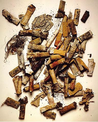
Irving Penn is the Fred Astaire of 20th-century photography. In his studio, a pile of cigarette butts became as pure as Communion wafers. BBC obit here. Many more to follow.
Trailing the much smaller but much more game Henry Art Gallery, the Seattle Art Museum has a new blog titled SOAP. (As in, soft soap?) While it’s unlikely to top the Henry’s blog, called Hank, SOAP is off to a good start thanks to a charming entry from SAM’s new director, Derrick Cartwright.
I love SAM and can’t imagine living in Seattle without it, but (there’s always a but), it has a tight-ass, top-down approach to communication that does not lend itself to the free flow of a blog. Its communications staff, good as it is, labors under this burden.
Cartwright acknowledges this in his own tactful way:
SAM, not unlike other institutions at which I have worked before, puts considerable thought and care into all of its public communications. The blog held appeal as a PR tool, but also posed a distinct risk, since staffing at the museum is currently very tight and no one wanted to rush forward with something that couldn’t be maintained at the usual professional standards of SAM.
I’m intrigued by this sentence:
I confess that I have never written a blog before, although I have recently had the painful experience of being blogged about.
What? Name names, Derrick. Your pain will drive traffic. In the meantime, despite staff shortages, it’s time to do something about SAM’s Web site, which (usually) looks pretty good when clicked on but is unspeakably stingy at releasing information on exhibitions and collections.
In 2001, at age 33, Margaret Kilgallen received an MFA from Stanford, had her first child with her husband, Barry McGee, and died of breast cancer.
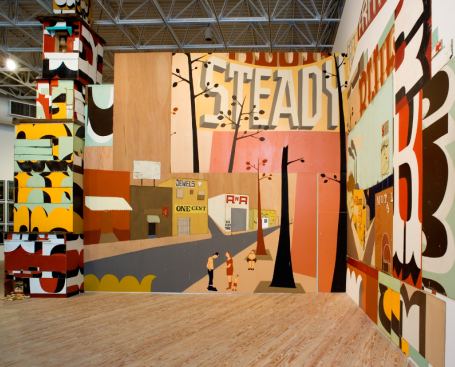
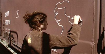 What she made lives behind her. Her storefront installation, Main Street from 2001, is one of the best things in The Old, Weird America: Folk Themes in Contemporary Art, now at its final stop at the Frye Art Museum.
 Borrowing signs and symbols from Stuart Davis’ street jazz, Kilgallen filtered them through Jim Nutt and Gladys Nilsson‘s hopped-up, skinny-legged figures of The Hairy Who, a Chicago group that Nutt and Nilsson transplanted to Northern California in the late 1960s and early 1970s, when Nutt was teaching at UC Davis.
Getting a good reception from Bay Area Funk and Dude Ranch Dada practitioners who were also on the faculty, Nutt’s and Nilsson’s impact rippled up the coast to Seattle and down to San Francisco and was still percolating when Kilgallen (and McGee) came of age in the 1980s.
Main Street is her monument. Full of scale-shifts, fractured street advertising and sad sacks caught in colored light as if the day loved them, it records the ordinary raised to gut-bucket sanctity.
I like things that are handmade and I like to see people’s hand in the
world, anywhere in the world; it doesn’t matter to me where it is. And
in my own work, I do everything by hand. I don’t project or use
anything mechanical, because even though I do spend a lot of time
trying to perfect my line work and my hand, my hand will always be
imperfect because it’s human. And I think it’s the part that’s off
that’s interesting, that even if I’m doing really big letters and I
spend a lot of time going over the line and over the line and trying to
make it straight, I’ll never be able to make it straight. From a
distance it might look straight, but when you get close up, you can
always see the line waver. And I think that’s where the beauty is.
After an atom bomb strikes its target, there’s a moment before victims are blown out of their shoes or blasted onto a wall as carbon shadows. Call it a soul flash. Matthew Offenbacher paints its presence in daily life. He paints it as a cat turns its head, flowers start to die in a vase and a fish, turning in its watery gyre, sustains the universe.
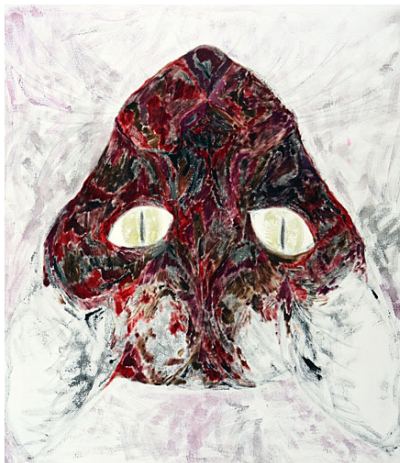
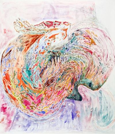 In acrylic and oil on treated cotton, each in the series on view at Howard House is 52 by 45 inches. None has a title, which is a shame. Offenbacher’s titles are worth collecting on their own, such as, from this painting from 2007, Recognizing the diligence with which death approaches, and trying to recognize also the desirability of her arrival, and to take advantage of such recognition.
Offenbacher is mildly mystical in an early-20th century vein, modest but aspiring to consequence, hopeful that there is a key and a mystery it will unlock.
Earlier paintings looked burrowed into existence, woven and bulging slightly along each line as if there were a roden beneath it, pushing up dirt.
Currently, lines are fractured and color smeared, bringing to mind the early paintings of Joseph Raffael, unfortunately not online. His later work is so decorative it’s hard for anyone who wasn’t in the Bay Area in the late 60s to believe that it ever mattered at all, and yet all my life I’ve remembered a painting of a man with birds in his turban, they and he living together in perfect, light-struck calm.
I doubt Offenbacher will take the same route. He’s too (for lack of a better word) smart. Even if given the chance to live in a fine house for becoming a shadow of himself, he wouldn’t take it. Unlike Raffael, what interests him is what art can deliver, not what are can illustrate.
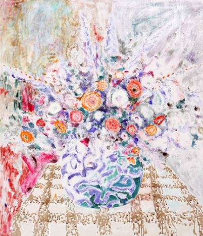 Through Oct. 31.
Tony de los Reyes specializes in suppressed landscapes. When he paints women, they’re suppressed landscapes, too.
A couple of years ago he was painting in oil alkyd: creamy white grounds with blue figures. Those surfaces look shellacked but aren’t. Sometimes a bird (always blue) flies by, high overhead. Sometimes there are sheep, ships or flowers, and sometimes a tree leaning into the air from an outcropping of ground, inspired by a combination of delftware china and traditional Chinese landscape painting.
Image via: The Chase, 2004
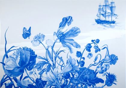 Recent paintings (and one sculpture) at Howard House could be called Fade to Black. Painted black space in ink and oil on linen overwhelms form, seeps into it and changes its character. His bright flowers are gone, replaced by the foam of a poisoned sea.
The Prophet, 2009, polyester resin, aluminum, wood.
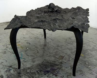 From delicacy he has moved to a bombast that resembles Robert Morris’ in the early 1980s. As Ricard Lacayo noted in 1984:
Two years ago, Robert Morris began showing a series of bas-relief
works that seemed to vent nuclear anxieties in a visual language of
medieval fatalism. Embedded in an infernal slurry of plaster, human
faces and fractured skeletons held the poses of apocalyptic death
agony. This year Morris returned to painting with a series of more
ambiguous abstractions. But a skeletal frieze has been retained along
the frame to specify the note of mortal dread.
Morris charted Dante’s Inferno. De Los Reyes is filtering Herman Melville through a lens of contemporary environmental degradation and economic collapse. De los Reyes’ paintings suggest the seeds of our ruin were there all along, in the chaos of our hearts. (William Carlos Williams: “The pure products of America go crazy.”)
1851:
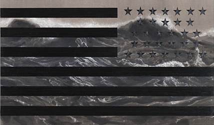 As with Morris, the bombast has a built-in problem. If it fails to overwhelm, it becomes its own parody. What de los Reyes has given up to get here is his subtlety, insouciance and tough-minded allure.
Also like Morris, what saves him are high craft values. His chaos is well made, which gives it focus and depth. After the white whale breeches and dives in 1851, the pool that churns in its wake under the stars in a backwards flag is a lizard’s eye.
Melville’s sea drove a boy stranded in it out of his mind. About rivers, however, Melville was more optimistic. From The Confidence Man:
Here reigned the dashing and all-fusing spirit of the West, whose type is the Mississippi itself, which, uniting the streams of the most distant and opposite zones, pours them along, helter-skelter, in one cosmopolitan and confident tide.
I miss in de los Reyes what he used to have in abundance, a sense of that cosmopolitan and confident tide.
Lawrence Weschler‘s essay on David Hockney’s cell phone paintings is another Weschler classic. Weschler is his own tour guide to what interests him, with none of the seen-it-all cynicism that can affect even the best art critics. Like Calvin Tomkins before him, his writing charts the process of absorbing a subject and clarifying it into revelation.
Hockney’s return to painting includes a fresh and unsalable application:
Over the past six months, Hockney has fashioned literally hundreds, probably over a thousand, such images, often sending out four or five a day to a group of about a dozen friends, and not really caring what happens to them after that. (He assumes the friends pass them along through the digital ether.) These are, mind you, not second-generation digital copies of images that exist in some other medium: their digital expression constitutes the sole (albeit multiple) original of the image.
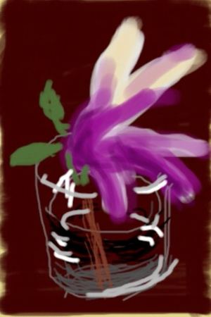
The thing is, if you are using your pointer or other fingers, you actually have to be working from your elbow. Only the thumb has the opposable joint which allows you to move over the screen with maximum speed and agility, and the screen is exactly the right size, you can easily reach every corner with your thumb.
And, Hockney on the joys of the phone itself:
It’s always there in my pocket, there’s no thrashing about, scrambling for the right color. One can set to work immediately, there’s this wonderful impromptu quality, this freshness, to the activity; and when it’s over, best of all, there’s no mess, no clean-up. You just turn off the machine. Or, even better, you hit Send, and your little cohort of friends around the world gets to experience a similar immediacy. There’s something, finally, very intimate about the whole process.
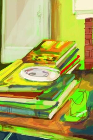
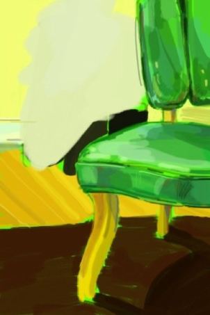
How many artists are doing this, creating originals that cannot be sold as such? In Seattle, there’s Patrick Holderfield, who seems to be taking a break from making anything else.
Is not John Sandford’s fictional advertising executive in Rough Country:
The agency over the years had accumulated foot draggers, time wasters, slow-witted weeds more suited for a job, say, at a newspaper than at a hot ad agency.
Plenty agree with Boston Globe art critic Sebastian Smee, who finds “familiar forms of patronizing ‘identity art” – art that addresses, in the most dutiful, box-ticking ways, the familiar tropes of exclusion and wrongdoing… wearingly predictable.” (more)
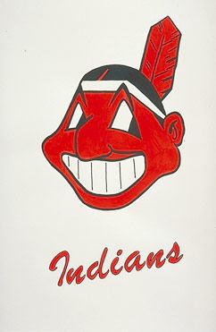
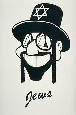
In the United States of denial, I don’t know how predictable any justice is, which is why I’m fond of Oscar Arredondo’s A Mile in My Moccasins from 2001. Subtlety is not his strong suit. (Insert eye roll from Smee here.) Arredondo holds his subject matter in his heavy hands like a bear preparing to smash a food chest. And why not? I love Jane Austen but wouldn’t want to live in her novels.
Arredondo wonders why one baseball logo is acceptable, at least in Cleveland….
Welcome to Cleveland, Home of the ….
 And others like it wouldn’t be.
Welcome to Cleveland, Home of the….
 More here.
an ArtsJournal blog


