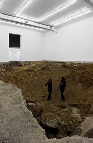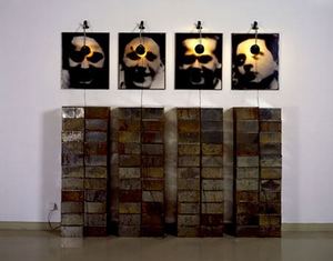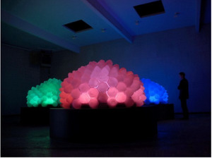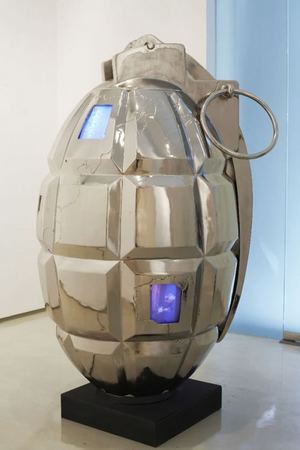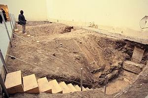
Urs Fischer, still a good idea, 21 years later
Archives for May 2009
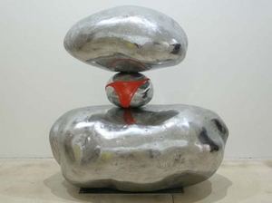
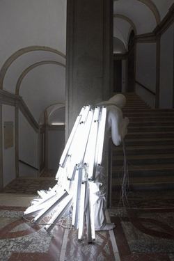
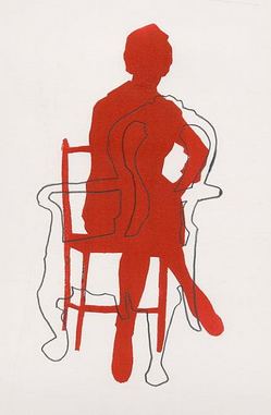
The female form from Henry Moore to Erwin Wurm
More than a decade ago, senior Henry curator Elizabeth Brown wrote about the inherent sexism in Henry Moore‘s approach to hill and dale, her essay unfortunately not online.
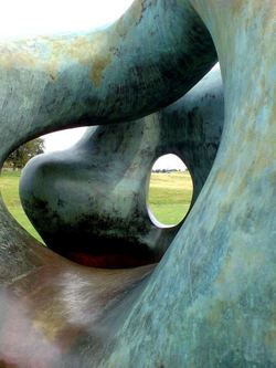 I wonder where that leaves Erwin Wurm?
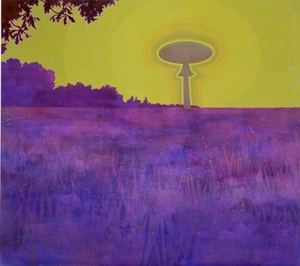
Space Needle in Japan
Friday links
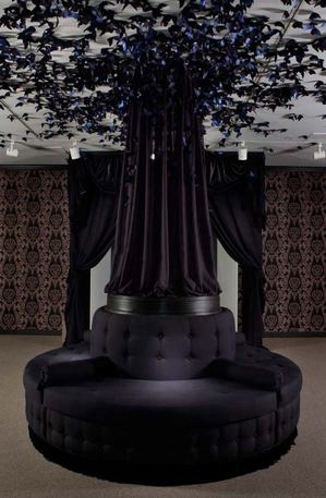
In the San Francisco Chronicle: Kenneth Baker’s stellar review of Splendid Grief, Darren Waterston‘s Victorian-style mourning parlor at Stanford’s Cantor Center. When he’s in his zone, Baker is one of the best in the biz.
Placing his own plainly anachronistic oil paintings in this environment must have given Waterston pause. For years, his paintings have evoked something of the strange unease that comes of recognizing oneself as a conscious organism. The setting of Splendid Grief heightens the paintings’ reminiscence of the Victorian vogue for seances and belief in the individual’s spirit as “ectoplasm” that might extrude itself from the body and even survive it.
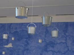
Helen Lessick’s first Texas exhibition consists mostly of barely altered mass-produced objects — metal buckets with holes drilled in them, a couple of words embossed on a mirror, store-bought fans with ribbons attached.
The alterations seemed designed to bring poetry out of the objects with as gentle a nudge as possible.
 Speaking of Texas, here’s a review plucked not at random from the essential arts catalog known as Glasstire: Ben Judson’s Six Years Later at Unit B.
The focus on objects and materials that are generally not valued for their aesthetic qualities allows Lapthisophon to draw viewers into a relationship with the poetry of the everyday, but also to consider the impact of conceptual art and criticism on mainstream aesthetics. The page from Six Years simultaneously serves as an echo of the title of the show, a kind of wall text and a chunk of raw material like the bricks and lumber.
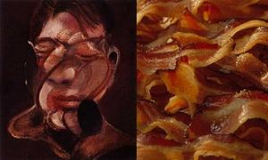
Also from Glasstire, I’m excessively fond of Roy Neinast’s comparison of Francis Bacon’s painting with, well, bacon.
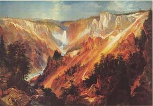
While on the subject of food, I’ve always thought Thomas Moran’s mountains looked like slabs of well-marbled beef.
In the New York Times: Holland Cotter calls William Powhida awesome, and Roberta Smith had this to say about Sophie Calle’s conceptually-rigorous unpacking of her latest in failed romance (both reviews here):
Sophie Calle’s “Take Care of Yourself” is an operatic monument to late Conceptualism, a full-throated demonstration of its means and effects. It mixes multiple mediums: photography, video, film, performance, music, dance and, above all, language, spoken, written, sung, delivered in a range of voices, styles and fonts. It combines appropriation, collaboration, randomness within a strict framework, quite a bit of real life, several forms of theory (including feminist) and no small amount of narcissism.
I wonder who’s foolish enough to date Ms. Calle. Don’t they know when the end comes she’ll reveal all (and I mean all) in installations that will receive world-wide notice?
What she did to ex-husband Greg Shepard here. I met him once, have no friends in common yet know him to be a lying, cheating self-mutilator. For the opening of the exhibit that exposed these traits, he was at her side and shaking hands with her fans. I tried not to look for bite marks.
In The Stranger: Jen Graves takes a look at a public art failure and promises a series on the theme.
What’s the latest art movement in Seattle? Public art. What? Yes. Seriously. For the last few decades, public art has been mostly thought of as a haven for losers, the place where artists go to die (or to hide). It’s not just that good public art has been the exception, it’s that good artists, with few exceptions, have avoided public art, preferring the freedom of their studios to the compromises of government work. But now, Seattle’s established and reputable studio artists–Dan Webb, Cris Bruch, SuttonBeresCuller, Lead Pencil Studio, Susie Lee, Kristen Ramirez, Leo Berk, et al.–are signing up in droves to make major public installations. Will public art kill this new generation of artists? Or can these artists save public art?
My piece on the event that motivated her response here. More to come from both of us. As a first rattle out of the box, I’ll say her denunciation of public artists who haven’t made her exceedingly small A team is excessive. But if that’s what it takes to stir the pot, then I’m for it.
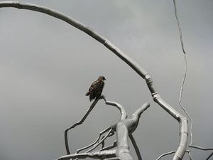
Roxy Paine: Real birds in metal trees
Roxy Paine at Seattle’s Olympic Sculpture Park, image via Seattle Art Museum:
Fat art
Damn braces: Bless relaxes
William Blake, The Marriage of Heaven and Hell
In life, corpulence signifies consumption of poverty junk food, poor choices, inertia and/or genetic predisposition. In art, it’s an opportunity. Figures who earn the space they consume are heroes.
Art began with fat people. The Venus of Willendorf was carved in limestone at least 24,000 years ago. Among painters, Rubens stands out, which is where
the complimentary adjective, Rubenesque, came from, although it doesn’t apply to his men. His fat women are voluptuous, while their fat male
companions are dim or funny in a Falstaffian vein, except for his gravely dignified Bacchus.
Lucien Freud also paints girth in both men and women; Jenny
Saville, women only, and Catherine Opie, photographing herself.
Where are we now?
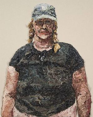
Mark Takamichi Miller paints from discarded or lost photos – prints never picked up from the drug store or undeveloped rolls he finds by accident. I love his blond woman in a baseball cap from 2003. She averts her eyes, as if the process of being in the frame is barely endurable, but she wears lipstick and sports a floral necklace in the grizzled folds of her neck.
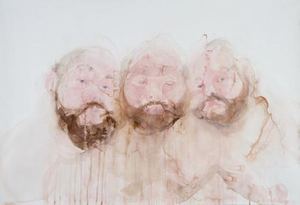
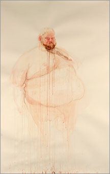
 Brian Murphy has made a career of painting himself as a massive volume with no weight. His image in watercolors is large and leaky, the brown of his beard underlining the sand-pink cloud of his face. He’s a tempest of his own making, creating weather states as self-portraits. Because you can see through them, they’re apparitional, an insubstantial pageant ready to melt into colored air.
 Using watercolor and graphite, Geoffrey Chadsey is all about attitude. His work is delicate but packs a punch.
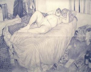 John Feodorov ‘s fat people live in their heads; in dreams they avoid responsibility.
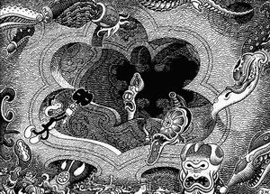
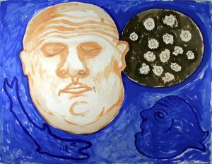 To paraphrase Carl Dennis: Chewed by his appetites, he chews his prey. (1) Takeshi Murata (2) Jim Woodring
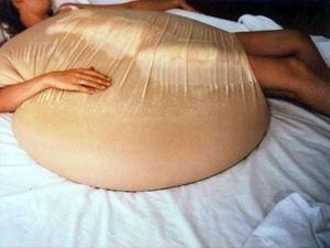 Also, Donnabelle Casis, free-floating fat in oil paint, here.
Light as a stringed instrument – the sequel
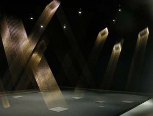
When the Seattle artist team known as Lead Pencil exhibited Arrival at 2 a.m. in 2007…
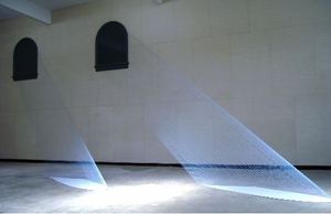 the piece reminded a lot of people of Mariele Neudecker’s The Internal Slipping Out of the World at Large from 2000.
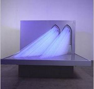 Much talk ensued, with little in the way of conclusion. Since then, other examples of the form have continued to circulate, suggesting that Lead Pencil cannot borrow what is already widely distributed.
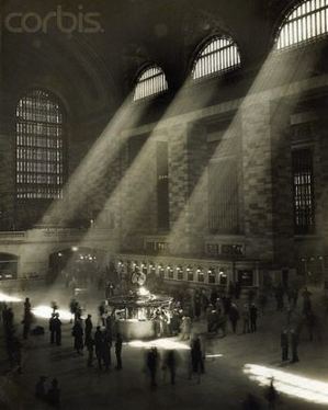
(Grand Central Station, anonymous, probably from the 1950s, from Corbis)
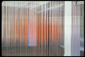
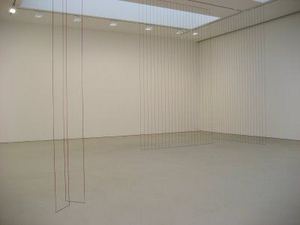
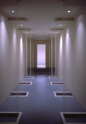 Hirschfield:
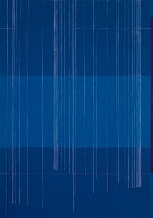
I have been using monofilaments to investigate the phenomenon that results from the creation of ephemeral planes that pass through, divide, and ultimately become an integral aspect of the space in which they exist.
He’s interested in changing space without occupying it, or, as Wallace Stevens put it in Thirteen Ways of Looking at a Blackbird:
I do not know which to prefer,
The beauty of inflections
Or the beauty of innuendoes,
The blackbird whistling
Or just after.
Fred Sandback is the master of ephemeral planes.
 Since his death, Alyson Shotz has been coming up fast on the inside rail.
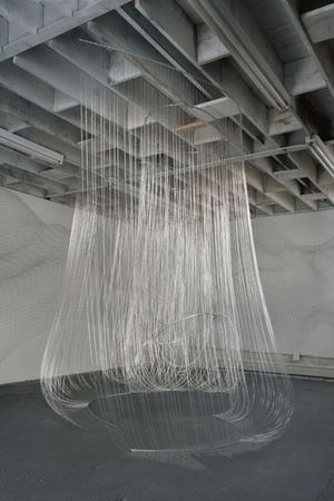
Painters have a stake here too.
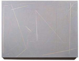
What Wayne Thiebaud said years ago, that art is more about likeness than difference, still holds true and is worth remembering the next time a confluence is understood to be a copy.
Heidi Anderson at Cairo
Heidi Britt Anderson and her twin sister Erika Lynn Anderson were born in Seattle in 1976. Both are artists, Heidi in Seattle and Erika in New York.
(Shared Web site here. All images here are Heidi’s. Click to enlarge.)
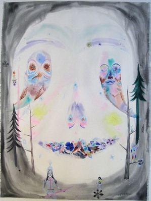
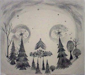 Just by looking at the Web site, which isn’t enough evidence, I think Seattle got the better deal. While Erika’s drawing is heavy and awkward, Heidi’s is confectionery light. Since they’re both dealing with the mystical end of other-worldly ventures, light is right.There’s a lot of folk fantasia around, but Heidi’s has every sign of the genuine.
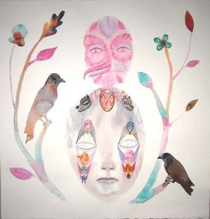 She opens in Seattle Friday night at 7 at Cairo.
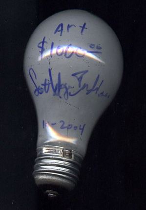
Let there be light (bulbs)
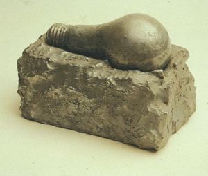 Joseph Beuys, via Judith Tannerbaum
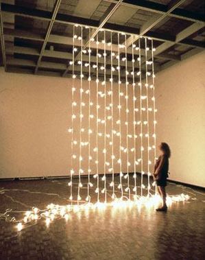 Haegue Yang
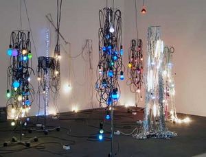 Atsuko Tanaka, Electric Dress, via Martin
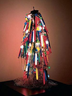 The Art Guys, Travel Light
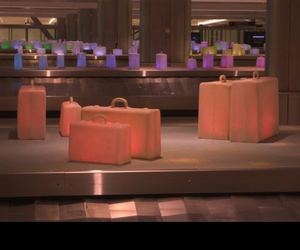 SuttonBeresCuller, Homesick
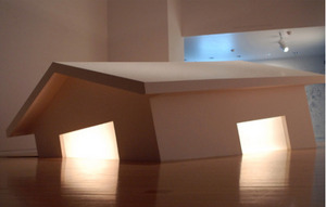 Christian Boltanski (via Claude Zervas)
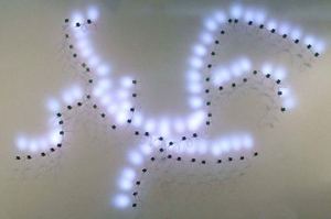
Tivon Rice, Resolution
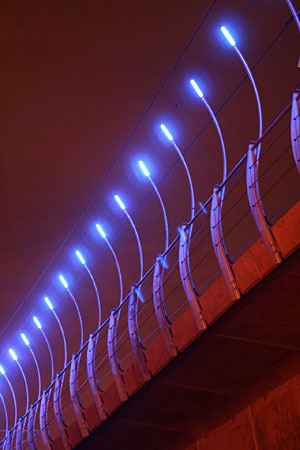 Brian Jungen, via BeFruitful&Multiply
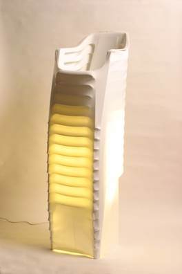
Tiffany Holmes, darkSky
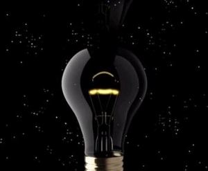 Ted Apel, via TJ Norris
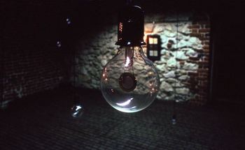 Roger Hirons (dipped in semen)
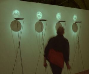 ANABA, via Martin
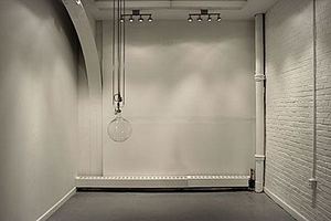
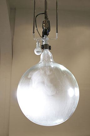
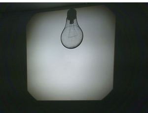 Tavares Strachan, Cloud Chamber
 Strachan, Cloud Chamber, detail
 Christina Seely, Metropolis 40°25’N 3°41’W (Madrid)
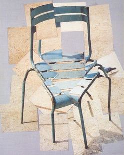
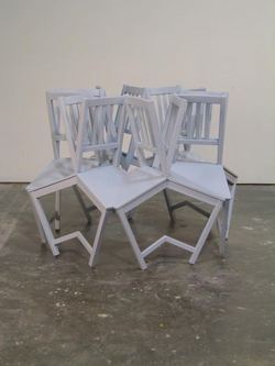
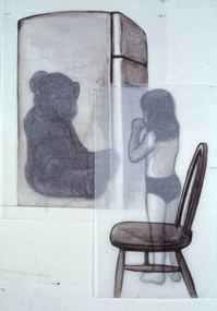
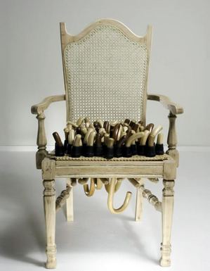
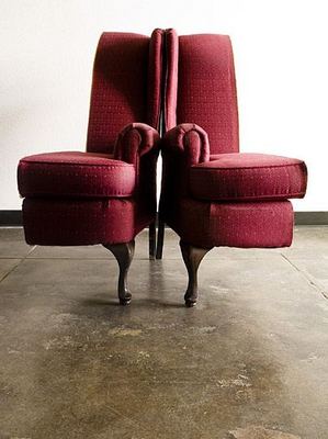
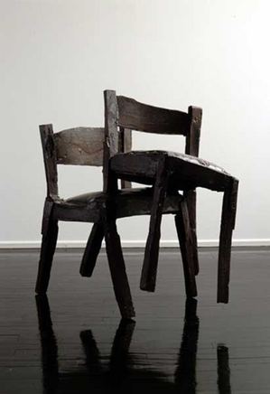
Chairs: perversions of the functional
When I enter a room, I look for a chair. Almost any room, almost any chair. The assumed context of this expectation is unexamined except through art, where it is frustrated.
Roy McMakin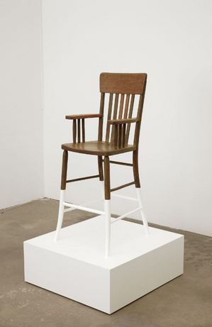
All the classics, from Duchamp and Beuys to Bruce Nauman, at DesignBoom.


