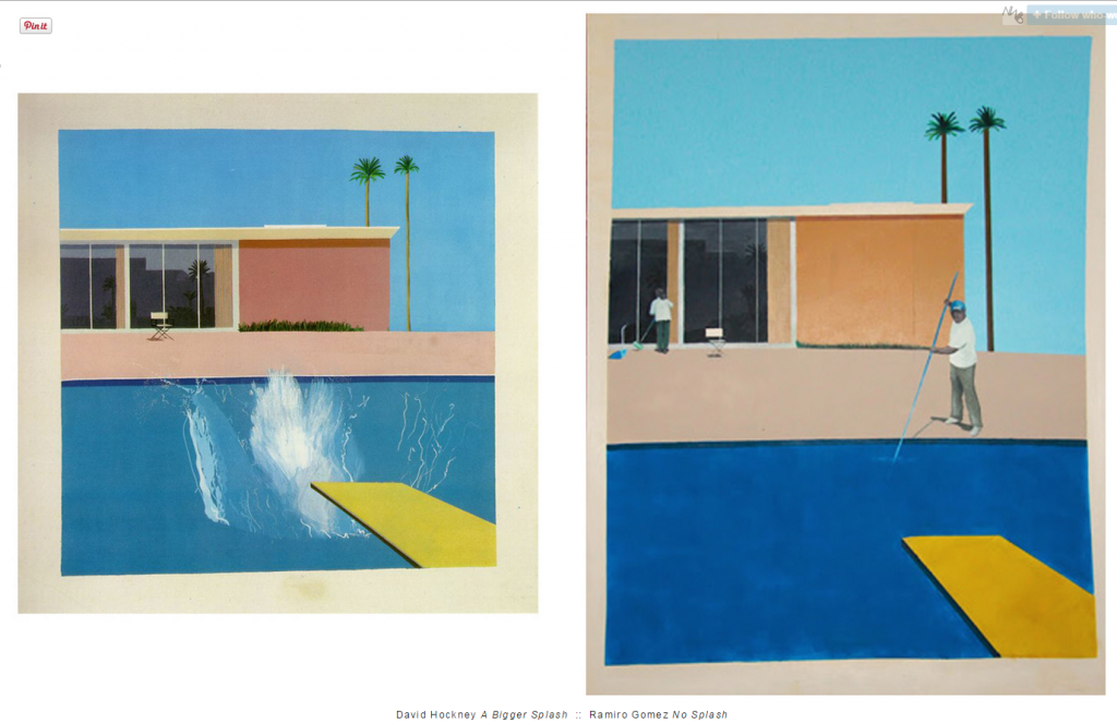
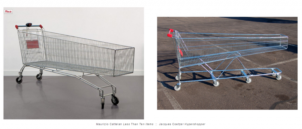
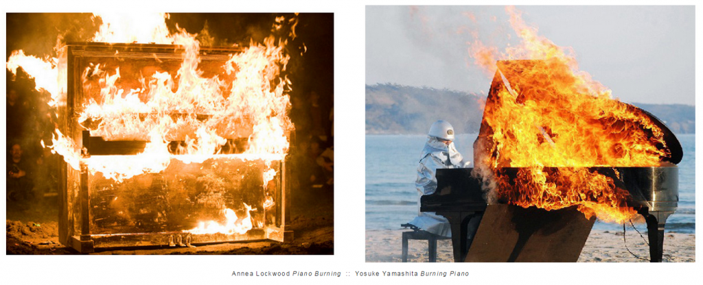
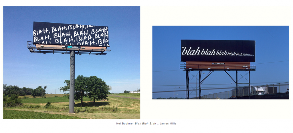
According to founders Alison Feldish and Derek Frec, the website ….. “Who Wore It Better is an ongoing visual research project presenting associations and common practices in contemporary art. This platform was created to promote formal and conceptual dialogue over originality.” Everyone should drop by the every month or so.
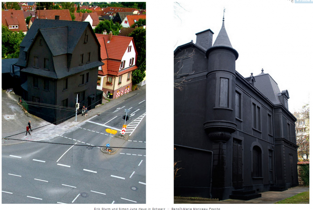
I am guilty of noting artists that should have known about each about. My comparisons were not about “originality” but rather promoting my observational and research skills. The comparisons should allow me and others experience the concept with more depth. Abstracting ideas is impossible without comparison. Like above, a single black house leads to thoughts about the physical and psychological impact of blackness in the city or on the feeling of home. With two or three black houses at different times and places and shapes, perhaps I can see what the blackness is doing and not doing. ( Right now I can’t think of anything.)
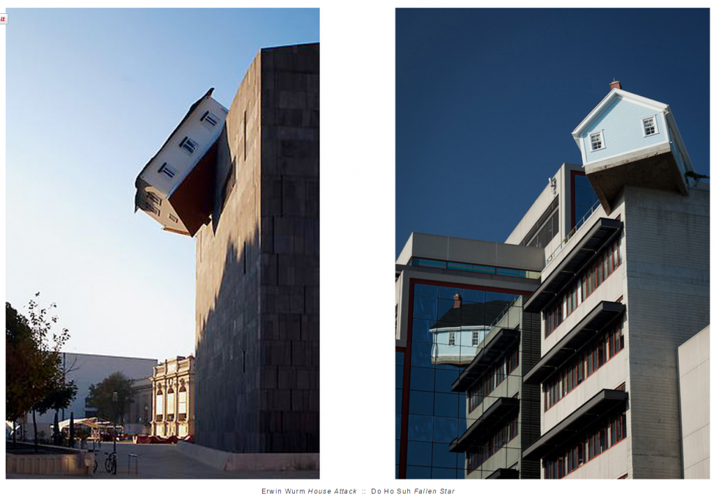
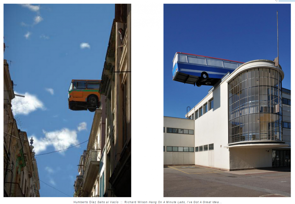
Today, it occurs to me that the repetition of ideas gives public art agencies the freedom to ask for something particular. If you have a famous story in your city of a falling house, does not the work of Wurm and Soh lets you ask for another one? With the ability to discover many of the same, the fear of “stealing” seems silly. Like the 19th century men on horses, is it not OK to ask for a bus in your town. Like architecture where repetition and borrowing has a 10,000 year history, can not public art agencies call for artists to create for them – an inflated duck or rabbit – or anything else they saw on the internet, exhibition or cityscape.

REALLY REALLY great site!!