A detour from new critical methods development to respond to Flyover. Or maybe this is on the way.
Unlike the museum or journal, the players in the selection, design and implementation of public art and public space do not have the luxury of open exploration as the primary value. Everyone that has served on a diverse, but sophisticated design competition jury, knows that generally the museum-type artistic merit is most evident in the runner-up or second runner-up. The winner must satisfy a higher percentage of different values and attributes.

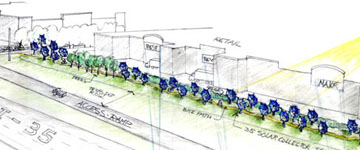
Harries & Heder Drawing for Sunflower, 2006.
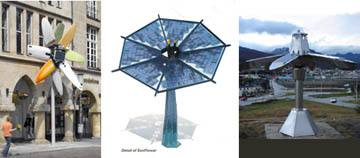
As a recent example from Austin, Texas, Harries & Heder won the Catellus Development Group’s competition for public art in front of a new suburban shopping strip center on Interstate 35. They were the correct winner, but The Art Guys envisioned the better public artwork. Harries & Heder project, to be completed later in 2007, is a rambling linear sequence of smaller shadetree-sized flowers with pedals of solar collectors. The work is less technically complex than Joaquin Fargas’s Sunflower and less joyfully big toy than Marko Lehanka’s Munster ’07 flower sculpture. If the giant sunflowers where real trees on a bike path, then no one would even notice any formal composition. But as a double row of blue metallic structures, the bike ride might be invigorating event.

Lehanka – Harries & Heder – Fargas
Historically, Harries & Heder 14 foot diameter “Sunflowers” requires homage to Christo’s 1991 Project “The Umbrellas” in Japan and California (with a nod to Martha Schwartz’s Flying Saucer Garden, ’98). The Umbrellas and the Gates are Christo’s only projects of repeating forms at a human scale. At a distance, the huge 26-foot diameter blue umbrellas accentuated the terrain while creating a beautiful pattern of blue dots. When under to the umbrellas, a ceiling of blue spread out, or with less umbrellas a sequence of places arose. “Sunflowers” doesn’t enhance nor embrace a landscape like Christo.
Umbrellas, 1991 (Christo) and Sunflowers, 2006 (Harries & Heder)
According to the artists, the work will be an “Icon for Sustainable Development” and will earn back 30% of its original cost through sold kilowatts. Here in lays the multiple values of public art. Harries & Heder’s persuades by the symbol of sustainability – the same way that past public artist carved the “White Man defeating the Indian” or the “Determined Spirit of the American Farmer”. The symbolic relationship between the sunflower, the sun and the high-tech disk combines with the functional attributes of shade for cyclists and distraction of driver’s eyes from the delivery trucks behind. Harries & Heder won because diversity of values – societal, functional and visual. These are the heart of judgment for public art and public space.
But Sunflowers fails deliver a fresh re-making of Christo’s legacy or an inventive synthesis that sparks my imagination to other things. I just think solar power in blue.
The Art Guys, Austin, 2006
According to one source, The Art Guys were the runner-up amoung other finalists Mel Ziegler and Dixie Friend Gay. The guys proposed playful figures of suburbanites on the top of a sequence of standard highway light poles. The figures are less universal than Jonathan Borofsky’s Walking to the Sky series and more static than Chris Doyle’s Leap.
The Art Guys, 2006 and Borofsky, 2004
Learning from the highway Texaco star or Shell seashell, the Arts Guy want a skyscape, rather than a landscape. Above the strip center in the sky, people joyously or painfully moving their bodies. Of course its a little silly, but substituting “people in joy” for a 19th Century victorious general, new world explorer or angel makes my imagination think of the emotional condition of those old stone or bronze column sitters from the past. The Art Guys have removed the solid highway logo of traditional advertisement naming and substituted the contemporary advertising branding of spirit as appears in the I-Pod dancers. Like Borofsky’s Skywalkers, I imagine the cyclists stopping for photo shots looking straight up.
Yet the Art Guys proposal lacks a solidity of form and rationale. The multiple poles with objects to make a skyscape were recently utilized by several of the competition entries for the Landmark Wales on highways. In the three announced of six competitions underway, solid form makers are 3-0 against openness. But more than prejudice against the lightness, the Art Guys failed to make the sync between a social purpose and the artwork. Exactly how would the work be explained to the average person? Only art could be the excuse.
Perhaps on the big blue bear and ghost trolley car tomorrow to find an artistic firing on all cylinders.
UPDATE FROM THE ART GUYS
The idea of the pole sitters originates from the word “Stylite”
We did not make reference to them (in the competition text), we did use the word as our title, so anyone who needed to might have found that connection. It is up to the viewer. We were more interested in the way a figure might look from the ground way up on a pole, like the pole sitter competitions prevalent in the early part of the 1900’s.
“What accounts for the minimal role of value-judgments in contemporary reviews?” The question from Flyover.
I VALUE “THIS!” Does the artwork have “this”? Does the artwork execute “this” to maximize its intensity and clarity?
Clearly, every critic performs the task above. So what do you mean by value-judgment? Do you mean a set of social values that the critic applies to the artwork even if the artist does not address those values? Or you mean advancing an artistic agenda by selecting works of art that provide the best examples to clarify the artistic agenda and its contribution to art or society?
As the discussion leader, please clarity?
In regards to the classic “value-judgment” thing, it does not happen in the journals that “we” are reading. It is happening everywhere else. The answer to the classic thing is that a certain thoughtful element of world culture wants to be open and free to all concepts and ideas. We love to see where the ideas travel. Restriction by an overlay of external values limits the possibilities.
This world culture group is very strong in a variety of museums, publications, universities, etc. If you want to play with this group, then you adopt their values – the value of openness. If not, many other groups with different values exist to join.
In terms of my values, I encourage our best and brightest to join or to form different groups around values. How else can we have a diversity of human experience with the coming global end to traditional geographic diversity? If we don’t form more groups, then we may be left only with economic diversity.
Perhaps the better question. What accounts for the fear of critics to declare themselves part of a different group? Are you willing to face the rejection of your city’s contemporary art museum and the links to the broader club of that universe? Or do values exists that allow the critic to float in a few groups, including the MOCA of ____________?
Glenn Weiss of Aesthetic Grounds, August 25, 2007
