As the super-connected and hyper-knowledged human planet moves forward in the last phase of geographic diversity, the analysis of any high culture specialty like visual art appears as useful as a pair of chopsticks. Most of the cultural activity generating and consuming the visual stuff just slides out of its grasp back into the bowl.
Public Art exists in a unique position outside the criticism of both the high art and the high design establishments and their historic traditions. Created mainly by people educated in universities, these artists quickly fall away from that high art dialogue and seek other kinds of visual, spatial and storytelling with connections to a much broader world.
What happens if we start to evaluate public art from these other traditions? And I don’t mean some critic’s “bone” toss and then back to the art point-of-view. Public art success might be based on these other traditions as well as the fine art one. Isn’t every tradition “collectable” and loved?
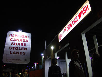
HOCK E AYE VI, Presence and Resistance, 2006, Photo: Miklos Legrady
Let’s start with an easy one – public signs. Many artists utilize this tradition, but we could have picked gardens, cars, TVs, dolls, maps………….on and on and on. In this method, we need to set the stage for the other tradition first.
Today’s general public (that is all of us) has a lifetime with public signs. We don’t know urban space and life without them. We always have a “name” for where we are. Verification through the simultaneous appearance of place name and sign is psychologically expected. The lack of signs makes Havana a much stranger place than Times Square.
The other public signs provide non-geographic information. We read the public signs to learn something or think about something or re-live a feeling. (Yes, we take action and read, not merely mindless observation.) When in 2005 artists Rainer Dempf &
Christoph Steinbrener “yellowed-out” all the signs on an Austrian street, the visitor desperately attempted to read them any way.
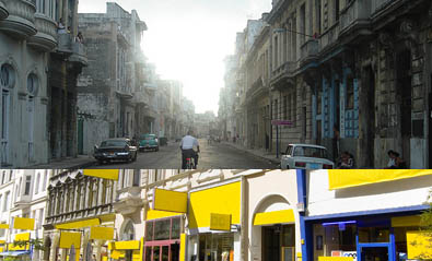
Havana photo by Pimpinela, “Delete“ by Dempf & Steinbrener
The repetition of signs in a place can be a significant element of its visual character, especially at night as Jenny Holzer’s work in San Diego. Or signs can be an intentional disruption of the character of place as Steinbrener & Dempf’s fake Starbucks construction barricade entrance into a historic church.
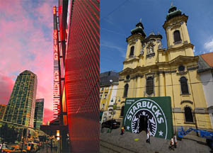
Holzer’s “For MCASD”, 2007 and Steinbrener & Dempf “Pass the Buck”
The signs can convey messages with new purposes such as Holzer’s repetition of local narratives at the Pittsburgh Convention Center. But how successful is the work in comparison with her sign fabricator, Sunrise System, LED for FOA Schwartz. (How many of thought it was a Holzer?) At the top of the page, HOCK E AYE VI Edgar Heap-of-Birds sloganizes Native American outrages in the traditional space of a billboard. He is manipulating the message and accepts the urban form.
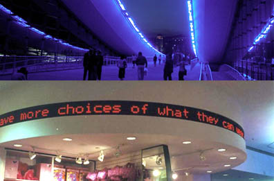
Holzer in Pittsburgh and Sunrise System in NYC
Of course, a love of the visual attributes of the signs can be the artist’s apparent aim. Franck Scurti distorts the form of the pedestrian signs made from light boxes, neon tubes or awnings. Jack Pierson rearranges cheap discarded channel letters in an intuitive sense of a book cover designer. (Another tradition to explore.)
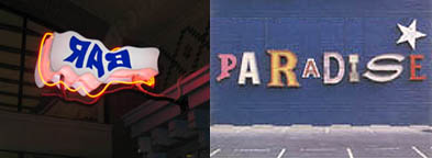
Scurti in France and Pierson at MOCA Miami (Photo- Jose Rodriguez)
Well I got to the end again. What have I learned? I think I learned that I understand these commonplace traditions of the street better than the art historical ones. There is more comfort in the local objects and spatial functions then engaging in a true art dialogue among artists and critics in the museum circuit. I like thinking about the physical world outdoors. Perhaps this is the source of critique for public art – a generator of thoughts and feelings about the common.
Public Art, Public Space
