For many years, I have believed that painters make better architects than sculptors. Painters and architects share a love for the contradiction of the illusion of space and the reality of the object. They succeed with the visual beauty of shaped stuff in a contained volume and with the felt relationships trapped in the volume.
Sculptors like the stuff too much. The architecture of the sculptors tends towards elaborate construction methods to celebrate the stuff. Weight dominates. Space dissipates.

Public Art Administrators in Miami
Break for the facts. On May 9-11, the Miami-Dade Public Art Program hosted the annual conference of Florida Association of Public Art Administrators. The 30 attendees were treated to a private tour of the new $500 million Carnival Center for the Performing Arts. Ivan Rodriquez and Brandi Reddick of the Public Art Program led us to each of the five works with a total art budget of more that $4 million. End of break.
Break for Links to Pictures:
1. General Photos of Carnival Center and Art from Sun-Sentinel
2. Aesthetic Ground Photos from May 10, 2007 Tour
Back to essay.
Architect Cesar Pelli leans toward the sculptor. His first recognized structure – 1975 “Blue Whale” in California – demonstrates his continuing interest in shaped, giant enclosing forms that stand as objects at the scale of the campus, district or city. There is no spatial complexity. You have the building and city next to each other.
The interiors are simple spaces connected by clear passages without much overlap except by volume. By volumetric overlap, I mean you walk under a sculptural shape protruding into another volume. Space is merely the air.

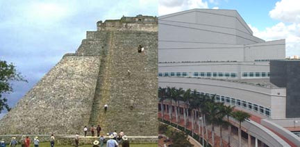
Uxmal and Carnival Center
In Miami, he designed two mountain-like forms in the tradition of Central American pyramids or Buddhist stupas. The non-level topographic breaks are illuminated at night like a “sound and light show” at various pyramids worldwide, but the hipsters of Miami are upset at the building’s lack of flash and more importantly lack of architectural praise in the media. Somehow a building like a mountain is considered “conservative”. The public acceptability of the architectural innovation has dramatically changed since Gehry’s curving metal.
Rodriquez told the Florida Administrators that Pelli wanted to assign the public art to particular locations or boxes. Apparently, Pelli won except for the dynamic floors by Jose Bedia. Pelli prevents the artwork from arbitrary application to the architecture and seeks locations where the artwork can sing freely. In effect he asks the artworks to be simple and contained objects like attributes of his own buildings. The artworks are never interventions into the architecture, but respected creative works within the architecture or urbanscape.
Of the artists, two are subtle decorators, two are powerful painters and one is a performance artist. No sculptors. The decorators – Anna Valentina Murch and Robert Rahway Zakanitch (even decorative names) – blend into the landscape or interior design. Murch’s lovely fountain imitates a sandy beach and functions as a picture frame for Diana Balmori’s much more aggressive plaza design. Although Murch has completed at least two new similar cascading fountains with sound artist Doug Hollis in California, the delicate sounds are lost to the traffic.
Zakanitch was one of the founders of the 1970s Pattern and Decorative movement in American art – the forgotten partner to Feminist Art. Zakanitch’s paintings can be fun with high contrasting simple objects from daily life or decorative traditions like lace. Unlike Murch’s frame, Zakanitch curtains are the framed objects – the opera theater curtain and temporary scrim backdrop. Scrim glows radiantly in the intimate blond wood, vulva inspired concert hall. Acoustically, the opera hall may be successful, but all the designers failed in this almost ugly space.

Gary Moore —– Cundo Bermudez
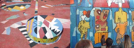
Two artists – Gary Moore and Cundo Bermundez – selected isolated corners without any requirement for architectural integration. Both artists were free to use the assigned space without control – a benefit of the Pelli system of public art. Moore – a Miami visual artist with performance passions – chose the abandoned backside for a sprawling colorful painting on the plaza. A dance platform or turntable is provided with disco lights under the planters. Bermundez, a 90-year-old Cuban exile, transformed one of his paintings into glass mosaics. More agencies should steal the Honors public art program of King County (Seattle area) to commission large-scale public artworks by local masters that never apply for such things. Thank you King County (4Culture.org) for one of the best ideas in public art administration ever.
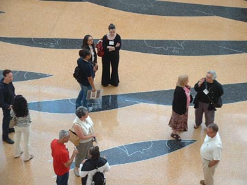
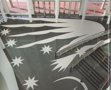
Finally to Jose Bedia on the floors of the lobbies of both halls. After a decade of commissioning artists for terrazzo floors around the USA, someone – thank god -hired a painter. Most of these terrazzo floors are by professional public artists that have no substantial reputation for painting. These floors are calm and without any interest to look at more than once. They frequenlty contain small objects that are installed in a random or “follow the path” pattern. Historic and landscape themes dominate. The surrounding architecture has no interaction from the blandness.
Bedia shows what a painter can bring to public art and I say “Bring it on!” The giant elongated hands fill and fight the edges of the space just like a good canvas. The works made me run up the stairs to different balcony levels to see my favorite parts of the work. At the highest level, the powerful graphic anchors the tight narrow lobby. On the ground, Bedia provides images – faces, fish, stars – at the same 6 to 8 foot size of his canvas. At every distance, the eye is filled with a full composition. What more can you ask than to enjoy the art from different locations over and over and over again?
I don’t know if Pelli is pleased since the work visually defeats the architecture. But I am pleased with the courage of Miami-Dade to select a mature, aggressive painter with very limited public art experience. I hope this is a new direction in public art – the rebirth of painting for public buildings.

Jose Bedia
Public Art, Public Space

From Mark Flickinger, Public Art Director for Pinellas County, Florida (St. Petersburg)
Thanks for writing the review of public artworks at the Carnival Center (wish we could do away with this name).
I appreciate your ability to clearly express your architectural knowledge and insights into design–as well as your understanding of the inter-play with painting and sculpture. This type of analysis is both informative and important.
I share your expressed opinions on the architecture of the building as well as the artworks discussed.
I loved the jazzy design treatment of the plaza–though the glass used on the sides of the raised turntable seemed not to fit…(at least in daylight). I think that the plaza between the two buildings was a missed opportunity that somehow got lost…Therefore the fountain was inconsequential.
My opinion…despite my generally favorable feelings about preserving older buildings…the remnant of the “tower building” that stands awkwardly adjacent/in the middle of the plaza is a real visual interference to the overall project…and the car traffic unfortunately is a complete killer of this space…they would do the space more justice by permanently steering vehicular traffic away to an alternate route (and if possible–re-construct the tower building elsewhere).
Cheers, Mark