Since I coordinated a contest for a mural in the freshman architecture studio at Georgia Tech in 1976, I have been involved in public art and public space. After 30 years, how did the public art establishment get cornered into public bathrooms and terrazo floors with their limited public art dollars? It’s time for public art to be front and center of new spaces and buildings again.
A few years ago at the Polk Museum of Art in Lakeland, Florida, I met artist John Henry. (Lakeland should be on every cultural tourist itinerary for the Frank Lloyd Wright campus at Southern Florida College, the annual Lemon Street sculpture display and the general beauty by which the lakes are integrated with the city.) Henry was joking with a friend about the “no-see-um” art. I always wondered what the “plop art” artists called integrated artworks. “No-see-um” (slang for tiny, blood sucking flies) has not caught on, but it is at least as insulting as “plop”.
In my days in Seattle, I worked as hard as any curator or arts administrator to merge art into daily life and to enhance the built stuff. But in Florida I have felt the desire of sincere, creative citizens to SEE the art. They want the art in the front of the building, at the busiest intersection or on the crowded pedestrian plaza. They want the work to be framed with landscaping or architecture.
It is time to add a new method to our systems of commissioning new work. In certain projects, pre-plan the artwork as the visual priority. Imagine the RFQ for the A&E: “Artists will be selected to create works for the project. These artworks will be the main visual focus on any exterior plazas, main façade and/or lobbies. Site planning, architecture, landscape and lighting throughout those areas will be designed to reinforce the priority of the artwork.”
Or perhaps the artist is selected before the A&E firm. In addition to the A&E contract, the building program would include the following: ” The public art program selected an artist based on past work to design an artwork for a façade, plaza or whatever. The artwork will be the main visual focus on the façade, plaza or whatever. The design of all aspects of that area of the facility will assist in making the artwork the pride of the community.”
A value exists regarding the location of the artwork. All the “generals on horses” have the best places in the plan of the city and punctuate the roadway vistas. The fountains in Rome animate the plaza. The Virgin Mary hovers above the alter and on axis with everything in the basilica.
An artwork in a corner may have the advantage of intimate contact, but the location and scale may imply its lack of importance to the institution. A classic example is the glowing mosaic murals by Dixie Friend Gay in the passage between the parking garages at the George Bush Houston airport. $250,000 spent in lonely corridor without any substantial place value. Despite the immense quality of the work, the choice of place demotes the work.
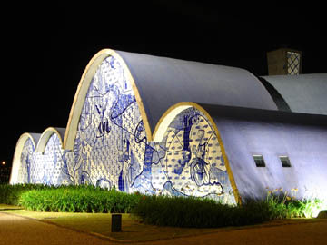
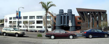
Below are a few modern and postmodern examples of artworks prioritized by the owner and architect. No tricky photography is necessary to make the artwork look important. The building and site want the artwork.
It’s simple to know when the priority occurs. Step back to a location where you can see the artwork and building as a normal traveler would approach space. Does your eye go to work? Does some feature interfere with the artwork? If the artwork went away, would the space or building be empty? Would the architect need to design a substitute?
Priority for artwork in the valuable places should only remain one possibility, but one that needs to return to our cities

Church of Saint Francis, Brazil, 1943, Architect Oscar Niemeyer, Artist Cândido Portinari
Bacardi Building, Miami, 1963. Architect Enrique Gutierrez. Artist Francisco Brennand Photo Joe Kunkel
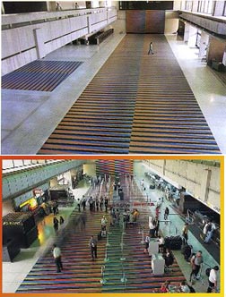
Tour Stratos, Valencia, Venzuela, 1990. Architect Yañez and Láncara. Artist Carlos Cruz-Diez

Chait Day Building, Los Angeles, 1991. Architect Frank Gehry. Artist Claus Oldenburg

To prove I am NOT against floors, here is Carlos Cruz-Diez at the Caracas Airport, 1974. Architect Montemayor and Sully
Public Art, Public Space

I love your comments. You’re a breath of fresh air in a stale art world.
This is a double edged sword.
I trace a lot of it back to the current myth, among big name contemporary architects, in the “Singular Genius Theory”- that is, the belief that one person, in this case, the architect, can, and should, design every single part of a building.
This is a new way of thinking, dating back to modernism, just before the second world war, which simplified buildings enough that it could at least theoretically be possible.
Before that, architects took it for granted that great architecture was a collaborative process, between an architect and master builders, stone masons, glass artists, metalworkers, woodworkers, painters, plasterers, and so on. The combined hundreds of years of experience of all those skilled craftsmen allowed architects like Gaudi to conduct the orchestra, but not insist on playing every instrument.
But now, the architects really believe that the entire process can be controlled, and all decisions made, by one person.
So they resist the idea of integrating craftspeople or artists into their work.
Therefore, I actually think some of this integrated public art is a GOOD thing- provided that it is indeed commissioning skilled craftspeople to do craft oriented work on buildings.
But when it attempts to stretch the budget, by commissioning a painter or sculptor or printmaker or even a “conceptual” artist to design a floor, or a window, or a fence, it is often a failure, both artistically and functionally.
It makes for bad craft, and bad art.
Often administrators seem to take the position that since they have to have bike racks, or a railing, or a bench, anyway, and since the law requires art, why not kill two birds with one stone?
If, in that situation, they commission an artist who knows and understands the craft processes, and enjoys function and design, then they can get great work- Albert Paley’s Renwick Gates, for example.
If, on the other hand, they shoehorn a studio artist into what is essentially an industrial design project, we get unsittable benches, or strange shotgun weddings between art and building parts.
We also see a lot of very poorly thought out execution- take someone who is a wizard with paint, or printmaking, and force them to oversee the fabrication of complicated functioning building parts which combine several trades- and you get a fair amount of duds, many of them quite short lived as well.
I would agree with you wholeheartedly that in many cases, the artwork should be given the budget, and the location, to be great artwork, and nothing else.
And in other cases, when the budget and site really does need an artistic fence, or a light fixture, or a bench, they should avoid the allure of someone who, while the toast of the last Whitney Biennial, has never changed a lightbulb, much less designed and overseen a several hundred thousand dollar construction project.