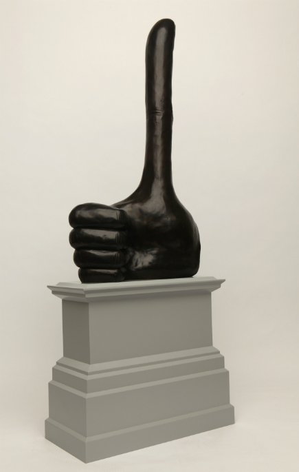
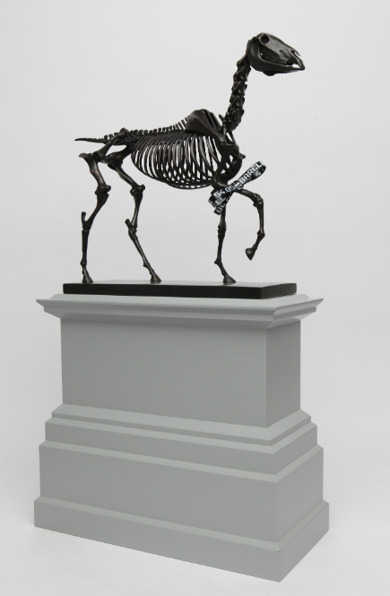
Public sculpture has been replaced with graphic design at the Fourth Plinth in the UK. Following the blue rooster, we will now have an elongated “thumbs up” and the skeleton of a horse. None of this works require traditional sculpture making skills. And the conceptual art thinking is just as minimal. Just scan a found image into the computer, make modest photoshop modifications and send to the foundry. The 4th Plinth curators should just hold a competition for teenage graphic designers. They need to re-think what they are doing.
David Shrigley – Really Good
Really Good will be cast in bronze with the same dark patina as the other statues in the Square, the comic extension of the thumb bringing it up to ten metres in height. Shrigley’s ambition is that this will become a self-fulfilling prophecy; that things considered ‘bad’, such as the economy, the weather and society, will benefit from a change of consensus towards positivity. Proposed Material: Bronze.
Hans Haacke – Gift Horse
Instead of the statue of William IV astride a horse, as originally planned for the empty plinth, Hans Haacke proposes a skeleton of a riderless, strutting horse. Tied to the horse’s front leg is an electronic ribbon which displays live the ticker of the London Stock Exchange, completing the link between power, money and history. The horse is derived from an etching by George Stubbs, whose studies of equine anatomy were published the year after the birth of the reputedly decadent king, whose statue was abandoned due to a lack of funds. Haacke’s proposal makes visible a number of ordinarily hidden substructures, tied up with a bow as if a gift to all. Proposed Materials: bronze, electroluminescent film
http://www.london.gov.uk/priorities/arts-culture/fourth-plinth/2014-2015-commissions


