The flu kicked the shit out of me this week. So some foggy thinking about Indianapolis.
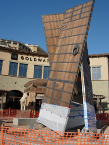
This week, Indy announced that Donald Lipski would develop the 50th Anniversary Legacy Public Art Project. I would say that Lipski is now the most popular public artist in the USA, replacing James Carpenter from a few years back. I liked the old Horse on the Red Chair, but the current crop of repeating shapes making up another shape seem a little too easy. Lipski’s latest work The Doors, (three doors making a walk-in kaleidoscope) is dedicated on May 12th in Scottsdale.

Donald Lipski, The Doors, Installation Photo, 2007
The Indy public art program has jumped quickly on the scene with a good mix of temporary installations, local commissions and international artists. Indy seems to be using the visual and civic arts to invigorate the community in a very American rational way. Everything seems thought out, straightforward and democratic. Each effort has multiple rationales that different kinds of people can find useful. For example, I was surprised, but it is very Indy, that the “Cultural Trail” is really the new urban bikeway.
The problem with Indianapolis is that my critical heart just wants to make fun of. Everything is so earnest and sensible. The video pod casts are well done short works where the artist or public art director leads a quick tour of a work or place. These are best in the country, but I can hardly watch them.

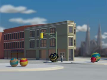
Emily Kennerk, Marbles, Proposal for Cultural Trail, 2007
Something gets started in the mind that is very unfair to Indianapolis. Once it starts, nothing is really good. As I will continue to argue, public art has a vernacular attribute that is valuable to the critical dialogue and emotional connections. But when I see Emily Kennerk proposed artwork for large marbles, I think Nancy Holt, Martha Jackson-Jackson and Target Stores. Here is a perfect opportunity to compare the uses of the form and its meanings, but instead I react like the artist is unaware. This is unfair, but it’s my instinct.
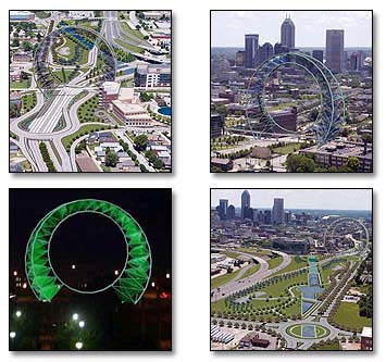
Some criticism exists through a few blogs by the same gang of: Four Square No. 266, Circle and Squares and On the Cusps. Thanks to them, I learned on the worst gateway/icon project now under consideration. Indianapolis is apparently considering building an oversized loop from a contemporary rollercoaster as its civic monument. Absolutely meaningless and uninspired artistically. I hope they check out other competitions in the UK and elsewhere and start over. Otherwise, Indianapolis will spend millions on something that will make them feel equal, but will be insignificant to anyone outside the state.
Maybe this is what bothers me. Indy does not care about me. Indy creates art and civic spaces to make them feel good about themselves. And why shouldn’t they do that?

Kevin Parsons & Associates Team, 2006
Public Art, Public Space

Glen, you and your readers might check out one of the proposals that did not make the cut for the gateway: Proposal 5 at http://www.bsu.edu/capic/gateways/projects/rotary/rfp_boards.html . It was created by a local team in collaboration with the Australian urban design firm Denton Corker Marshall http://www.dentoncorkermarshall.com . Does this proposal have the requisite nod to current European initiatives in urban landmarks?
Why Down on Indy
I dont understand why you wanna pick on Indy. It seems like they are trying hard, and mostly succeeding. I like a lot of their smaller, local artist public projects. It aint easy to manage a project like that in such a way that you get a quality piece, well executed and lasting, from an artist who is just starting out at public art, and they seem to have done a good job at that.
Poor Selection Process, Not Bad Pick
I have to say that if I was on the jury, I would have picked the roller coaster too- given the choices. All 5 of the proposals are devoid of personality, or soul. Like Truman Capote said- “thats not writing- its typing”. Well, those big ribbons, or that archway, or that roller coaster loop- its not art, its graphic design.
My particular pet peeve about public art in general these days is the Photoshop Invasion- you get these designs that are all virtual, done by people who obviously have no physical connection or experience with materials.
The jurying process to get to this short list was flawed, in my opinion- I wonder if it was an open call, or if it was by invitation. Every proposal gets an “A” for snazzy modern graphics on the boards, but they have little else going for em.
Architects and Sculpture
On further study, I have found the reason these 5 proposals for Indinapolis are so dry and soul-less.
They are designed by Architects!
Now I have been closely associated with architects for 30 years now, and I know lots and lots of em. Some good, some great, some just average.
But when an architect designs a sculpture (and every architect harbors the belief that they can do this, and better than an artist to boot) it always comes out like these 5- big, flat, devoid of ideas that cannot be expressed with an adjustable triangle and a french curve, and clean and neat.
This is a trend that cities feel comfortable with on big commissions- after all, unlike those bohemian artists, with their little goatees, architects have all the trappings of adulthood- offices, secretaries, suits, college degrees, neat handwriting, and combed hair.
Not to mention liability insurance, AIA certification, great presentation skills, and a track record of getting big expensive projects built.
Indy Artworks
Contrast these 5 proposals, each with a page of documentation of how professional the team members are, with the small, local projects the Indy podcast features.
The streetlight pole tied in a knot is funny, clever, unexpected, modest, and kinda sneaks up on you in a very sweet and local way. No groovy Liebskind like supergraphics on the presentation board, no professional color forecaster on the team to rename Beige for the new year, no silly verbiage that requires a Delouze & Guittari to English Dictionary.
Or the Cardinals sitting on the roadside crash barrier- again, local, human scaled, fun, the kind of thing that will grow into a fond neighborhood institution.
Mega Artworks
Somehow, though, cities feel that to be taken seriously, they must do these big name brand projects- corporate branding on a mega scale. Usually the actual execution leaves a lot to be desired, the surfaces fade and peel, the image that looked so compelling on the computer monitor is just sorted faded monolithic bombast after a year or two in the elements.
Me, I am old fashioned- very old fashioned- I feel the best public art is usually made by people who understand the materials, and have a hands on relationship with them. Although Maya LIn may not have carved the granite for the Vietnam Veterans Memorial herself, she does work with real materials in her studio, and the knowledge she has gained is evident in her work.
But a giant red or yellow knockoff of a Serra Tilted Arc?
Cmon- the guys who did that little Photoshop extravaganza have probably never touched a piece of 2″ steel plate. Serra can do what he does because of years of experience, hands on.
Ries – The Indy Gateway project used an open call for entries (not well publicized, I was invited by word of mouth the day the proposals were due). Teams were to be made up of design professionals and artists combined, although there were no restrictions regarding who on the team controlled the design (artist or design professional). The five finalists represent the work directed by artists, landscape architects and architects. Although I would agree the schemes and the chosen winner are not strong conceptually or aesthetically. Personally, I couldn’t get past the impetus for the competition – the tired idea of ‘gateway,’ which to me is a civic foul when plunked in the middle of a city. The implication of leaving one zone and entering another better zone seems to have unforseen consequences which might be more siginificant than some aesthetic celebration of entering downtown.
To understand public art in Indianapolis, you must first understand the context from which it comes… or perhaps I should say ‘from which the money comes’. Recent public art initiatives in Indy are tools to soothe problems of politics and perception. They are the work of politico who are seeking tangible solutions to elevate the city to ‘world-class’ status and to alleviate the ceaseless ‘brain-drain’ (both problems intangible and unachievable by planning alone, in my opinion). Our public art initiatives are also the work of tireless lovers of art and community who are bolstering the current trend. Kudos to them all for seizing the opportunity.
We are also a city struggling with identity. Unfortunately, the notion of ‘world-class’ haunts and handicaps the artists and art institutions in Indianapolis. Let’s be honest… world-class successful artists usually must leave this city (or others like it) to establish their careers. I point to Carl Robert Pope the photographer and conceptual artist and to my high-school friend, dancer and choreographer Ted Stoffer as recent examples. Their success was not and could not be made here.
As for vernacular… I might disagree as to it’s importance. Is there a vernacular for midwestern American city? Does Indianapolis have a context (conceptual, historical, climatic, etc.) which is markedly different from Cincinnati or Louisville or St. Louis? When the civic history card is played in public art… we enter the realm of interpretive art, art for learning history, art with limitations. The vernacular of now is right here in these blazing pixels, and I have no idea what that means to a lump of steel on Massachusetts Avenue.
For the politico in Indy, whether one likes the work of Julian Opie or Donald Lipski is not really the point. These are artists with credentials whose names link Indy to all of the other world-class cities in which they have installed. These are civic accomplishments which I for one am pleased to hear of among the drudgery and bad news that plagues the local media.
For the community and art-lover in Indy, these names and their six-figure installations open the doors for local names and their five-figure installations. And confronting your average Hoosier with all of the mysteries of art can be priceless. The real art may not be Emily’s marbles, it might be that perfect moment when my grandma cusses at them.