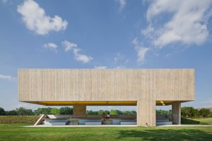
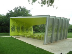
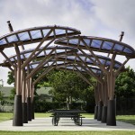
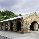
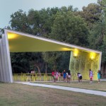
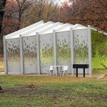
In 2003, the City of Dallas passed a bond to renovate its parks. The bond included generous budgets for new picnic pavilions as architectural features. After a series of pavilions from regional firms, Dallas hired CooperJoseph and Snohetta. If this was a football game, the final score would be CooperJoseph, 45 and Snohetta, 10.
A few years ago, I heard Ai WeiWei describe his frustration with architects designing pavilions for his architecture park. He noted that most architects have no idea how to start a project without a function. But, WeiWei got better results than Dallas. All the pavilions in Dallas are examples of architectural construction techniques – some pure, some exaggerated. No conceptual thought that WeiWei desired in China. In Dallas, the pavilions compare to 3rd year student architectural projects at a university. The American architects have not matured in 20-30 years.
If we use the standard American architectural evaluation of Frank Lloyd Wright / Meis van der Rohe placemaking and beautiful construction, then a few stand out. Unfortunately, I can’t really tell from my screen in Florida. Maybe HOK, Good, Fulton & Farrell Architects and LZT Architects. The two pavilions by Laguarda‐Low Architects have originated from a smart marketing brain. One is a minimalist pavilion for Dallas art patrons that make Donald Judd look friendly. The seconded is targeted for the Chinese market with its awkward organic forms. Architects faking art.
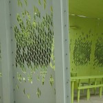
So I admit that I have not seen a Snohetta design that I love. Snohetta appeals to clients that fear the visual. Perhaps someday I will travel to Norway and FEEL something special. I hope so. But I can tell that the pavilion in Dallas is without tactile or visual splendor. As a Public Art Administrator, I anticipate with horror the graffiti scratches. The laser cut leaf patterns would not survive the first round in an American public art competition. Basically, I can’t think of anything positive or negative – it is just dull.
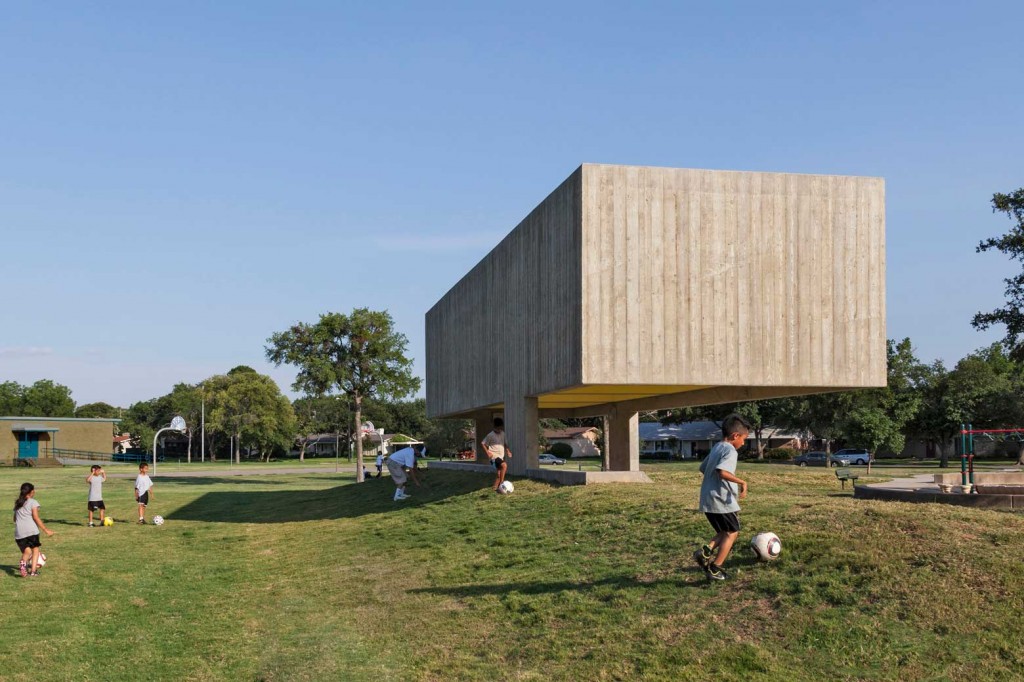
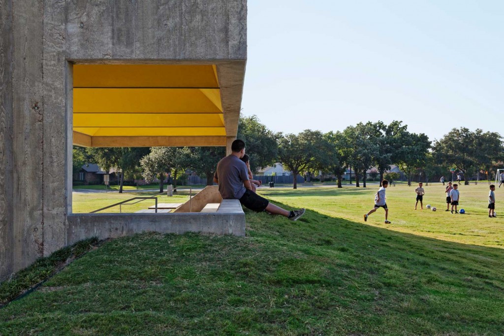
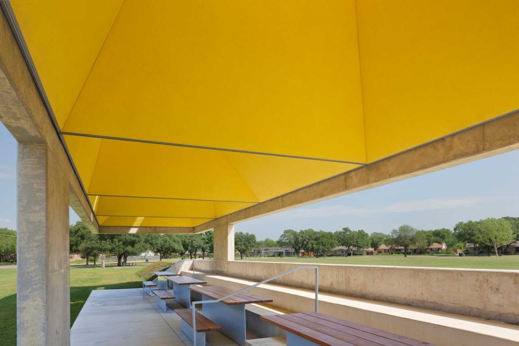
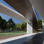
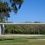
CooperJoseph pavilion feels me with desire – to visit it. So many good features: architectural (not sculptural) phenomenon of heaviness, graphic clarity against 360 degree backdrops, setting into slight berms and slops, a temple like feeling with the internal sun pyramids pushing vision upwards, faster breezes caused by the venturi effect, structured outside views, benches and concrete walls that can be sat on improperly in many directions. Thru its brutalist roots, it retains the ideas of bringing an architecture forward that wants to be rejected immediately by much of the public. But as the pictures shows, appears extremely comfortable and enjoyed by the public that uses it.
Overall, the CooperJoseph pavilion performs the magic of attracting the new and repeat visitor “to just be with it.” This is what is missing from all the other pavilions including the 1920s. They function during the family picnic in rain or shine, but they remain lonely without the forced use. CooperJoseph found the unwritten program to a make an architectural space for use as architectural space. Congrats.
Download the Pavilion Brochure and Map
- Dallas Pavilion, 2012, by LZT Architects, Austin
- Dallas Pavilion, 2012, by LZT Architects, Austin
- Dallas Pavilion, 2007 by Elliott and Associates Architects, Oklahoma City
- Dallas Pavilion, 2008, Laguarda‐Low Architects, Dallas
- 1920-30s Dallas Pavilions
- Dallas Pavilion, 2013 by Snohetta, Norway
- Dallas Pavilion, 2013 by Snohetta, Norway
- Dallas Pavilion, 2013 by Snohetta, Norway
- Dallas Pavilion, 2008, Laguarda‐Low Architects, Dallas
- Dallas Pavilion, 2008, Laguarda‐Low Architects, Dallas
[contextly_auto_sidebar id=”NXt91stuiCMwym5Lb2XXmcBnAOJiohD9″]

