Blake Gopnik of the Washington Post cannot handle the world. He traveled to Venice, Kassel and Munster and concluded the artwork is directionless, an attribute that according to Gopnik fits nicely with the marketing of art. No artist is out. Everyone is equally for sale.
I don’t want to be as flippant with Gopnik as he is with three serious artworld events. Rather than stress his apparent sadness over the loss of a single direction of progress in art (an idea that I thought had already died), he might have better directed his comments toward curators that failed to present a point-of-view. The silence of the NY Times critics on the overall impact seem to verify Gopnik. Michael Kimmelman very gingerly comments that the Venice show is a “little boring” and curator “Robert Storr’s choices seemed risk-averse”.

Ai Wei Wei at Documenta – After and Before the Storm
From my CRT in Delray Beach, I depend on flickr to bring me the images. Photographers on flickr are most attracted to the following. In Munster: a big flower, a giant ball of crushed fiberglass “cows on parade” and miniature sculptures on a lawn. In Kassel, nothing. Ai Wei Wei’s sculpture collapsed in a freak rainstorm just after the opening. The stuffed dogs ready to be judged in the dog show and the gently waving mylar gains a photo or two. From the flickr group, Munster totally crushed Documenta who apparently forgot to show up to the public art contest on the street. Perhaps Documenta succeeded better indoors.
Munster built a website that provides simple access to images and text about the works through posting all their press materials. Documenta and Venice seem to have no interest in the online audience. I would complain even if I had been in Europe. As I try to demonstrate with the paired pictures below, the online digital imagery allows the viewer to make connections among the works. Rather than complain like Gopnik, the critic has the responsibility to write two reviews: one the “performance” of the temporary exhibition created in the city or space by the curator and the other that links between works that did not inhabit the same room or nation. And every curator should release the exhibition toward a powerful performance by teaming with an internet librarian.
Gopnik does assault something personal to me: the word “aesthetic”. He seems to think the word means pretty or beautiful. I thought “aesthetics” was the philosopher’s term for the thoughtful exploration of the arts as a phenomenon of human nature. No matter the definition, Gopnik is striving to retain meaning as the core value of the arts rather than pretty colors (that look good over the couch.) But those powerful new meanings come from a cultural need to renovate our ethical foundations to conform to the unintended consequences caused by the reality of human creation. Today the artists that use meaning are frequently just a decorative as the decorators. They easily repeat the conceptual act of Bueys just as a painter repeats the color of Matisse. As I hope to explore in more essays, public art may better tools to create meaning than the gallery and museum universe.
ORDERED, COLORFUL JUNK WITH A HISTORIC BACKDROP
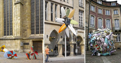
Munster Three: Genzken, Lahanka, Siekman
Genzken Photo: Roman Mensing, Siekman Photo: Blake Gopnik
THE ARTIST’S DREAM OF SADNESS
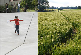
Munster: Naumann’s 1977 negative pyramid and Althamer’s 2007 path to emptiness
Naumann Photo: Arendt Mensing Althamer Photo: Roman Mensing
MAGAZINE GRAPHICS IN THE LANDSCAPE
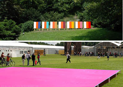
Documenta Pink & Green: Gernes 2007 strip and Atsuko’s 1968 canvas
PRETTINESS FROM FILTH.
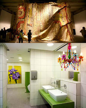
Venice’s shimmering bottlecaps by El Anatsui and Munster’s pretty public restroom by Feldmann
Anatsui Photo: Librado Romero Feldman Photo: Arendt Mensing
TWO METAPHORS FOR THE PRISONS OF THE LANDLESS
In Venice: International Razer Wire Camps by Abdessemed and Brazilian Ghettos by Dias
Photos by NY Times
STRIVING FOR DENSE SPACE
Flowing room by DeFreitas in Documenta and crushed room by Sosnowska in Venice
DeFreitas Photo: akikouki Sosnowska Photo: NY Times
DON’T WE ALREADY KNOW THE POWER OF REPRODUCTION?
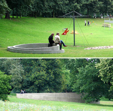
In Munster: Little Mini Judd by Gonzalez-Foerste and Judd by Judd
Judd Photo: akikouki
MY FAVORITES
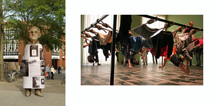
Wagner’s pain-in-the-ass man in Munster and Brown’s wiggle gym at Documenta
Wagner Photo: Sarah Bernhard
RESOURCES
Flickr Group on Documenta (The official Documenta website is only slightly better than the totally useless Venice website)
Documenta Blog with In-Progress photos of lectures and performances
The Munster website is excellent with photos and descriptions of every work. Click Here
Good Munster Photos by akikouki and STFE
ARTISTS
Question: Why don’t well-known artists have websites? Is it snobbery? So far I have found only one website.
Adel Abdessemed
Isa Genzken
Peter Feldmann
Marko Lehanka
Pawel Althamer
Dominique Gonzalez-Foerster THIS IS HER WEBSITE
Poul Gernes MADE BY OTHERS
Trish BrownHER, BUT PLACEHOLDER
Ai Wei Wei HIS, BUT POOR
Bruce Naumann FAN WEBSITE
Monika Sosnowska
Iole de FreitasTHIS IS HER WEBSITE
Atsuko Tanaka
Click for Full Blake Gopnik text from Washington Post, July 8, 2007
Download file
Sign up for the Monthly email that lists the Aesthetic Grounds essays and links.
Public Art, Public Space

I’ve just arrived home after The Grand Tour that was anything but. It was my second venice and first Documenta and Munster. I found all bad. Documenta was an insult to the intelligence, I’ve never seen so many bored and shell shocked art viewers in one place. Munster was as bad! Venice was just boring and yes, fail safe by Mr Storr.
It’s the curating and not the art around at present that is to blame. Also I think there is now a real ingrained denial of the power of pop cullture and the mass media coupled with an old school leftist agenda that somehow thinks the audience for contemporary art needs ‘re-educating’ (pace one of the 3 Documenta themes).
What the audiences need is some real guts in choices, some cohesion and most importantly some old fashioned faith in something good to actually bother to look at!
Don’t blame the market, Basle was the only place where Visual art was that, visual.
Just get better and younger curators. It’s simple.
Scott Redford