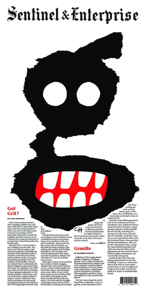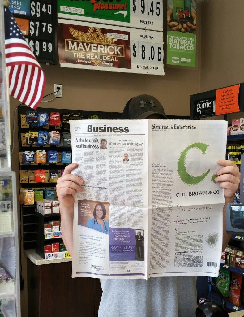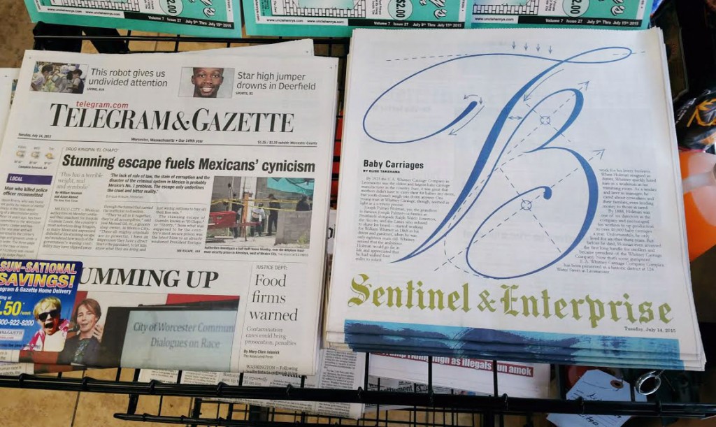
A by Felix Salut. The Alphabet project by artist Anna Schuleit Haber, Sentinel & Enterprise, Fitchburg, MA 2015
I love excellent type design. Anna Schuleit Haber convinced the local paper to use the front page for 26 days to display a new letter each day by an invited artist.
It is the best in public art as it
1,) interjects itself in a valued public place (front page and newsstands),
2.) establishes repetition as the method to the spark thinking through comparison and memory,
3.) utilizes a commonly understood concept – the alphabet, and
4.) establishes aesthetics as the primary feature for appreciation.
From Hyperallergic.com by Allison Meier – Each edition of the Fitchburg, Massachusetts, newspaper this month has one of 26 typographers designing a letter from the alphabet, and writers contributing poetry and stories inspired by that letter. The Alphabet is the creation of artist Anna Schuleit Haber, who launched the project on July 13, 2015. “The front page resembles Main Street, in a way,” Schuleit Haber told Hyperallergic. “And handing it over to an artist for 26 days is very gutsy. Everyday through August 11, 2015.
The Alphabet was commissioned by the Fitchburg Art Museum, and is a collaboration with the Sentinel & Enterprise newspaper and its editor Charles St. Amand, along with students and faculty at Fitchburg State University.
Artists Redesign the Alphabet, One Letter Per Day, on the Front Page of a City Newspaper


