A footnote — or an intermezzo — in the midst of what I’ve been saying about how orchestras should talk about themselves. (Here and here.)
Whenever I do a post, I look for an image, to give the page at least a little sizzle. So to find one for my last post, I Googled “orchestra,” and clicked on “images.”

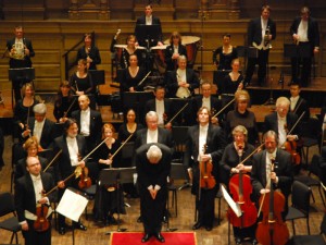
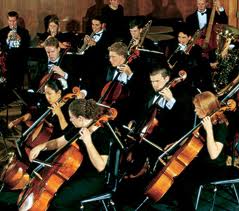
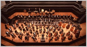
The results were ghastly. Utterly boring. Pointless. And these (most, if not all) are official photos released by the orchestra managements.
What’s the point of them? What do they tell us? An orchestra is made up of musicians, probably in formal dress, who play in a concert hall. These musicians play violins and flutes, all the standard orchestral instruments.
Well, everyone knows that! What these photos don’t tell us: The musicians love to play. Their concerts will be gripping, passionate, irresistible.
Or, more simply, that anything even remotely interesting might be going on.
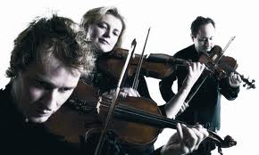
That’s even true when an orchestra goes for something arty:
The results are often (almost always) blah.

And likewise when a photo shows closeups of musicians. No one, as a rule, shows any sign of interest. They’re just sitting there, playing their instruments.
This makes no sense. In any other field, would anyone with any sense of marketing or branding let photos like these out into the world? It’s hard to believe they would. These photos make me wonder whether even the people running these orchestras really think their concerts are worth going to. If they really believed that, wouldn’t they find more compelling images?
Which wouldn’t be hard to do. Some years ago, the Pittsburgh Symphony featured striking photos of its musicians on the covers of its program books, and in posters outside Heinz Hall. This wasn’t, I fear, a strategy with much depth. If the idea was to promote the orchestra by making its musicians seem exciting, then more needed to be done. The musicians should have gone on stage, gone into the community, become personalities (at least some of them) known throughout Pittsburgh.
 But still the photos were terrific. The Australian Chamber Orchestra has truly striking photos, like this one. See their website for another sample.
And for a really stunning look at what photos of musicians can look like, watch Jonathan Demme’s film Heart of Gold, which shows Neil Young giving a concert, with backup singers and a band. Demme, a real filmmaker (of course), doesn’t film musicians playing. He films people.
Often the camera will come to rest on someone who isn’t playing at all, or isn’t playing anything that stands out. But the person seems rapt, engaged, transfigured. So you’re drawn in — rapt, engaged, transfigured by the music, just as the musician is.
If you’re at an orchestra, and want photos like these (I’m sorry that none of the stills from the film available online show what I’ve described), they shouldn’t be hard to get. And you don’t need Jonathan Demme.
Just find a photographer in your town who has style. imagination, and sensitivity. And a telephoto lens. Put her in a seat from which she can see musicians’ faces. (First balcony level, far on the side?)
And let her shoot, looking for the moments when someone really seems to care. When you go through her shots, be as tough as a serious magazine photo editor, and don’t settle for anything that wouldn’t delight you if you saw it in Vanity Fair.
It should go without saying that all this applies to any classical music photo — pianists, cellists, wind quintets, new music groups, opera productions, anything.


Excellent post Greg, and it needed to be said forcefully as you have. When you think we live in a society where some photography is exceptional, just think of the magazines teenagers read and the images in the shops they go to. Probably the female orchestral mangers read magazines with exceptional photographs and the male managers may well have wives/girlfriends who read these magazines.
This is a photograph of a pianist I knew, on the cover of his concert programme from 1991 – the concert was contemporary British classical music! As I don’t think it is possible to add images to comments on this blog, I have provided a link to the image on my website here:
classical pianist with a punk image
I have to mention an orchestra I’ve had some involvement with (as a composer and broadcaster):
For its last two seasons, the New Zealand Symphony Orchestra has let a design agency go nuts and made their programmes into beautiful art works. The agency comes up with high thematic concepts, photographs the orchestra players in studio (costumes, make-up, props, the works), then puts in hundreds and hundreds of hours in Photoshop.
Here’s some of the art from the latest season launch, along with a 5-minute behind-the-scenes video:
http://thechurch.co.nz/work/nzso-2012/
I never thought that the Elgar Cello Concerto could be marketed interestingly, but they dressed ther principal cellist in a WWI lance corporal’s uniform amid the wreckage of war. It found it compelling.
I certainly agree that MOST classical photos are utterly conventional and utterly boring. On the other hand, there is a real risk of becoming ludicrous by trying too hard to be different. Of course you aren’t referring to these, which would never show up in Vanity Fair, but you can get a lot of entertainment value (and learn some things to avoid) by visiting http://awkwardclassicalmusicphotos.com/
As an (amateur) photographer who has often tried to take pictures of orchestra musicians, both in rehearsal and in concert, I can say that it’s easier said than done. Reason is simple: from a purely visual point of view, it’s a jungle. For one, you have music stands in the way, big black spots that are discreet in the physical space of the concert hall but take a lot of place, are not at all esthetic, and are terribly difficult to get rid of on a flat picture. The “bunched-up” set-up of orchestra musicians also make a good picture difficult, as you always end up with someone’s head cut off – there is just no “visual breathing room”. A telephoto lens doesn’t help – at the distance you suggest, it flattens everything and you loose both perspective and context.
Even more important, and awkward, are moving instrument parts. A string section is a wonderful thing to watch live, but on a still picture, you have no idea how many times you end up with a violin bow coming out of someone’s head, hiding another person’s eye, or seeming to be headed directly towards the conductor’s nose. This is why orchestra photographers often end up asking the musicians to pretend playing without any stands around and with bows neatly arranged in a non-threatening position. It’s also why out of context solutions such as the ACO photos (+ a lot of post production!) always look much better.
This said, I do agree with you: most orchestra photos are very boring, lack life and humor. Orchestras send us the same old stuff year after year for our brochure and website and we usually end up putting up the picture of the conductor and soloist alone. But I do understand the difficulty.
Alex Benjamin
Greg, have a look at the photos the Orchestra of the Age of Enlightenment uses. You might even want to add one or two of them to this post.
Nicely said Greg. What you have described is to reveal the artist. I think orchestras and conservatoires have forgotten that we are in the arts, not middle management. I’d much rather go and see British comedian Bill Bailey (http://www.youtube.com/watch?v=ZQyR0HRxNEA) than Maurizio Pollini. Why? Because although his piano skills may be mediocre in comparison, he lives, performs and breathes as an artist, and bases his show on that spirit of engagement with the hitherto unknown (and reflects it in his PR). Always fresh and engaging without being an idiot. Of course some groups like ACO you cited, pianist James Rhodes, and some fabulous baroque groups are doing the contemporary artist thing, but still only 1% of what’s out there, mostly doing what Billy Connelly calls the ‘beige’ problem. Just a perspective…
I really like what my hometown orchestra (Louisville Orchestra) did for photos. They took these quirky pics of their musicians at all these local landmarks and cultural centers unique to Louisville. To me they conveyed a fun sense of community (opposite of stodgy stage shots). And the photos are high-end – I’m guessing an ad agency or pro photographer took them. You can see them on various pages at louisvilleorchestra.org. Anyway, the orchestra just recently declared bankruptcy, so perhaps it was too little too late. On the other hand, I think they are restructuring, so hopefully they will resume this kind of thing when they return. As someone whose day job is in marketing, I strongly agree with you on the importance and power of images (as well as design, copy, etc.) in conveying a sense of passion and excitement.
They’re in the process of replacing the musicians, Andy. The recent spake of craigslist ads for musicians has been the butt of some satire and parody.
Ironically, many of the images being used for critique of LOI could easily be satire and parody of what Greg’s talking about here too regarding re-visioning through images.
Oh, and just to get the timeline straight–the LO was operating with a budget surplus of a modest $91,000 in the fiscal year of 2009 when these photos were first used on the website (you can view the image info to see when they were created) and the very next year the operating deficit was $500,000. So despite the recession, the orchestra had a surplus, and despite the introduction of the new images the orchestra then went into a deficit. That’s not to say the deficit might have been greater had the images not been used, but obviously the images weren’t enough to keep the organization in the black despite the previous year having a surplus.
Hey Jon, I’m just a lay concertgoer and amateur musician, not an expert on orchestra politics or finances. I like the photos for the reason I mentioned – to me they were quirky and had the musicians out there in the community. Just my opinion. I wouldn’t think photos/marketing alone could save or sustain an orchestra or any other organization, but since the post was about images I thought I’d share my two cents. Andy
Hooray! This is sooooo true! In our work to change the way we present the arts to the public – we’ve shared a series of images that show the way we used to do it, and the way we do it now. Now, we strive to avoid photos of 100 people in back and white surrounded by gold leaf on a stage — separated from the audience.
Instead, we work hard to use photos that show people enjoying themselves, photos that are fun and engaging, AND photos that show the audience interacting or reacting to the artists/musicians too. THIS is what citizens value about the arts — even those who don’t go. (Check out http://www.theartswave.org for examples right on the home page!)
If we want broader support for the arts – changing the images we use to show citizens how the arts enliven community and add value is a necessary step.
Greg: for some good examples of creative orchestra musician photography you should check with the New World Symphony and ask for some of the photo images we used for our tour to Costa Rica in the late 90’s and our residency in Monte Carlo. We used many dynamic images to feature musicians as energetic, athletic and confident artists. I have yet to see any other orchestra make a similar effort.
Here’s an obvious reason for the boredome that everyone has overlooked–MUSIC IS NOT A VISUAL MEDIUM! There will always be a disconnect between photos of an orchestra and the music that is being promoted. I speak as a former photographer of orchestras. The best photographs of musicians have nothing to do with music.
Roberta,
With all respect, you’re making an extraordinary claim here. Music engages musicians’ minds, hearts, souls — and bodies. If you look at photos or films of musicians in any other genre but classical, you’ll see wonderful physical involvement. Have you never watched a rock guitar solo, or a jazz sax or bass player? Or a gospel choir? Or a drummer in just about any musical tradition?
In classical music, though, musicians are _taught_ not to move when they play. Ask almost any music student about that. They’re taught to restrain themselves physically, which really is unnatural. And hurts their playing. Not every classical musician does that, though. Conductors are intensely visual. They have to be. I remember one old film of Yevgeny Mravinsky, the Soviet-era conducting star. In a lyrical Tchaikovsky passage he looks like he’s rocking a baby to sleep. Find the 1946 film Carnegie Hall, with performances with some of the great musicians of that era. Especially watch Artur Rubinstein. And then tell me that classical piano playing isn’t visual. There’s a clip of him from the film on YouTube: http://www.youtube.com/watch?v=Wj6_5qWZCDY
Or watch the Berlin Philharmonic. There’s an orchestra in which everyone moves. The bass players just about dance with their basses. This isn’t choreography. It’s plainly unplanned. Completely natural. The result of people not feeling inhibited. After I’d heard — and seen — them in New York a few years ago, I ran into a NY Philharmonic musician, who’d been at the concert. “Did you see how they moved?” he said. He loved it. But he added, “I’d be reprimanded if I moved that way.”
So I’d suggest that one reason you haven’t found orchestra musicians very photogenic while they play is that they’re deliberately restraining themselves. Maybe if they didn’t do that, they’d come a little closer to the stellar musical quality — and collective magnetism — of the Berlin Phil.
Another area in which boredom seems to reign is with musician’s biographies. Boring! Here is a post I did on that:
http://themusicsalon.blogspot.com/2011/10/highlights-of-my-career.html
Bryan, thanks for this! I agree, and it’s a topic I’ve written about many times.
But please, everyone — follow Bryan’s link and go to his blog. Read his post. Especially read the bio he’s written for himself. It’s pure genius. And then, by all means, take up his suggestion, and hire him to write your own bio. When I read the standard classical bio — with, in the case of a top-class soloist, a mind-numbing list of major orchestras the soloist has played with — I want to run as far away from the artist as I can. Here, I say to myself, is someone who’s gone out of her way to make herself seem as boring as possible. Why should her playing be any different?
Read Bryan’s bio, though, and you want to hear him play immediately. (And yes, it’s way over the top. Which for me is part of its appeal. But think about it, everyone. You could dial the over the topness back, and come up with something spirited, but still (God save the mark) respectable. Take the standard bio, though (like the one Bryan quotes in his post), and there’s nothing you can do to bring it to life. It’s DOA. Nothing to do but wipe the slate clean and start over.
Bravo, Bryan. You’ve made my day.
I nominate this as the best AJ blog of the year, and that includes all the thoughtful comments.
Thanks, Larry. i’m honored that you think this. And very happy that you included the comments!
‘If the idea was to promote the orchestra by making its musicians seem exciting, then more needed to be done. The musicians should have gone on stage, gone into the community, become personalities (at least some of them) known throughout Pittsburgh.’
Well, yes…that IS the solution. i have found far toooooo many of my colleagues unwilling (or unable) to do this, preferring to believe that the ability to do things like play those particularly wicked passages in Strauss qualified them for a lifetime of employment inside the orchestral ‘bubble’.
In city after city, that bubble has either burst or come close to it. The next generation of musicians will have to do that which the generation before mine did: truly join in the life of the community for which they make music.
There are loads of interesting ways to portray orchestral musicians visually, on and off the concert platform (the latter tends to be more effective, see comments above). But for the moment I shall confine myself to what I think is the hardest bit: how to portray the whole orchestra. While there should also be opportunities to stress that an orchestra comprises individual musician of talent and personality, equally there will be the need to show the orchestra as a whole, and this is fraught with difficulties, mainly the sheer number of people involved. (Look how much easier it is for the ACO, above, with its relatively small line-up.)
Here at Casa d Música we struggle like any colleagues, but I like to think we have some successes with our 94-member symphony orchestra. Some of the results are at http://www.casadamusica.com/group/images.aspx?channelID=D281C672-B6A9-45BF-B72C-38E9C8A16217&id=E5AA3496-BDB8-4A75-89D2-87311C4FEEA9&leftChannelID=D281C672-B6A9-45BF-B72C-38E9C8A16217
Of course I am still happy to steal others’ success stories for our future images!
One of my favourite photography campaigns from recent years (disclaimer: it was my own orchestra, but I wasn’t directly involved) presented individual musicians as “larger-than-life” in settings that were recognisably of the city – Sydney – but not necessarily the usual tourist-trap landmarks. There were two components: the outdoor photography to provide the canvases and the studio shoots with the musicians. These were then combined, giving the impression of huge outdoor posters. You can see a selection of photos here: http://knight-photo.com/#/Advertising/Sydney%20Symphony/5/
And more detail about the brief and concept here: http://www.london-photographic-association.com/site/pages.php?fid=0,359,468
One of the attractions of this campaign was the “spot-the-location” aspect of it – almost a game. (Since it was part of a season brochure intended for the local market, rather than the tourist market, this was a smart approach.) I also liked the fact that it showed the musicians away from the formality of the stage, but still recognisable as musicians and members of our community.