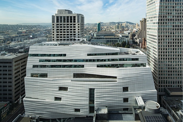
Have you seen the new Snohetta-designed expansion of the San Francisco Museum of Modern Art? I’ve seen only pictures (one, at right), but it should in my opinion put to rest the line many museum directors have been using in recent years that traditional museum buildings are “intimidating” to young people. (See here for such a reference by Tom Campbell, director of the Metropolitan Museum of Art,* and here for another instance in which he said it. Then you might go to another time I blogged about the very idea.)
 For some inexplicable reason, the meme going around is that Beaux Arts buildings and grand staircases are  too foreboding for the average person, especially if they are young and contemporary, to contemplate.
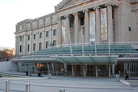
Rather, they stay away–unless the museum does something about, as the Brooklyn Museum did, to the dismay of many, by covering its grand entrance with a glass, well, something like a half-saucer (below right).
Why am I saying this about San Francisco, though? From the pictures, the new building looks as if it’s wrapped in bandages, masking some deep wounds, rather like a building equivalent of The English Patient. Too horrible to contemplate what’s underneath or, in this case, inside.
Of course, it’s not: SF MoMA’s permanent collection is excellent, and now it is supplemented by the 100-year loan of the huge collection amassed by Doris and the late Donald Fisher, founders of The Gap. Over the years, I’ve seen only a few samples from it, but it is reputed to be a great collection.
If museum visitors can enter SF MoMA without fear, they certainly can walk up the steps of any museum built in “traditional” architecture.
As for those staircases, a review by Julie Iovine in today’s Wall Street Journal indicates that this very up-to-the-moment design also includes staircases, including a grand one:
…Staircases, in fact, play a feature role throughout.
From the entrance plaza they flow like streams from a plateau: one set of stairs combined with tribunal seating leads down to a free gallery where commissioned works will reside, visible from the street through large plate glass windows; Richard Serra’s monumental “Sequence†(2006) is there now. A grand staircase cascades down from the new galleries; its maple-wood risers are narrow at the top and spread wide at the bottom. Another new stair runs down to the original lobby.
 There’s more on those staircases in the review. Overall, Iovine praises the design for several reasons, including its circulation: “the architects make a daunting total of 460,000 square feet feel, not vast and intimidating, but inviting and easy to navigate.”
I do question one sentence in her review: “Welcome to the new museum experience—casual, transparent and diverting.” I’m not sure how the building’s external face, so covered as it is, suggests transparency (as, say, the Americas Wing at the Museum of Fine Arts in Boston does). Maybe you have to be there.
*I consult to a foundation that supports these museums.
