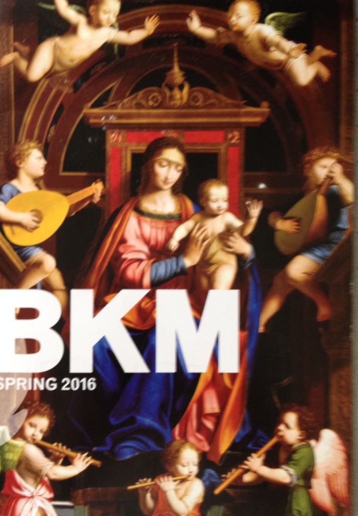
 Can you guess? It is another attempt by a museum to be hip to the younger generation. It’s one of the latest changes to the visual identity of the Brooklyn Museum.*
I don’t believe this change was announced, and I’m not sure when it took place. But several days ago I received in snail mail a copy of the museum’s Spring 2016 program, and there it was (at right). Recent press releases have also contained something new: a logo modified by the museum’s new director, Anne Pasternak, more about which in a moment.
Disemvoweling is, of course, a common practice in text-speak, AKA txtspk. People who text do it to save time, and the practice has long since spread to other spheres. In what one employee of the Brooklyn Museum not too long ago called “the creative capital of the world”–that would be the most populous borough of New York City–disemvoweling is common. Little wonder that somewhere along the way, the Brooklyn Museum decided to use it–though I think, at least initially, the museum called itself the Bklyn Museum.
 I say that because, a few years ago, the Brooklyn Public Library* took to representing itself as the Bklyn Public Library, and an official told me that the Library had stolen it from the Museum.
I find the Library’s distaste for vowels more unsettling than I do the Museum’s, but I am taken aback by the sheer shortness of BKM. And still don’t believe that its use will have any affect on a young person’s desire to visit the museum, any more than I believe The Metropolitan Museum of Art’s new logo will have any affect on its appeal to younger generations. Sometimes these changes just make me laugh.
 Speaking of logos, what Pasternak did was not, unlike the Met’s recent change, radical. She merely changed the color of the logo that former director Arnold Lehman had put in place. It went from turquoise-y blue to, what else for the art world? Black. And there’s a little more definition to the images, of which I found a couple of variations, which I have posted here.
Pasternak may be pleased that the change floated under the radar, and there may be more fiddling.
But she has more substantive things in mind. Just today, the museum announced that it would soon open “American and European galleries[that]Â have been refreshed and reorganized.” Its “unparalleled Egyptian galleries have [also] been reinstalled with a new thematic structure.” All can be seen when the museum has it’s annual gala, Apr. 20.
 Gone will be the acid-colored walls in the American galleries, and the reinstallation there is intended to be “more inclusive.” European art, like the Egyptian, will be hung “thematically with works that now span a wide range of mediums, including sculpture and works on paper, in addition to painting.”
 I am looking forward to seeing all of them.
*I consult to a foundation that supports these organizations.
UPDATE, 4/14: Here’s another iteration of the logo! Just arrived in a press release.

