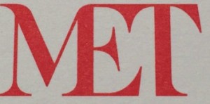
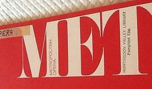
I am, of course, talking about the Metropolitan Museum* and the Metropolitan Opera. Since I last posted, on the Met Museum’s new logo, many people have weighed in both here and on other sites as well as to me personally. The naysayers have been more vocal, if not more numerous (that is hard to tell).
A couple are worth sharing, starting with one that wonders about plagiarism. Well, there’s nothing new under the sun, but just take a look at the rendering of
“Met” in these two pictures:
On the left we have the opera–an old libretto; on the right, the museum.
Look a little similar? For this the Met Museum paid millions–the number $3 million has been cited to me by several people, inside and outside the museum, but the museum has told me that is too high. I simply don’t know.
Now, it’s true that the millions will cover the design of the whole rebranding campaign, not just the new logo.
The Wall Street Journal‘s article on this, published Friday, engendered a couple of trenchant comments. Here’s one I like, edited (boldface mine):
The former logo was superior, especially so because of its homage to da Vinci and thus artistic tradition. The new Macy’s logo is merely OK. And it scares those of us who fear an eventual Brooklynization of the great institution. I’m referring to the somewhat recent morphing  of the Brooklyn Museum into a landfill of modernistic/contemporary junk.
The justification of the new mark, that it represents a more inclusive welcome to the masses, is nonsense….
That a red color was chosen  because it “embodies passion and vitality…across time and culture” should have added  “and Madison Avenue” to make it more accurate. Is the store on the 1st floor going to be made bigger?…
Here’s another:
Not an art major, but one thing that bugs me is the lack of a serif on the ‘E’ in MET. Â How to explain it, like the ‘M’ is pulling down the ‘E’. Â I see the problem there, but don’t know how to fix it.
Over at Vulture, where Justin Davidson broke the story, there was this comment:
I am not a designer, but I have eyes and the semblance of a soul and this is atrocious. In fact, I am calling it an act of hostility. It’s the equivalent of a bride forcing her bridesmaid into an ugly frock.
And another:
Abject design failure. Why bother changing such a great, iconic logo? As other commenters mentioned, with all the artists in residence and in the NY/NYC area, this is what they came up with? Yuck.
And then of course there was this:
The words do not yet exist to properly describe how infinitely abhorrent this wretched thing is. Perhaps one day, centuries into the future, the people of earth will unite in an effort to properly define this abomination so that the generations proceeding may right the wrongs of their ancestors and see to it this never happens again.
So, right, let’s all relax. The Met is not happy about the controversy, but it should be happy that people care so much.
*I consult to a foundation that supports the Met.


