 It’s no secret that Thomas P. Campbell has been working overtime to make his Metropolitan Museum* different from the one he inherited from Philippe de Montebello. And the change has been dramatic–some covered in the press, some not. At least not yet.
But as the King of Siam sings in “The King and I” (and here I will stop to give a commercial to the current production at Lincoln Center Theater; if you haven’t seen it, go. It is one of the best productions I have ever seen of any musical), some of what is going on at the Met is “a puzzlement.”
 For example, word is that the Met will soon introduce a new logo. What precisely is holding this up is unclear. I hear from insiders that the design was chosen some time ago. Perhaps the ad campaign isn’t ready? Perhaps there are second thoughts?
Anyway, Campbell–distancing himself from the past–had (I’m told) hired a rebranding consultant. Some say it’s the same one that changed the name of the Tate in London to simply “Tate.” Dropping the article before a proper noun is a trendy thing to do–witness Facebook. But, I’ve noticed, few publications actually drop “the” before Tate. The Whitney, in its new downtown location, also sports a logo that’s just “Whitney,” no “the,” no “museum,” although its press releases and other written materials continue to use the article and the full name, Whitney Museum of American Art. That’s unlike the Tate, which puts horrible sentences like “Tate holds the national collection of British art” and “Tate is a charity” in its materials.
 The Met’s consultant also proposed calling the museum at 1000 Fifth Avenue “Met.” That’s it. Someone–perhaps trustees on the board?–rejected that idea. The last I heard, “the” stays; the museum will be called “the Met.”
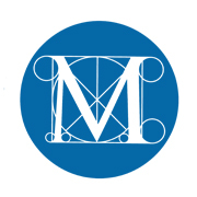
But a new logo was designed, replacing the one I’ve posted at the top here (a perfectly good logo, if you ask me). It will, I predict, be more streamlined, designed to appeal to the young. I know people who have seen it, and none of them like it. It’s red, not blue or black, and it looks nothing like the current one, which alludes to Leonardo’s Vitruvian man. Will the Met’s new logo refer to art at all?
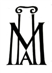
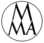
The Met has had other logos; I’ve pasted two I found on the web here. I anxiously wait to see what the new one looks like.
*I consult to a foundation that supports the Met.
