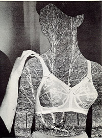
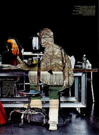
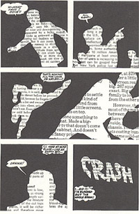
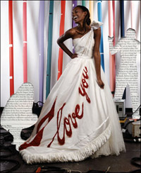
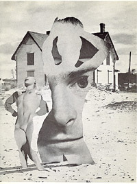
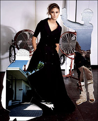
Do you see any similarities in the images below? Three are by Norman O. Mustill, from Flypaper (1967) and Twinpak (1969). Three are by Vik Muniz, from a fashion spread that appeared in The New York Times Style Magazine (Dec. 5, 2005).
The similarities, though not exact, are so striking when taken together that if Muniz’s images and techniques are not plagiarized from Mustill’s, they bear what Martin Filler calls in the context of architecture “the onus of plagiarism.” That is, they are imitations, acknowledged or not. And they can’t be claimed as postmodern appropriations because by definition appropriation art is intended to deconstruct, parody or otherwise comment on well-known cultural icons — Mickey Mouse, for instance, or the Mona Lisa.
Shortly after The Times fashion spread appeared, I raised this issue with the editors of the magazine. After three months of stonewalling, they finally got back to me. The magazine’s photography director, Kathy Ryan, who worked on the spread with Muniz, a currently “hot” self-described copycatter, said: “The similarities are a coincidence.” She said Muniz told her he doesn’t know Mustill’s work.OK, they’re a coincidence. But to be fair to Mustill, a currently “not hot” original cat, how about allowing a letter to be published in the magazine noting the similarities with matching illustrations? Can’t be done, she said. So much time has passed, it wouldn’t make sense. (Blame the victim, anyone?) I guess I’ll have to blog about this, I said. Fine, she said, no problem.
So have a look at the evidence.
Exhibit A: On the left, Mustill (from 39 years ago). On the right, Muniz (from three months ago). In this case, notice the exact material: tree branches within a human form in the context of a fashion statement and the referential hand.
Mustill comments: “Ape artist perhaps. D’ya think he believes this admission gives him carte blanche to rip off anyone and anything he surveys?”
Exhibit B: On the left, Mustill (from 37 years ago). On the right, Muniz (from three months ago). In this case, notice the technique combining newsprint and human figure cutouts.
Mustill comments: “So much for originalité artistique. Puts the whole fucking rumble into its proper perspective. He’s still working in advertising.”
Exhibit C: On the left, Mustill (from 39 years ago). On the right, Muniz (from three months ago). In this case, notice the reversal of imagery: the house as background vs. the house within the figure. (And how about the thematic reversal: ludicrous preening vs. fashionable tailoring?)
+++
Mustill comments: “‘cept to have my work morphed, reinterpreted, redeployed, and included (anonymously) among the famous, is no comfort at all.”
Incidental intelligence: The “O” in Norman O. Mustill stands for “Ogue,” a single-word manifesto. When he took the middle name years ago, by dropping the “V” from Vogue, it made the point that … oh, never mind, if you don’t get it, there’s no point explaining it … Suffice to say, it underscores a special irony of the Muniz “coincidence.”

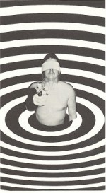
![TwinPak [Nova Broadcast Press, 1969]](http://www.artsjournal.com/herman/wp/wp-content/uploads/2013/07/twinpak-cover-e1374339873843.jpg)
!['Flypaper' [Beach Books, 1967]](http://www.artsjournal.com/herman/wp/wp-content/uploads/2013/07/flypaper-cover-copy-e1374339574281.jpg)
