Site of the Barnes Foundation’s future foundation
After I attended the Philadelphia Art Commission’s meeting where the plans for the new facility for the Barnes Foundation were approved, I headed over to the active construction site, just a few blocks away.
On the video at the end of this post, in which I’ll show you the construction action, I comment:
It’s not your mother’s Barnes.
If Andrew Stewart, the foundation’s kind spokesperson (who was nice enough to escort me inside the fence), hadn’t been at my elbow, I might well have said:
It’s not Albert Barnes‘ Barnes.
Actually, that goes without saying. Anything that puts the doctor’s renowned and cherished collection anywhere else than the place where he stipulated it should always remain can never be “Albert Barnes’ Barnes.”
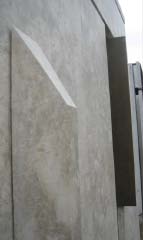
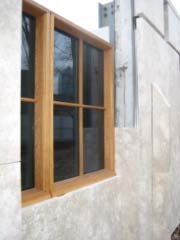
Although we’ve never seen a detailed rendering of what the new building’s exterior will look like, there’s now an on-site prototype of a wall with a window. Admittedly, it’s unfair to judge a whole building from one fragment. But to me it looks likely to be the antithesis of the dignified, classically balanced façade of the Paul Cret-designed mansion in Merion, where Barnes had stipulated that his collection was always to remain:

The Barnes Foundation in Merion
Here’s part of the prototype at the Philadelphia site. In reality, the stone is more beige, less pink, than it appears here:

One wouldn’t expect a contemporary architect to slavishly recreate an 84-year-old building. But I was disconcerted by Tod Williams‘ and Billie Tsien‘s crazy-quilt arrangement (“syncopated,” in the architects’ words) of limestone panels that that will sprout not one but two types of fins—limestone (which you see just to the right of the window, above) and bronze, jutting out at the right side of the stainless steel channel.
Here’s another view of the right side of the wall that you see above:
Here’s the limestone fin in the foreground, with the bronze fin above and to the right:

Here’s a closer look at the bronze fin, which, as you can see, has a speckled texture:

And here’s the oak-framed window, somewhat incongruously set in the limestone:

The Jerusalem limestone chosen for the project is a busy, mottled surface (“lively,” the architects call it). The panel below is particularly lively. It contains fossils:

Now that I’ve given you the background, let’s all don our hardhats and get our shoes nice and muddy!
